GRAPHIC DESIGN AND VISUAL COMMUNICATION lR
1950-1970
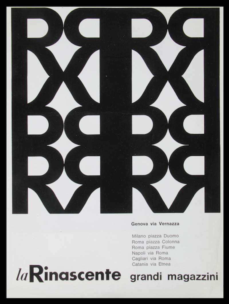
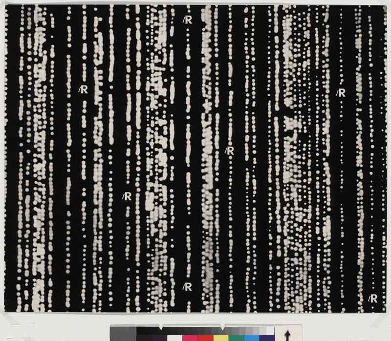
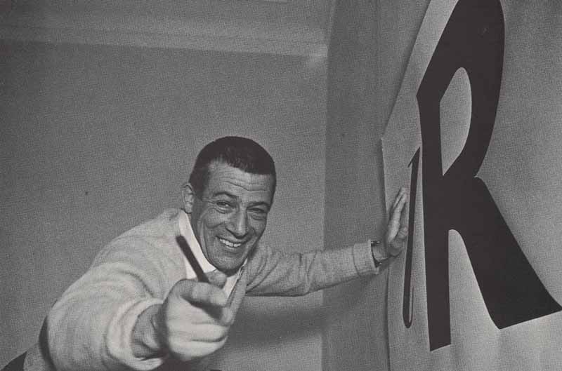
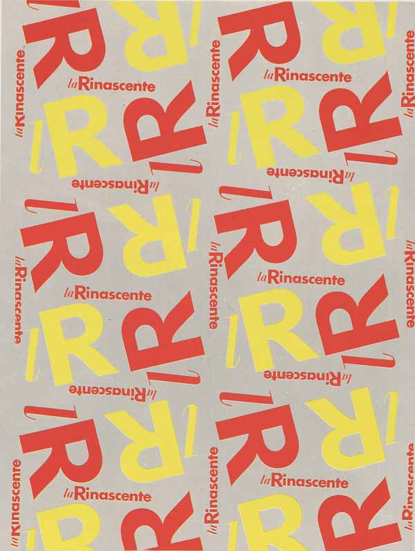
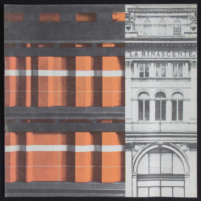
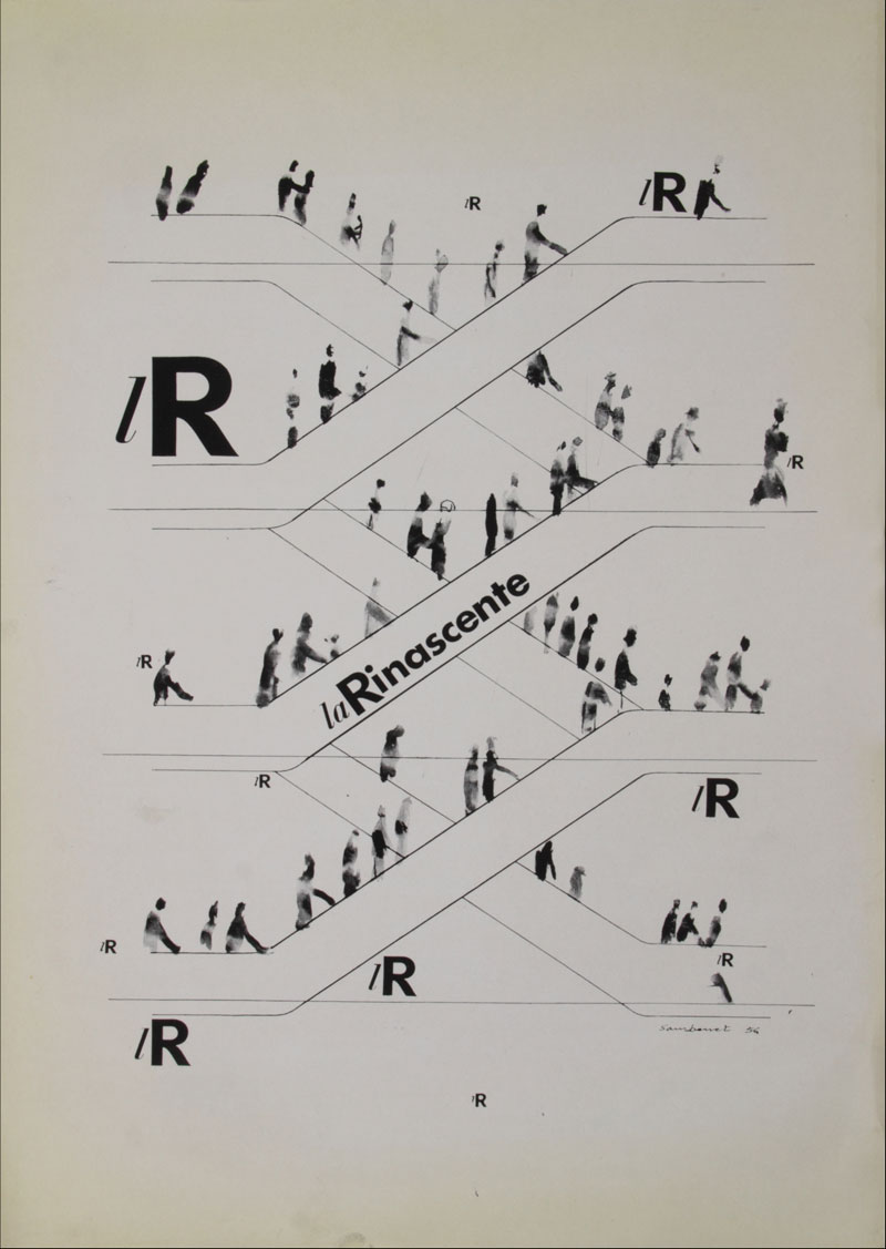
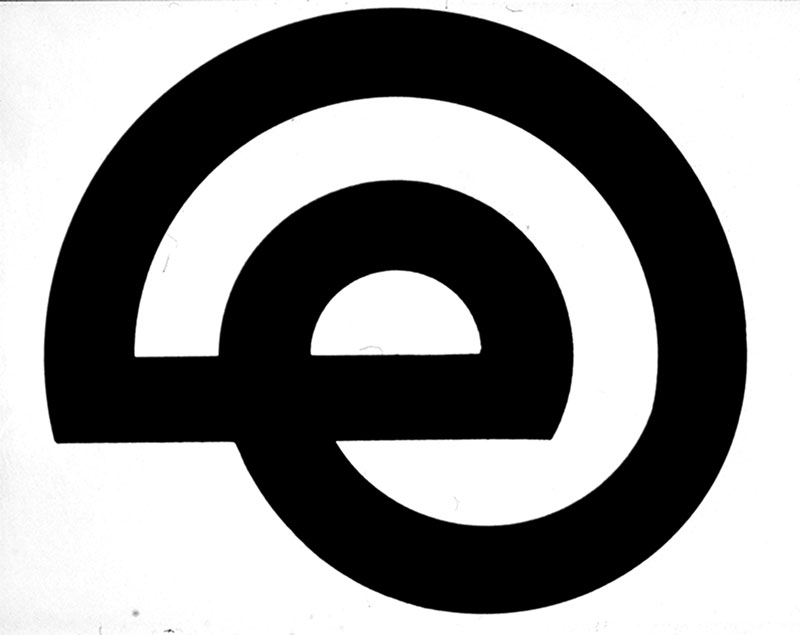
To open the story there is a logo, a lowercase  in italics and a capital
  , which together form a pictogram of two typographic characters. Two font types which are practically design opposites: the first is Bodoni Italic, light and elegant, whilst the second is Gill Sans, a thicker, black humanist sans serif without any flourishes. Both are treated as purely physical forms, removed from phonetic purpose. They belong to two worlds which become linked: the first, deep-rooted in tradition, deriving from one of the most well-known and familiar typographic fonts of Italian culture; the second, functional and decidedly modern, communicative, signposting with an immediate impact. In the full version of the logotype, the complete word
  follows the initial , but in lowercase and Futura font. The initial however is slightly larger, like a historiated initial, with a subtle curving of the descending diagonal stroke, a touch that does not appear in Futura and which creates a slight, deliberate imbalance. And theespecially, as its phonetic function slips away, becomes an ambiguous and subtle indicator, thereby highlighting the collage composition which also appears in the pages of Giambattista Bodoni font type, with a visual awareness that has been rightly acknowledged in contemporary times as pop art
Luca Monica
(lR 100. Rinascente. Stories of Innovation)
This logo was created by Max Huber in 1950 for the re-opening of the la Rinascente department store, defining the essential principles of a system of communication aesthetics which would then erupt and develop through a hypertext of diverse stimuli and in a richly expressive variety, thoroughly and effectively characterizing the Rinascente image.
1950 was an important year in the history of la Rinascente stores. It marked the end of a decade of war economy, of depression and reconstruction. The postwar boom was about to begin, a period based on growth with fresh enthusiasm, alongside an ambitious and daring project to provide the public with an amazing new world of goods, images and culture. Because, to quote Rodolfo Francesconi in his book “Azienda come cultura” (“Business like culture”), the Rinascente “was not only a ‘temple of consumerism’ but also an experimental university, a huge modern sanctuary supplying goods and ideas”.
New consumer goods, often never seen before and at times arriving from other countries, tempted customers to try out a modern lifestyle centred around the individual, his/her character, and a new pace of life. Commodities were presented and represented in original ways. It was a consumerism in fact heralded by a wave of communication images and advertising tools. Innovation, the aperture towards new horizons as glimpsed in the wide-ranging offer of goods, was inevitably reflected in the new experimental strategies of visual communication that appeared in the brand’s advertising and marketing.
In the years that followed, the sociological relationships of communication with the world of design, production and sales would be investigated in depth by experts, but such awareness seems to have been preempted much earlier, in a more natural and direct manner, by the Rinascente company.
What’s certain is that an understanding of the semantic and aesthetic aspects of communication (graphic, display and architectural) was clearly evident in Italy at a certain point. Proof of this can be found in the remarkable fitting of the introductory section of the XIII Triennale of Milan in 1964, dedicated to “Momenti di tempo libero” (Moments of leisure time), curated by Umberto Eco and staged by Vittorio Gregotti and Massimo Vignelli with the use of neon signs, screenings and consumer goods. Leisure time was already decidedly the domain of shopping (especially in its most enjoyable, attractive and, in some ways, ethical versions) as practised at the Rinascente, here raising awareness of the social relationship between work time (planning and production) and consumption time (in the exhibition itself).
Italian graphic design in the immediate postwar period was based on artisan skill and exquisitely artistic techniques acquired in art school, as many of the graphic designers who worked with Rinascente were trained in Brera. And alongside these, there re-emerged the avant-garde experimental forms of the pre-war era (from Futurism onward), strongly fitted to the representational skill of Italian artists.
There was a strong fusion of the graphic and illustrative world with figures from artistic backgrounds; to name but a few examples, the hinging role played by the experimental work of Bruno Munari who assisted at the Rinascente with some display sets, or well-rounded graphic designers such as Albe Steiner who experimented with photograms, as well as Franco Grignani and Luigi Veronesi.
A precise artistic concept provided the backdrop: concrete art, which featured strongly in some important collective exhibitions around 1950. These included the 1951 exhibition in Rome at the National Gallery of Modern Art, Arte astratta e concreta in Italia (Abstract and concrete art in Italy), with contributions from Giulio Carlo Argan, Ernesto Nathan Rogers, Enrico Prampolini, Gillo Dorfles, Achille Perilli, Bruno Alfieri, Bruno Munari and others, both architects and artists. Such exhibitions provided moments of reflection, examples of adherence to the interpretation of modern art in all its contemporary design forms whilst upholding the traditional concept.
Again in Milan, Munari would become the founder of MAC (Movement of Concrete Art) in 1948, which in Italy summed up the graphic design, sculptural, painting and architectural driving forces of a European artistic and cultural movement that began with the De Stjil school of Theo van Doesburg and was followed up by Bauhaus. Its leading light was Max Bill at the School of Ulm, at that time presided over by Tomás Maldonado (who would also be responsible for the interior signage of the Rinascente and Upim stores in 1969).
This idea of syncretism of parallel arts which permeated the birth and growth of the entire artistic architecture culture of the twentieth century, widening the capacity of multiscale planning and involving industrial design and graphic art in the world of architecture, appeared also in the world of la Rinascente.
It would not be inappropriate to point out here that it was in fact the Rinascente company which introduced the Golden Compass Award for Product Aesthetics in 1954 (the Compasso d’Oro), the oldest and most prestigious industrial design award both in Italy and abroad.
This period marked a decided effort by graphic design studios to raise the benchmark, bringing together teams of highly talented individuals. One noted example was the Unimark International Studio, open between 1965 and 1972 with its main branches in Chicago, New York and Milan. The team counted Massimo Vignelli, Bob Noorda and (later) Salvatore Gregorietti amongst its numbers. Another key player was, Boggeri studio (1933-1981), CNPT (1956-1965) with Giulio Confalonieri, Ilio Negri, Michele Provinciali and Pino Tovaglia. These companies all shared a common goal: to match the strong technical development of the market in those years, whilst maintaining the essential craftsmanship of its members, at times riding against public tastes. This often meant confliction with the growing tide of advertising agencies which focused merely on strict marketing principles where the graphic element featured solely as a mere link in the greater chain of profit, totally unrelated to any idea of communicative responsibility (social, productive, etc).
Observing the graphic design and interior set-ups in Italy – at the Triennale events, and industry expos and trade fairs in Turin, Milan, Naples, etc – the period between the two world wars marked a moment of great (and original) skill in production and experimentation among the same players later to be found in the postwar period, from Olivetto to Pirelli and Rinascente, who pulled along with them a group of less renowned but equally important players in the history of visual expression. They were prime examples of the Italian ability to link business and culture, to schematise the complex relationship between social demand, aesthetic training, and technological and industrial development.
And, in fact, 1950 marked the beginning of two golden decades for the Rinascente company, also in terms of graphic design and visual communication in general. The Advertising and Communication Department on the seventh floor of the building in Piazza del Duomo in Milan, in close proximity with the actual retail floors, became a professional environment of huge importance for the graphic designers, draughtsmen and communication staff, both Italian and foreign; a stint at la Rinascente was practically a must for professionals in the field at that time, when anyone who hadn’t worked there was simply a nobody.
The large department store attracted important professionals, some of whom were already established in the industry, others who were upcoming talents, thus training and fostering a work team where complementary skills and prowess interacted in harmony. The Rinascente workplace offered enormous freedom, and the atmosphere was permeated by everyone’s awareness of being part of a huge movement, in the construction and diffusion of a new “civilization of images”, a design process full of issues to resolve via artistic and cultural imagination.
During those years, the Rinascente developed an integrated communication strategy which was entirely innovative and effective. The freedom allowed to experiment was tempered by the efficiency naturally required in responding to the needs and commercial demands of the market, in a professional equilibrium where aesthetic pleasure was in no way sacrificed. So, for example, the traditional act of sending mail-order catalogues and brochures to promote clothing or events such as fashion collection shows, was extended further and enhanced with front covers and pages designed by Max Huber or Lora Lamm: advertising inserts were illustrated with the elegant artwork of Iliprandi, while the in-store posters of Gorgerino and Hopper adorned the aisles of the department store to catch the eye of shoppers, breaking traditional art norms and offering everyday opportunities to exploit fresh and effective design, in unquestionably original manners.
From these professional collaborations came communicative solutions which still today catch the eye for their quality, creative energy and innovative power.
These two decades offered up a surprisingly rich variety of expressive forms, a wealth of codes, languages and styles, which are amazing for the sense of overall unity and harmony that emerged to promote the lR brand. Ongoing coherence can be tracked between the messages emitted through different communication channels, whether synchronic (for example, in event advertising via complementary information tools) or diachronic (ensuring continuity and recognisability of the brand over time, also regarding annual events). Coherence, then, was key in the company’s two communication strategies – internally, in the set-up of display areas and retail goods and signage, and externally, from the posters and price lists to packaging materials.
All of this could only result from rigorous research, planning and design in the advertising campaigns and communication methods overall. This same precision could also be found in the scouting and preliminary selection stages of the proposed retail supply.
The la Rinascente advertising was aimed directly at the target market, and placed the goods themselves at the centre of attention. It represented an invitation to customers to expand their personal tastes, to aspire to new consumer models and lifestyles, a challenge to open their mind to a new retail world while, at the same time, assimilating the innovative marketing languages used to present these goods.
From the point of view of graphic design, the trend to focus on the object itself meant using the avant-garde graphic tools of the pre-war era – collages, objet trouvé, visual montages, also with varying depths and texture, adopting materials from real everyday life and exploiting a familiar language well established by tradition (such as the illustrated price lists of the beginning of the century), only to then let them ‘explode’ in the shop windows, or appear rearranged on the white background of a printed page. This was where illustrations took hold. Illustrated design, as in the splendid examples of Lora Lamm, Brunetta or Pegge Hopper, served the purpose in all ways. The inserts and advertising pages for newspapers created by Iliprandi, Waibl, Gregorietti and Lora Lamm with a chart format were exemplary, eclectic in their montage of different fonts, drawings and photographs, like memos, impressions and suggestions of the multifaceted world of la Rinascente, in a lively aesthetic fragment. They were a multitude of visual stimuli, which together conjured up elegant and unmistakable taste.
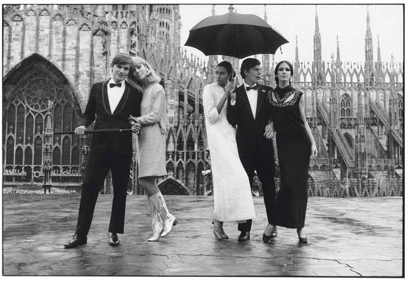
Illustrations were joined by photography, which became particularly popular at a later stage, with all its enchanting and imaginative power as revealed in the rival fashion magazines. La Rinascente signed up Serge Libiszewski, Aldo Ballo, Oliviero Toscani, Helmut Newton, William Klein, Henry Clarke, Jeanloup Sieff and other well-known names. One important project was the 1961 catalogue Incontri in Europa (Appointments in Europe) for Apem (a clothing supplier for Rinascente), curated by Adriana Botti Monti and with graphic design work by Giancarlo Iliprandi.
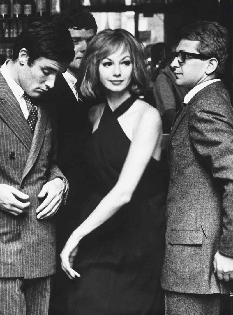
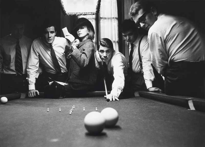
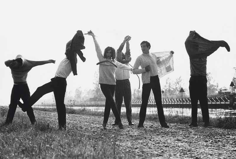
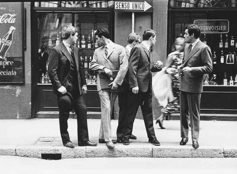
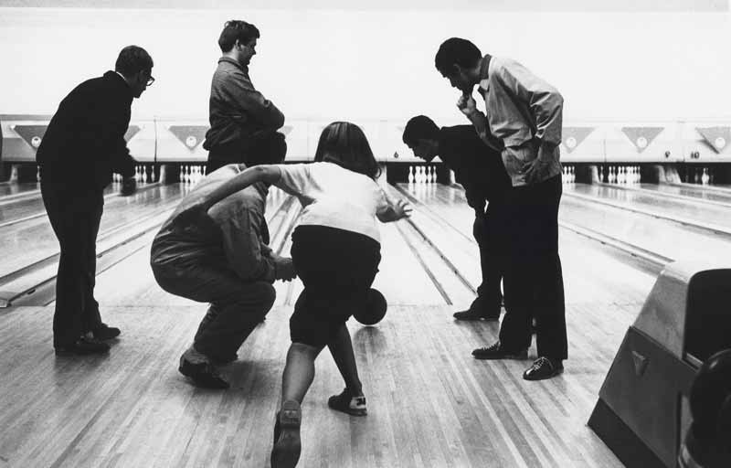
Libis, especially, revolutionized the paradigm of fashion photography. He set up photo shoots which focused on fragmented moments of everyday life and spontaneous shots, also immortalizing particular backstage moments. These timeless photographs still have a particular impact today, unconventional and refined at the same time, an aesthetic quality and inventive concept emerging from expert mastery, a know-how and true craftsmanship that is even more surprising when considering the almost rudimentary tools available in the pre-digital analogical era.
Thus, advertising was created where the communicative task was entrusted to the image, while the reduced verbal element returned to the form of signs and typographic gestures, perfectly placed and a real support to the construction of the image. This can be seen, for example, in the architectural, geometric and balanced treatment of photographs in many graphic design projects by Salvatore Gregorietti.
Today, a study of the graphic design of that period as regards the lR brand reveals many surprises regarding the role this company played. By moving beyond mere commercial objectives, the company became a key player in cultural and artistic evolution, as well as in innovation regarding production and distribution, establishing itself as a national and international retailing benchmark.
And now it’s time to introduce some of the protagonists from that extraordinary period in lR visual communication and graphic design.
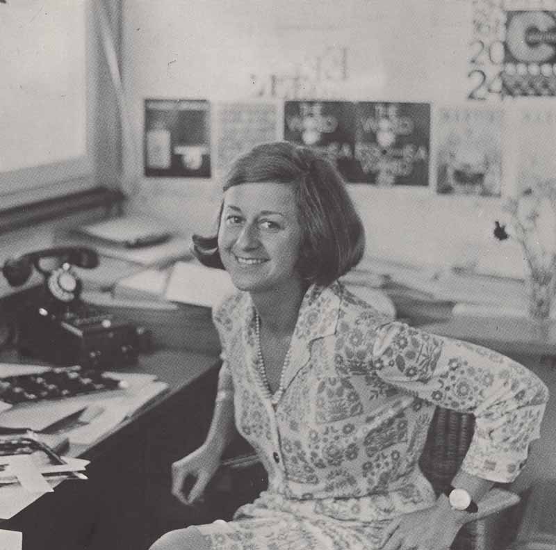
Adriana Botti Monti
Adriana Botti Monti was born in Milan in 1937. After attending classical high school, she was awarded a diploma from the School of Translators and Interpreters before attending the Faculty of Law at university. She collaborated with various women’s magazines, first as a translator, and then as a fashion journalist.
From 1960 onwards she was a consultant for la Rinascente in the advertising department. She dealt specifically with advertising for the APEM lines, curating the publication “Appointments in Europe. The APEM autumn/winter collection 1961-1962, with photography from international maestros.” In 1962 she became Art Director for the department, overseeing promotional material for the company, press releases and posters. In 1967 she became an executive, coordinating an incredible team that included Salvatore Gregorietti, Giancarlo Iliprandi, Serge Libis, Aldo Ballo, Oliviero Toscani, Carlo Orsi, and Guido Vergani. She created the Rinascente Office of Fashion and Style, where a young Giorgio Armani served an apprenticeship first as a window dresser and then as a sales assistant in the menswear department.
She received various awards, including the Corriere della Sera Award for Art Direction in 1967 for the press release Inverno luminoso moda aggressiva 1966, the Ferrania Award for her art direction contribution to the photography layout of the men’s fashion supplement Uomo lR, and the La Domenica del Corriere Award for her art direction contribution to the illustration of Deserto dervish.
In 1971, with the arrival of new management, Adriana Botti Monti left Rinascente. She worked for some months for “Vogue Italy”, followed by five years at Longanesi, before rounding off with “Casa Vogue” between 1979 and 1997.
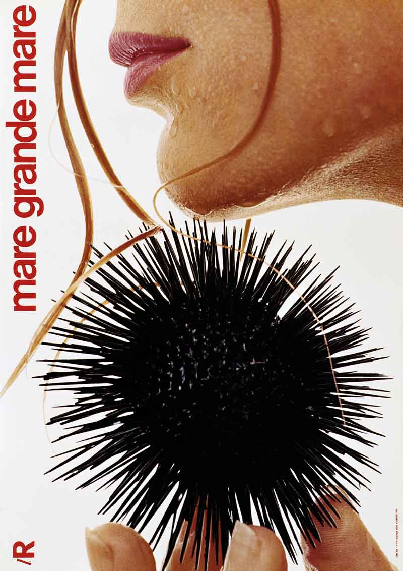
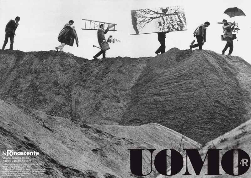
1 — Mare grande mare, 1969, manifesto
Art director Adriana Botti Monti
Progetto grafico Salvatore Gregorietti
Fotografia Serge Libiszewski
Archivio Serge Libiszewski, Milano
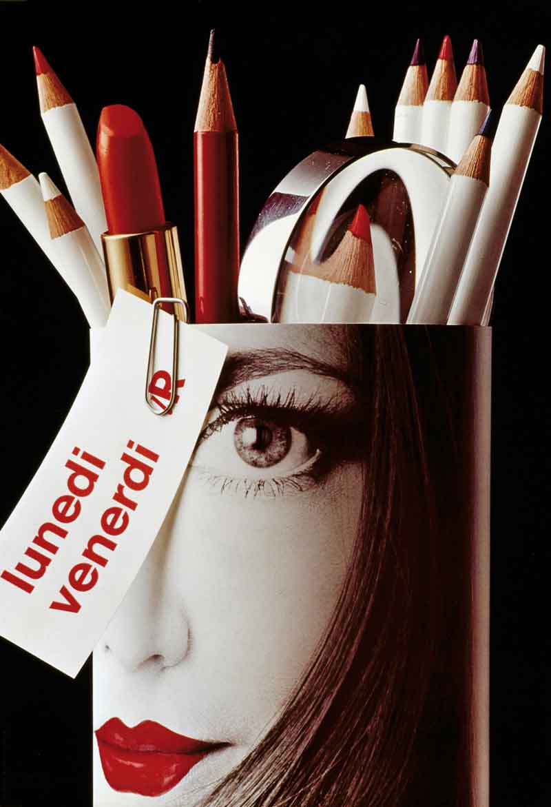
2 — Lunedì venerdì, 1968, manifesto
Art director Adriana Botti Monti
Progetto grafico Georg Erhardt
Fotografia Serge Libiszewski
Archivio Serge Libiszewski, Milano
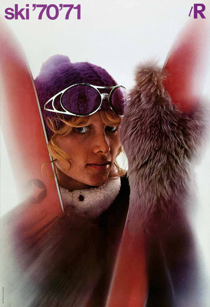
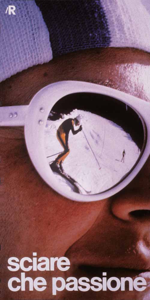
3 — Ski ’70 ’71, 19670, manifesto
Art director Adriana Botti Monti
Progetto grafico Salvatore Gregorietti
Fotografia Serge Libiszewski
Archivio Serge Libiszewski, Milano
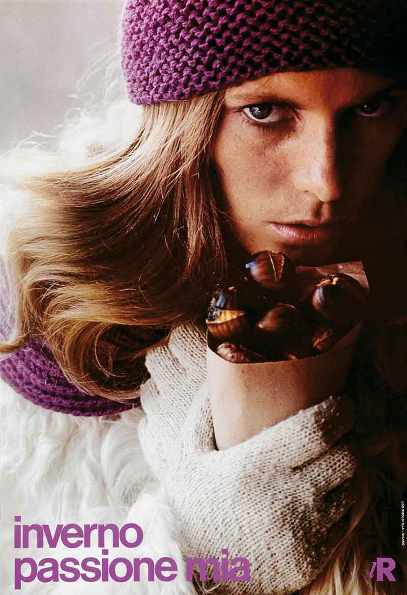
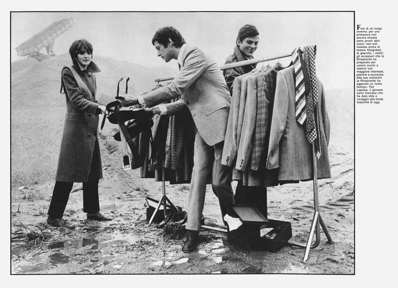
4 — Inverno passione mia, 1970ca., pieghevole per la Rinascente
Art director Adriana Botti Monti
Progetto grafico Salvatore Gregorietti
Fotografia Serge Libiszewski
Archivio Serge Libiszewski, Milano
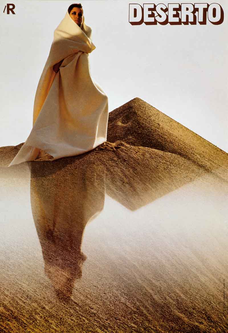
5 — Deserto, 1967, manifesto
Art director Adriana Botti Monti
Progetto grafico Salvatore Gregorietti
Fotografia Serge Libiszewski
Archivio Salvatore Gregorietti, Milano
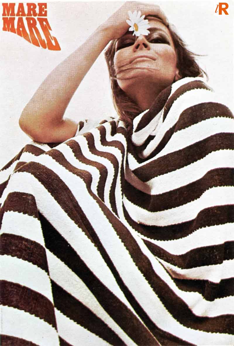
6 — Mare mare. lR, 1967, manifesto
Art director Adriana Botti Monti
Progetto grafico Salvatore Gregorietti
Fotografia Oliviero Toscani
Archivio Salvatore Gregorietti, Milano
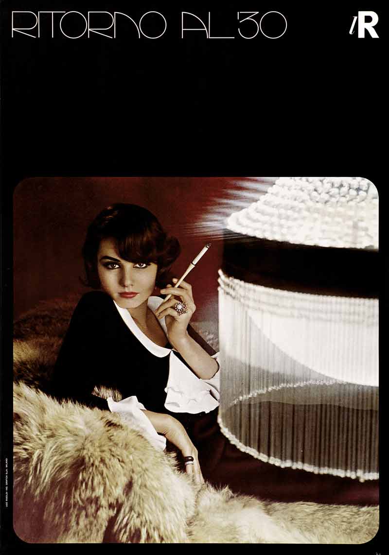
7 — Ritorno al '30. lR, 1966, manifesto
Art director Adriana Botti Monti
Progetto grafico Salvatore Gregorietti
Fotografia Serge Libiszewski
Archivio Serge Libiszewski, Milano
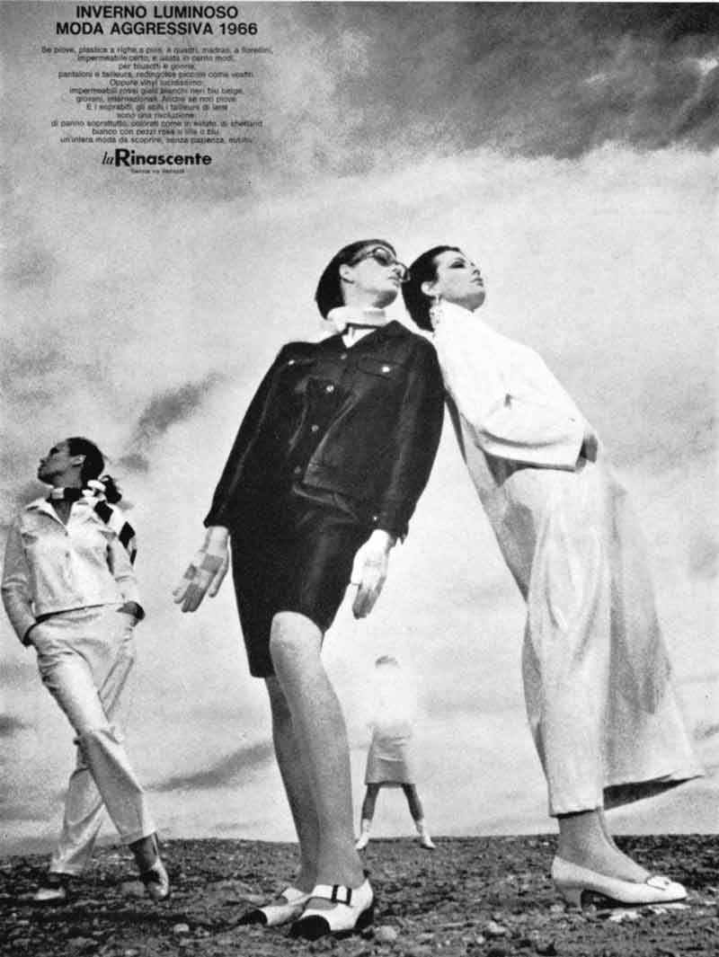
8 — Inverno luminoso moda aggressiva, 1966, annuncio per quotidiani
Art director Adriana Botti Monti
Progetto grafico Salvatore Gregorietti
Fotografia Oliviero Toscani
Archivio Salvatore Gregorietti, Milano
Premio Corriere della Sera per l'Art direction di un avviso su quotidiani
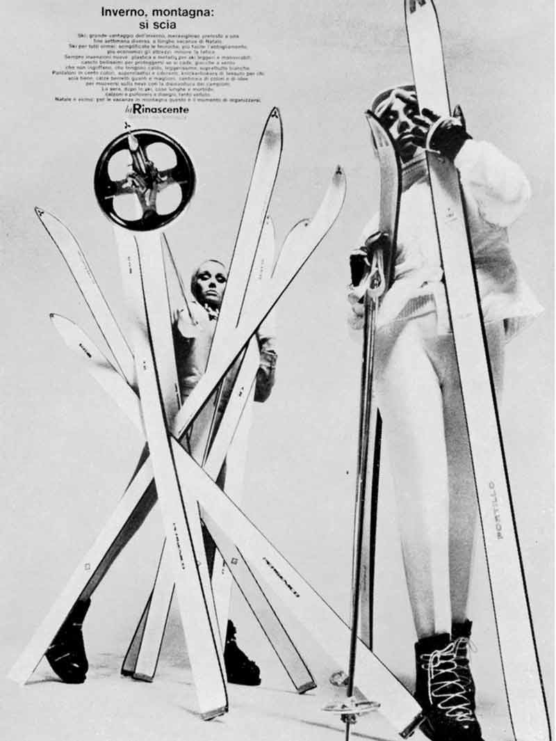
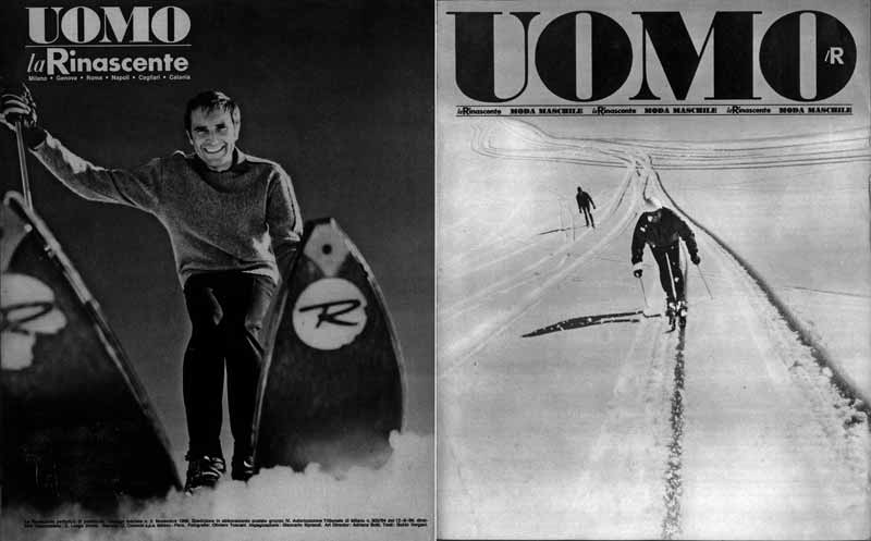
9 — Inverno, montagna: si scia, 1967, annuncio per quotidiani
Art director Adriana Botti Monti
Progetto grafico Salvatore Gregorietti
Fotografia Carlo Orsi
Archivio Salvatore Gregorietti, Milano
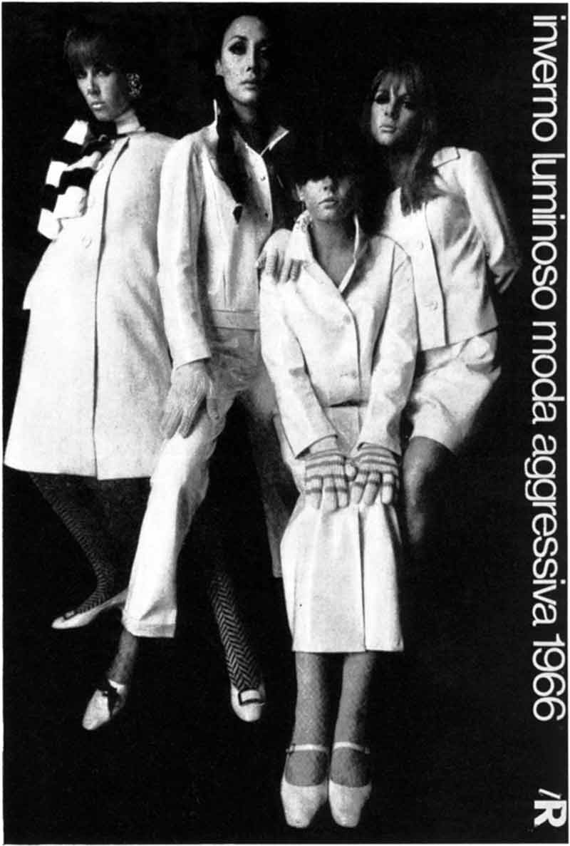
10 — Inverno luminoso moda aggressiva 1966, 1966, manifesto
Art direction Adriana Botti Monti
Progetto grafico Salvatore Gregorietti
Fotografia Oliviero Toscani
Archivio Salvatore Gregorietti, Milano
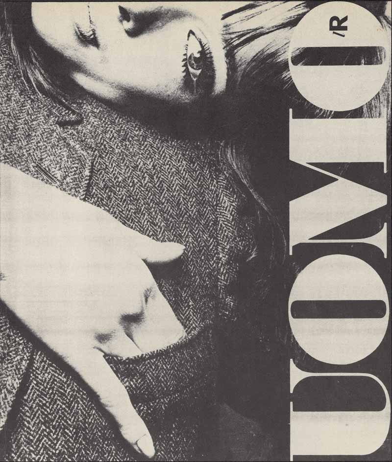
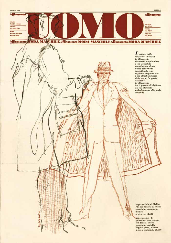
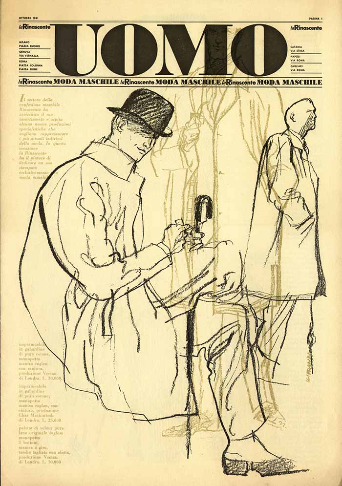
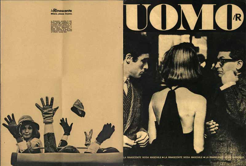
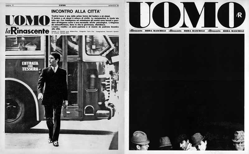
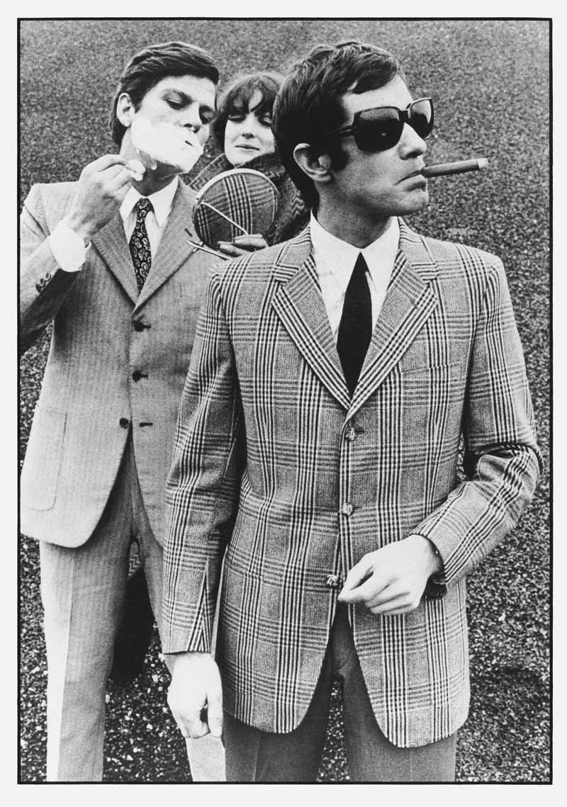
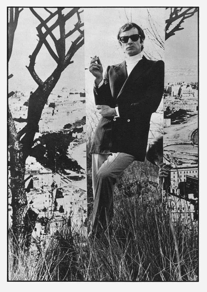
11 — Uomo lR, 1965, manifesto
Art director Adriana Botti Monti
Progetto grafico Giancarlo Iliprandi
Fotografia Serge Libiszewski
Archivio Serge Libiszewski, Milano
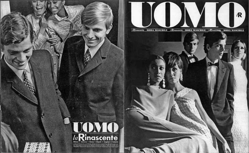
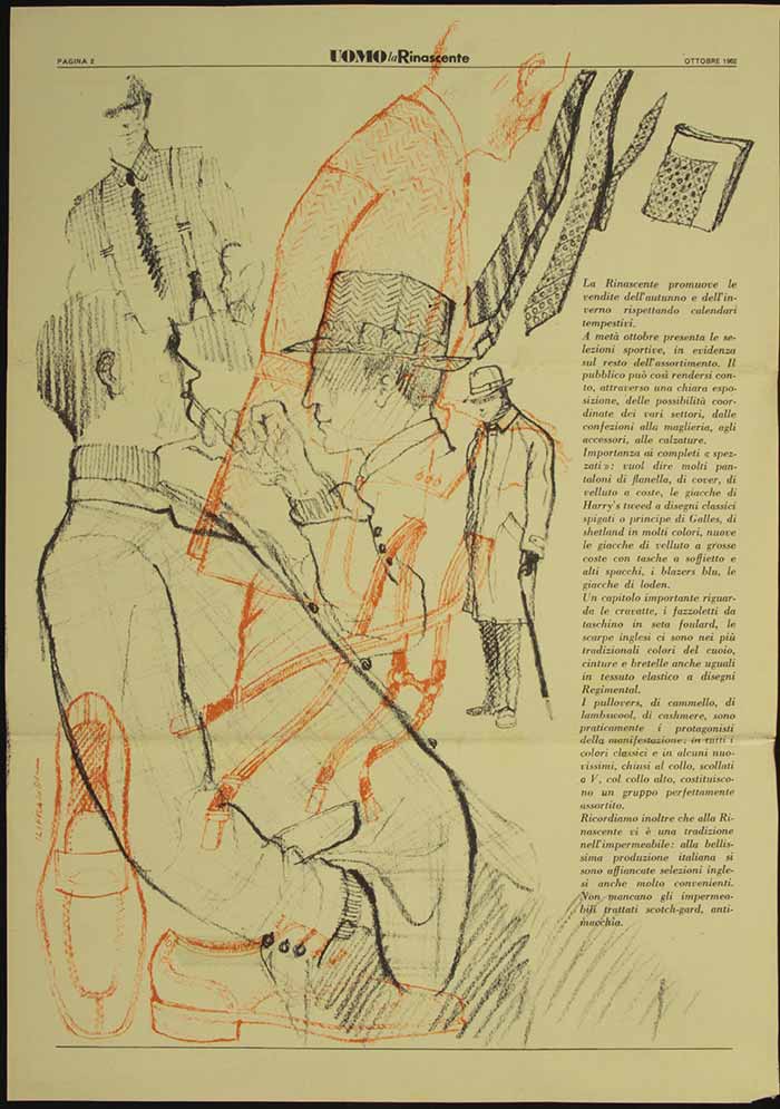
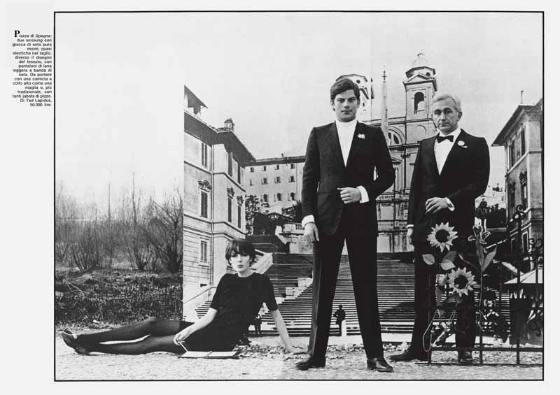
12 — Uomo la Rinascente Moda Maschile, 1966, catalogo [quarta di copertina e copertina]
Art director Adriana Botti Monti
Progetto grafico Giancarlo Iliprandi
Fotografia Serge Libiszewski
Studio Iliprandi - Fondo Giancarlo Iliprandi , Milano
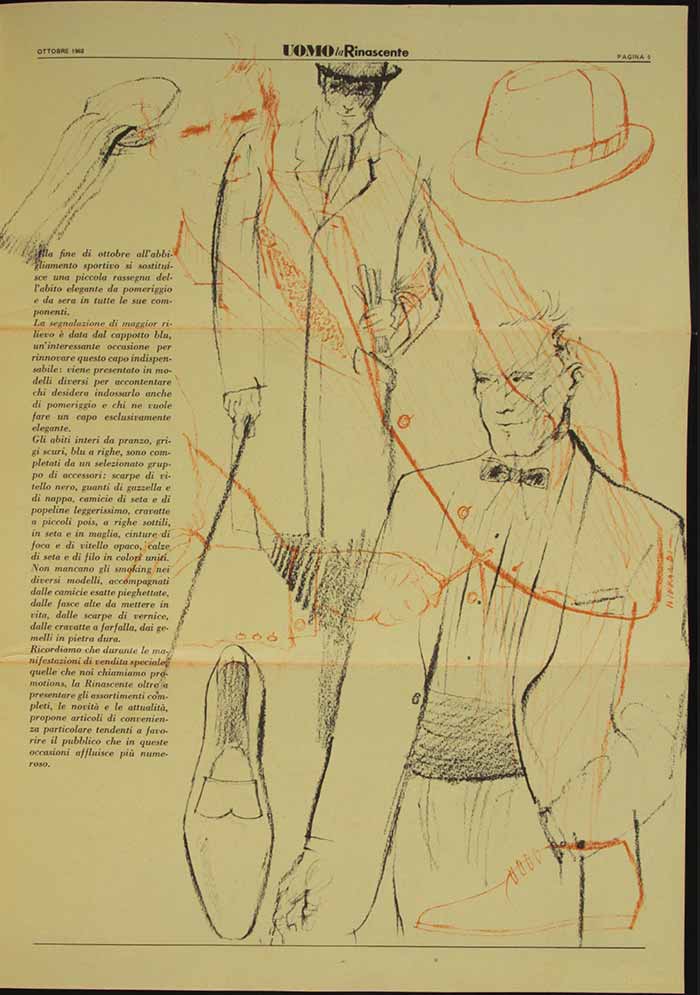
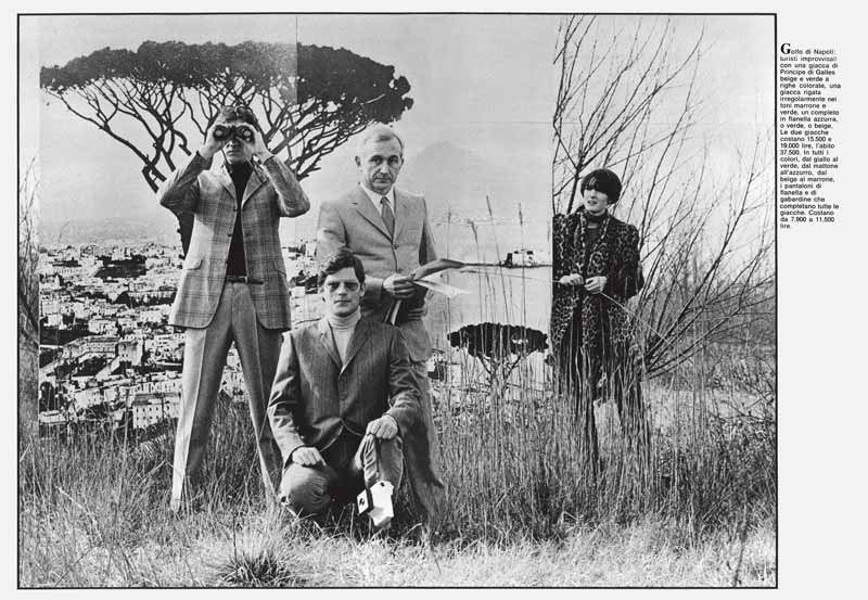
13 — Uomo la Rinascente Moda Maschile, 1966, catalogo [quarta di copertina e copertina]
Art director Adriana Botti Monti
Progetto grafico Giancarlo Iliprandi
Fotografia Carlo Orsi
Studio Iliprandi - Fondo Giancarlo Iliprandi, Milano
14 — Uomo lR, s.d., catalogo
Art director Adriana Botti Monti
Progetto grafico Salvatore Gregorietti
Fotografia Oliviero Toscani
in Primo annual Art Directors Club Milano
Archivio Adriana Botti Monti, Milano
Premio Ferrania per il contributo all’ideazione fotografica di un’opera di Art direction
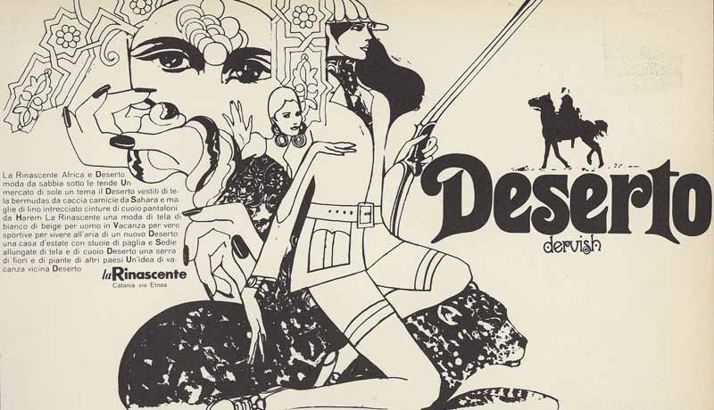
15 — Deserto, s.d., annuncio per quotidiani
Art director Adriana Botti Monti
Designer Hazi Osterwalder
in Primo annual Art Directors Club Milano
Archivio Adriana Botti Monti, Milano
Albe Steiner
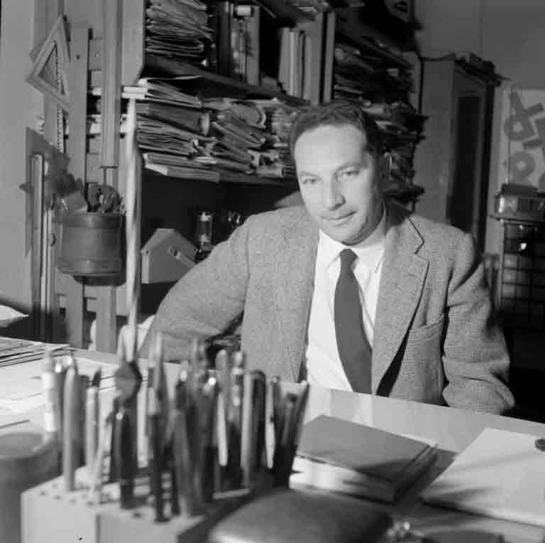
Albe Steiner began his career in graphic design in the Thirties, self-taught in the shadows of a clandestine anti-Fascist context, becoming one of the most important figures in the industry throughout the Fifties and Sixties.
A dedicated believer in the need for a relationship between art and political/social activism, as well as a supporter of cultural responsibility of graphic design in the informing and education of people, he created a visual language characterized by optimum clarity and readability in order to simplify reading and comprehension of the written message. It was an instantly recognizable style, echoing the visual culture of Bauhaus and Russian constructivism, and also influenced by typography and photography.
Steiner became involved with the Communist Party and with his wife Lica, his inseparable partner both personally and professionally, he worked undercover on information and propaganda, creating the graphic design format of Party leaflets, papers and magazines.
From the Forties onwards, he established a new relationship between text and image, helping to open up the Italian mentality towards a modern visual culture. After the Liberation, he was responsible for the graphic work of “Il Politecnico” of Elio Vittorini, making his mark in the Italian graphic tradition and paving the way for others. He later worked for many other magazines, for some of the most important Italian publishing houses such as Feltrinelli and Zanichelli, for many left-wing Italian newspapers, for cultural associations and for some large companies such as Pirelli and Olivetti.
From 1950 to 1955 he collaborated with la Rinascente and, in his role as art director, was assigned the task along with Max Huber of rebranding the company, from the interior and exterior shop displays to the advertising graphic design, in order to communicate more clearly and simply the philosophy and aesthetic choices and techniques of the department store. Steiner was responsible for the famous poster lR. Si riapre (lR. It’s back) marking the re-opening of the Milan branch of Rinascente in Piazza del Duomo in 1950, and the design of the Compasso d’Oro trademark. His creativity also emerged in some original window displays, where he favoured the use of lightweight and easily combinable materials.
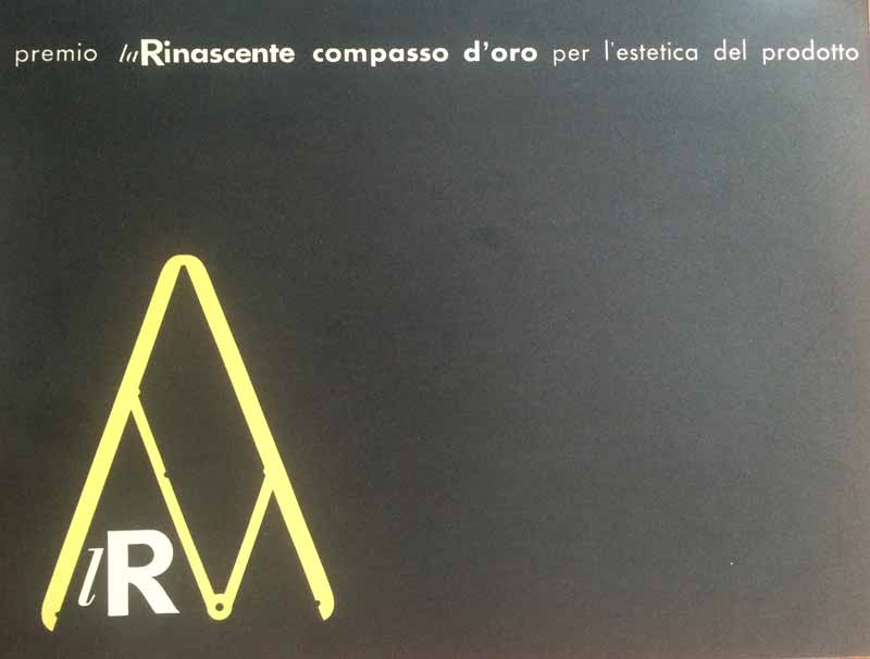
1 — Premio la Rinascente il Compasso d’Oro per l’estetica del prodotto, 1954, cartoncino nero con logo Compasso d’Oro
Progetto grafico Albe Steiner
Archivio Amneris Latis, Milano
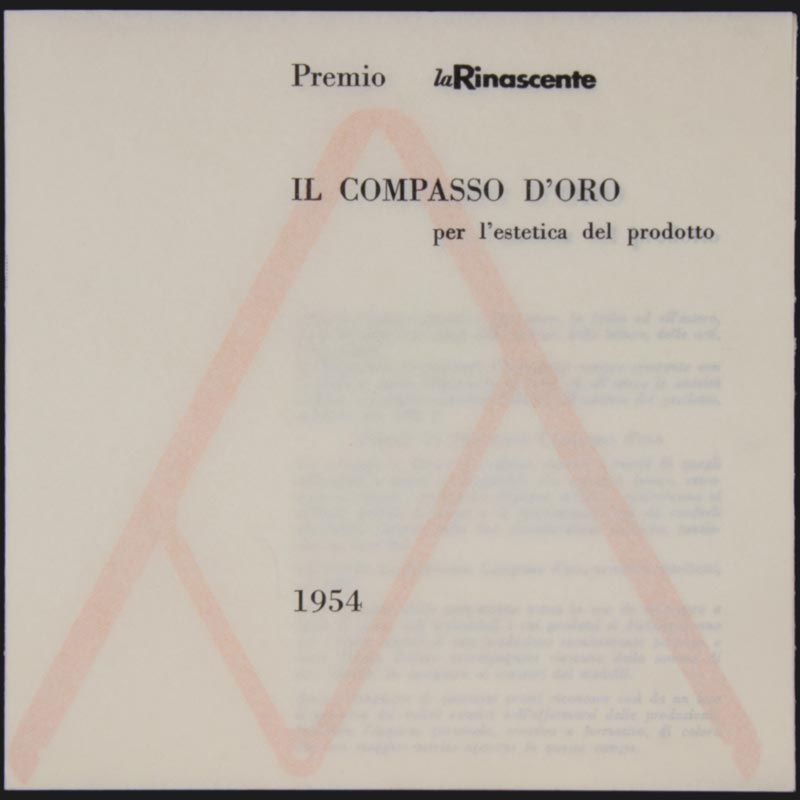
2 — Premio la Rinascente il Compasso d’Oro per l’estetica del prodotto, 1954, regolamento del Premio
Progetto grafico Albe Steiner
Archivio Amneris Latis, Milano
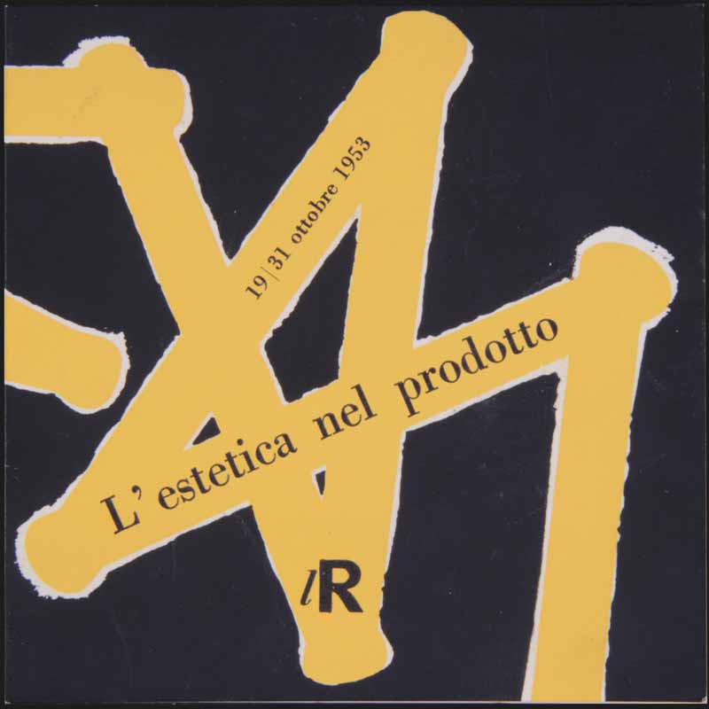
3 — L’Estetica nel Prodotto lR, 1953, pieghevole di presentazione della Mostra
Progetto grafico Albe Steiner
Archivio Amneris Latis, Milano
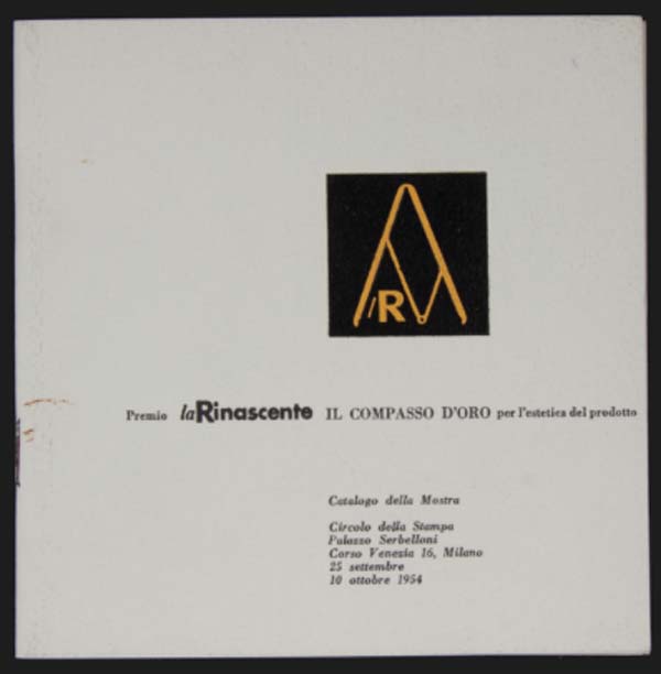
4 — Premio la Rinascente il Compasso d’Oro per l’estetica del prodotto, 1954, catalogo della Mostra
Progetto grafico Albe Steiner
Archivio Amneris Latis, Milano
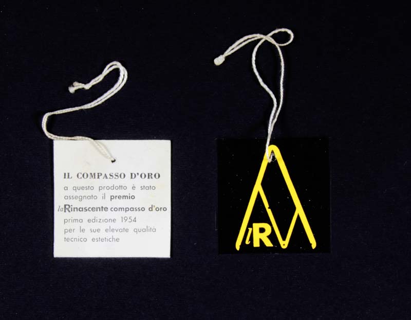
5 — Cartellino pendente applicato ai prodotti premiati, 1954
Progetto grafico Albe Steiner
Archivio Amneris Latis, Milano
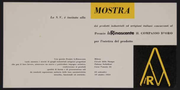
6 — Premio la Rinascente il Compasso d’Oro per l’estetica del prodotto, 1954, invito alla Mostra
Progetto grafico Albe Steiner
Archivio Amneris Latis, Milano
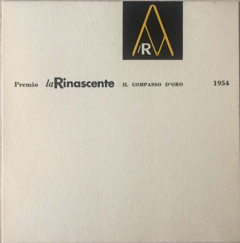
7 — Premio la Rinascente il Compasso d’Oro, 1954, cartoncino a cavaliere
Progetto grafico Albe Steiner
Archivio Amneris Latis, Milano
8 — I 15 prodotti premiati col “Compasso d’Oro 1954”, 1954, pieghevole
Progetto grafico Albe Steiner
Archivio Amneris Latis, Milano
9 — Pagina del catalogo del I Compasso d’Oro con la macchina per scrivere Olivetti Lettera 22 disegnata da Marcello Nizzoli, 1954
Fondazione ADI Collezione Compasso d’Oro, Milano
10 — lR la Rinascente milano. qu’est-ce que la Rinascente, 1952, brochure a spirale
Progetto grafico Albe Steiner
Archivio Amneris Latis, Milano
11 — Studi per promozione, 1950, bozzetti ad acquerello e pastello su carta, propedeutici per manifesto e materiale pubblicitario ‘LR. Si riapre’
Progetto grafico Albe Steiner
Politecnico di Milano, Archivi storici – Archivio Albe e Lica Steiner, Milano
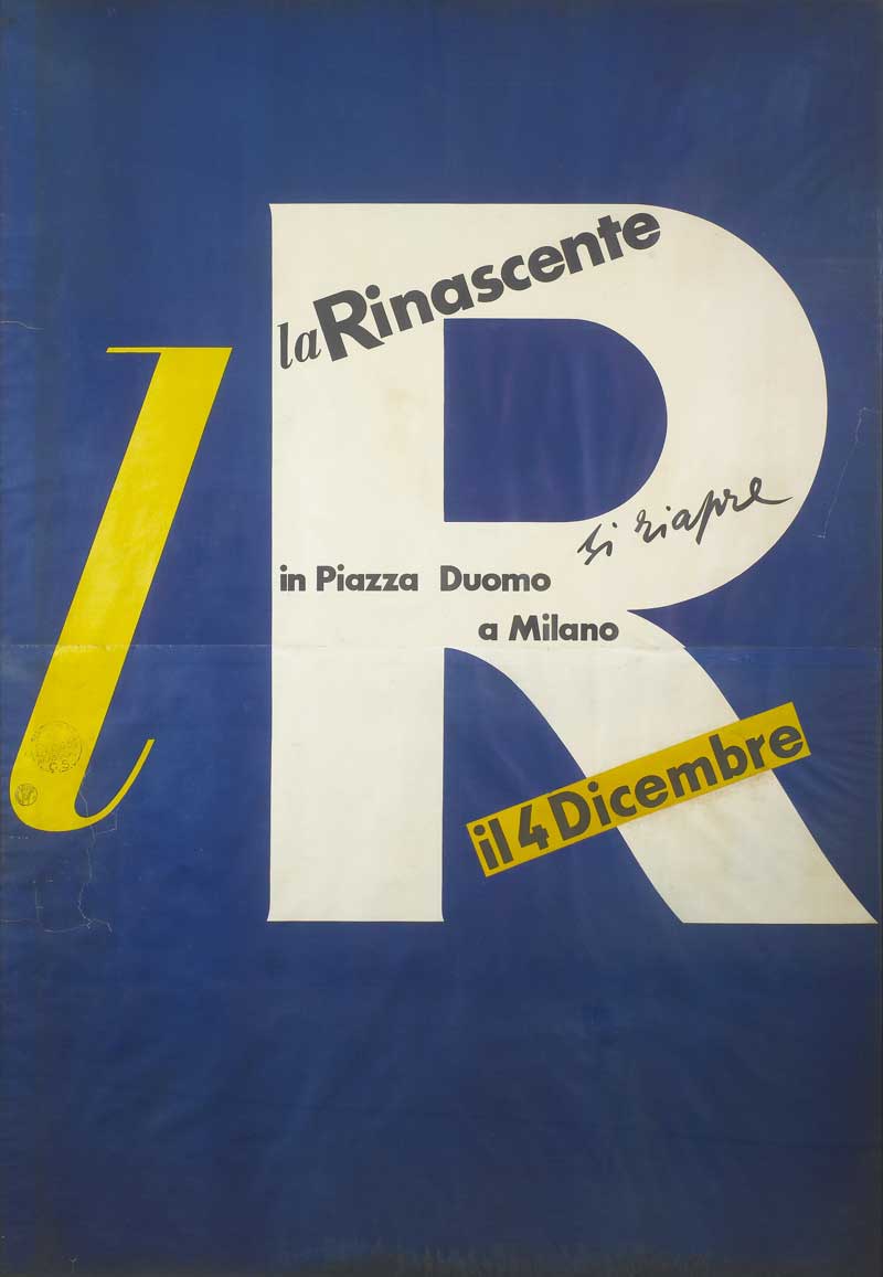
12 — lR. Si riapre in Piazza Duomo a Milano il 4 dicembre, 1950, manifesto
Progetto grafico Albe Steiner
Archivio la Rinascente, Milano
Carla Gorgerino
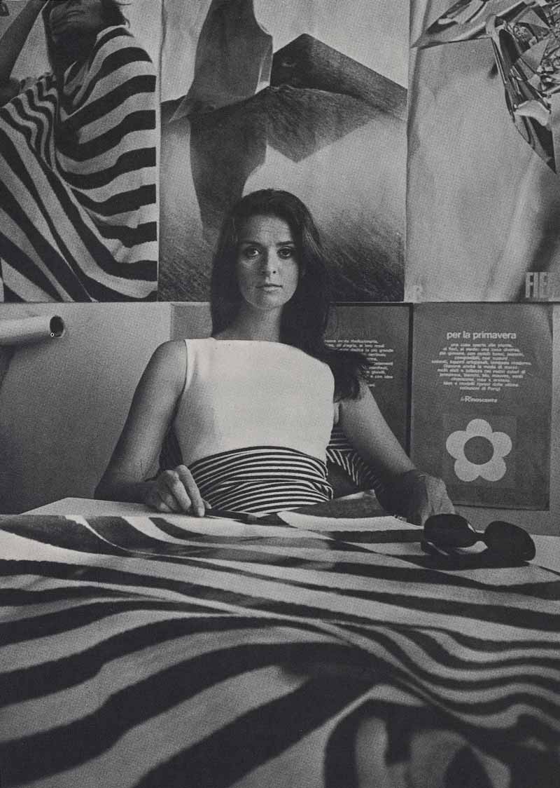
Carla Gorgerino, a brilliant graphic designer, created posters and advertising pages in 1962 with a unique sense of the importance of material presentation in the graphic montage of characters, with shading and trimmed pages. Little-known in the Milan world of graphics, she introduced a new awareness of typographic paging, combining formal structure and visual memory in new ways that would only reappear at a later point in time, re-proposed by a restricted circle of other important designers.
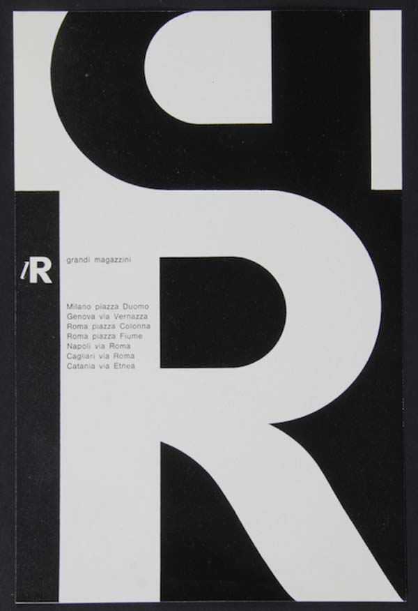
1 — lR grandi magazzini, 1962 ca.,
avviso pubblicitario
Progetto grafico Carla Gorgerino
Archivio Amneris Latis, Milano
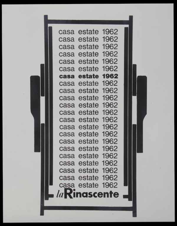
2 — Casa Estate 1962. La Rinascente, 1962 ca., avviso pubblicitario
Progetto grafico Carla Gorgerino
Archivio Amneris Latis, Milano
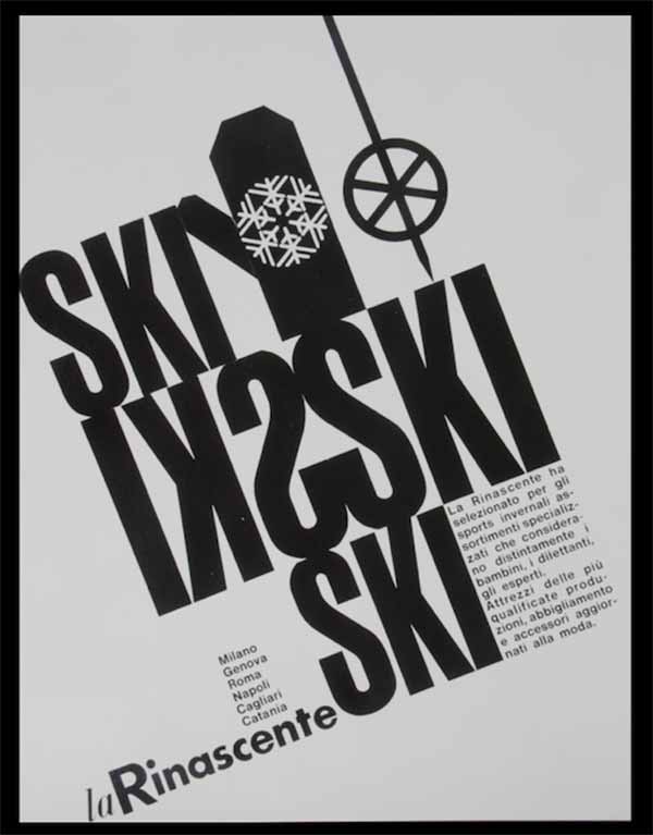
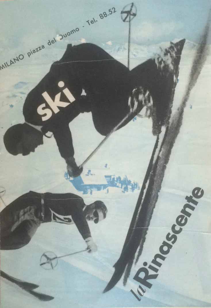
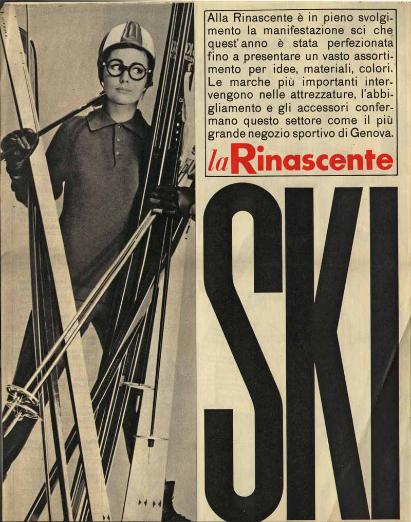
3 — Ski. La Rinascente, 1962 ca.,
avviso pubblicitario
Progetto grafico Carla Gorgerino
Archivio Amneris Latis, Milano
4 — La Rinascente grandi magazzini, 1962 ca., avviso pubblicitario
Progetto grafico Carla Gorgerino
Archivio Amneris Latis, Milano
5 — La Rinascente Upim, 1962 ca.,
avviso pubblicitario
Progetto grafico Carla Gorgerino
Archivio Amneris Latis, Milano
6 — 91 Magazzini Upim, 7 filiali la Rinascente, 1962 ca., avviso pubblicitario
Progetto grafico Carla Gorgerino
Archivio Amneris Latis, Milano
Aldo Ballo
The Ballo+Ballo Studio photography company was founded in the Fifties, the most interesting and dynamic period for the industry. It was created by Aldo Ballo and his wife Marirosa Toscani Ballo, role models for many designers. Following the death of Aldo Balli in 1994, the company has continued to operate under the steady hand of his wife Marirosa.
The Ballo+Ballo archive is offered to the public in the form of the story of a project, of a workshop of ideas, a hotbed of past and future images and icons. Aulenti, Boeri, Vigo, Sottsass, Castiglioni, Rossi, Bellini, Starck... these are just a few of the maestros who chose this studio. The reconstructed studio alongside the actual exhibition allow an extraordinary professional path to be traced, offering the public the chance to breathe in the atmosphere and dynamics of a workplace where a photograph is always accompanied by the creation of ideas and planning of visual communication campaigns, in a continual exchange of suggestions and skills between the studio and client.
Aldo Ballo summed it up: “I don’t take artistic photos, ‘pin-up’ photos, this is all about industrial photography, getting deep inside the subject to interpret the item, giving it back its soul”.
The Ballo+Ballo Studio enjoyed a strong working relationship with la Rinascente from 1955 to 1971, particularly with the Design Centre set up by Augusto Morello and run by Mario Cristiani. The Ballo+Ballo Archive today continues to hold many still-life works and photographs of design items and fashion shoots for advertising campaigns, posters and press releases from that era.
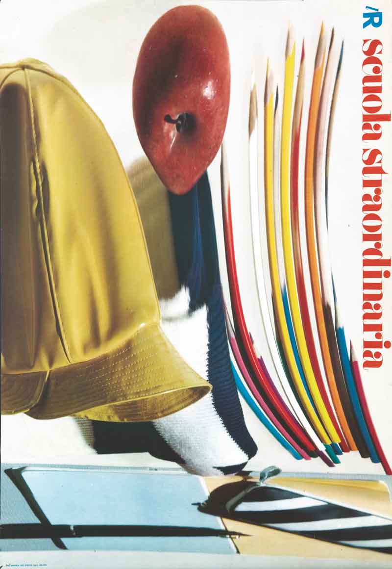
1 — Scuola straordinaria, 1966, manifesto
Fotografia Aldo Ballo
Progetto grafico Salvatore Gregorietti
Art director Adriana Botti Monti
Archivio Salvatore Gregorietti, Milano
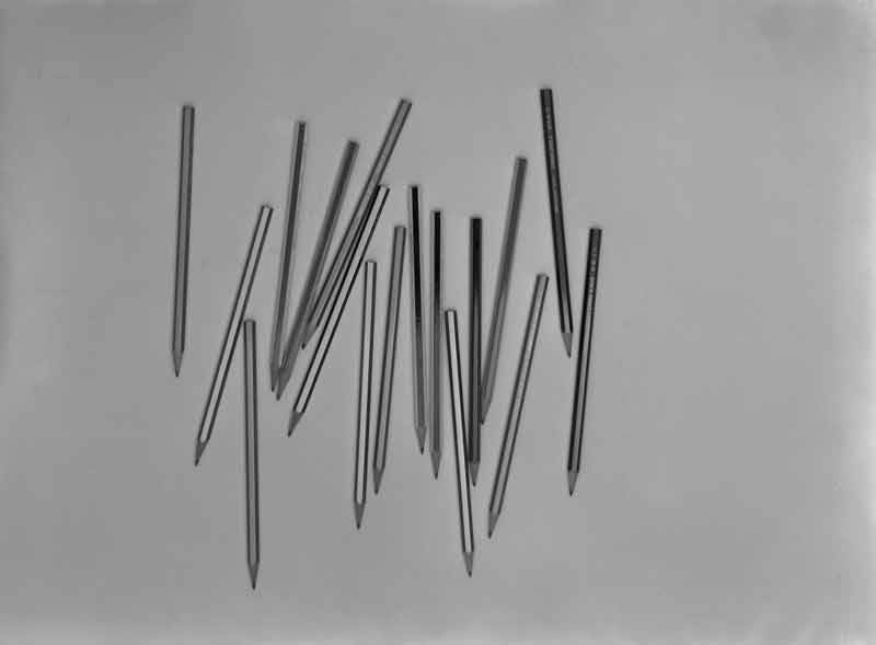
2 — Matite, 1958, still life preliminare
Fotografia Aldo Ballo
Archivio Ballo+Ballo, Milano
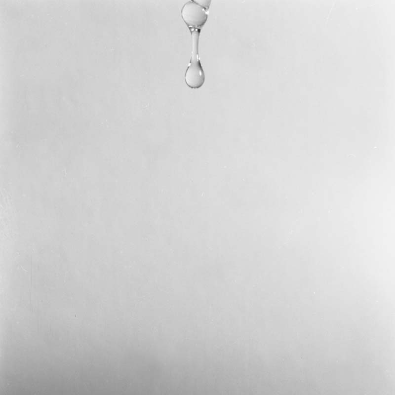
3 — Goccia, 1961, still life preliminare
Fotografia Aldo Ballo
Archivio Ballo+Ballo, Milano
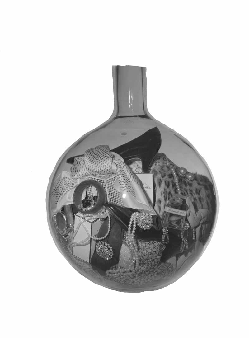
4 — Composizione oggetti in sfera di vetro, 1963
Fotografia Aldo Ballo
Archivio Ballo+Ballo
5 — Carta da imballo Natale lR, 1965, still life preliminare
Fotografia Aldo Ballo
Progetto grafico Max Vignelli
Archivio Ballo+Ballo, Milano
6 — Carta da imballo Natale lR, 1965
Progetto grafico Max Vignelli
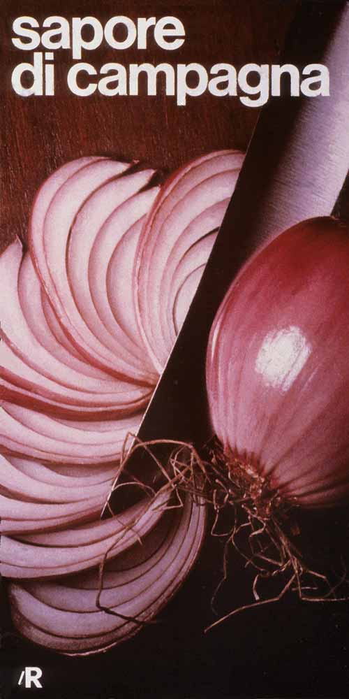
7 — Composizione per casa di campagna, 1965
Fotografia Aldo Ballo
Archivio Ballo+Ballo
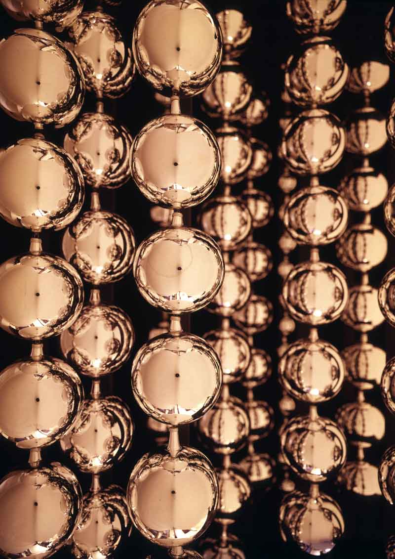
8 — Palle di Natale per manifesto lR, 1964, still life preliminare
Fotografia Aldo Ballo
Archivio Ballo+Ballo, Milano
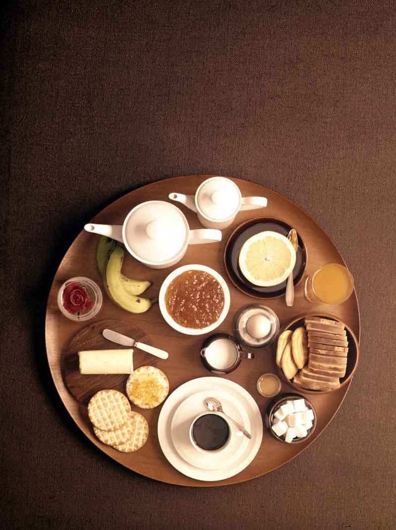
9 — Vassoio prima colazione per manifesto ‘Casa 65 lR’, 1965, still life preliminare
Fotografia Aldo Ballo
Archivio Ballo+Ballo, Milano
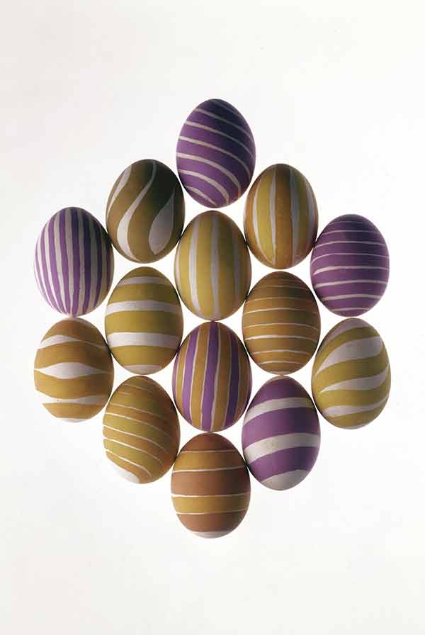
10 — Uova pasquali per manifesto ‘Buona Pasqua. lR’, 1965, still life preliminare
Fotografia Aldo Ballo
Archivio Ballo+Ballo, Milano
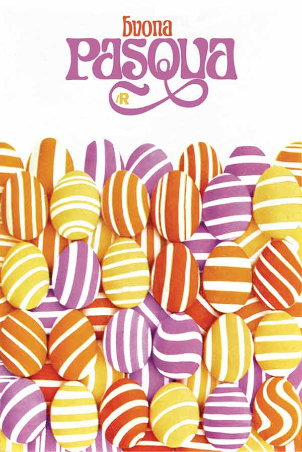
11 — Buona Pasqua. lR, 1965, manifesto
Progetto grafico Salvatore Gregorietti
Fotografia Aldo Ballo
Art director Adriana Botti
Archivio Salvatore Gregorietti, Milano
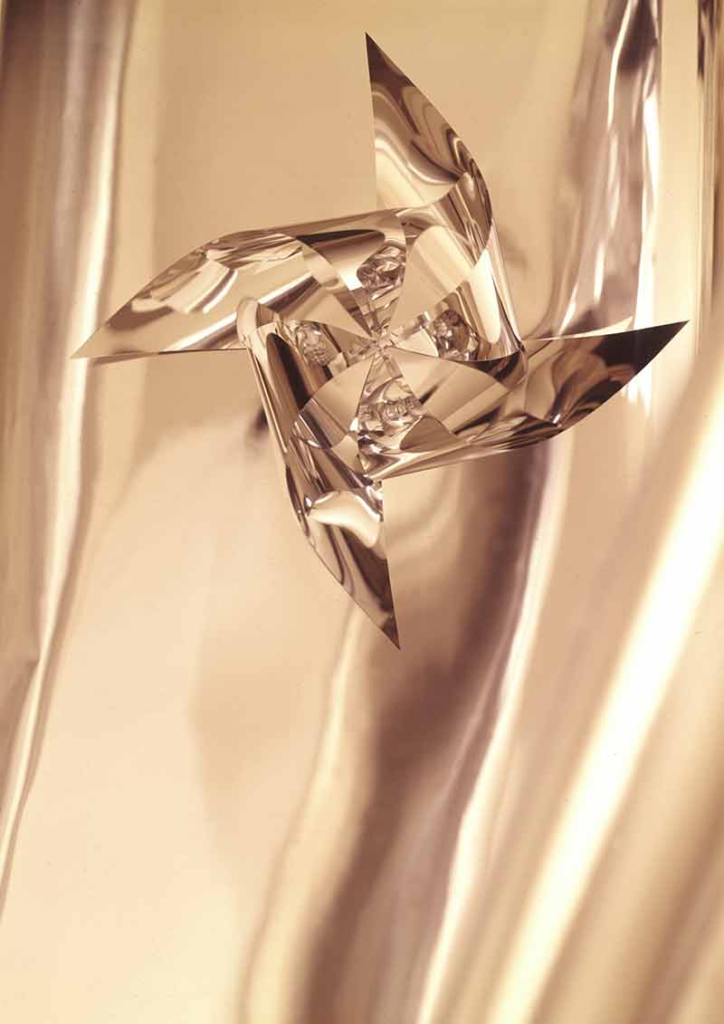
12 — Girandola per manifesto ‘Fiera del bianco 67 lR’, 1966, still life
Fotografia Aldo Ballo
Archivio Ballo+Ballo
13 — Composizione per manifesto ‘Nord. Casa Moda lR’, 1967, still life
Fotografia Aldo Ballo
Archivio Ballo+Ballo, Milano
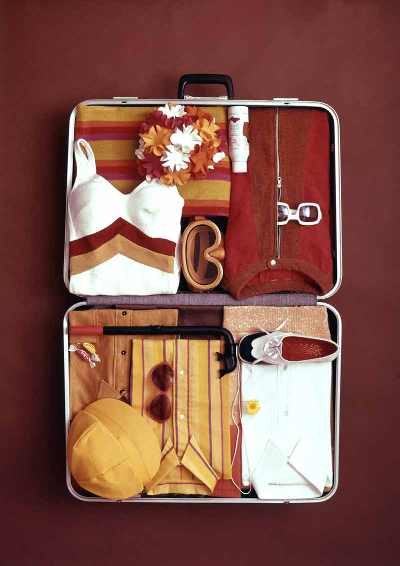
14 — Valigia per manifesto ‘Buone vacanze. Upim’,, 1968, still life
Fotografia Aldo Ballo
Archivio Ballo+Ballo, Milano
15 — Giappone. Oggetto in mostra, 1957, still life
Fotografia Aldo Ballo
Archivio Ballo+Ballo, Milano
Amneris Liesering Latis
Amneris Liesering Latis was born in Massagno in the canton of Ticino in 1924. After completing vocational school in Lugano, she started working as an assistant at the “Gazzetta Ticinese” newspaper, before becoming a journalist. In 1946 she married Mario Latis and moved to Milan where she worked with the Italian Swiss Radio broadcasting company.
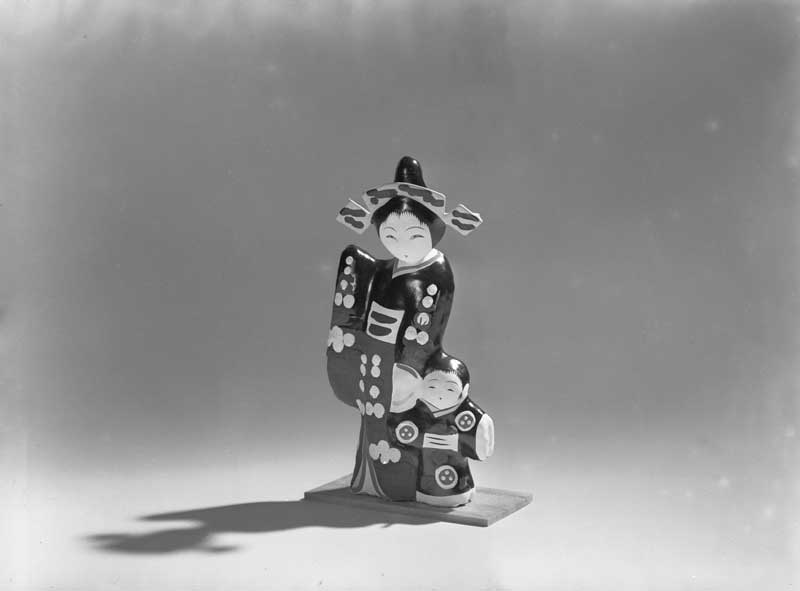
In 1954 she joined la Rinascente. In 1956 she was entrusted with the artistic direction of the first large exhibition (the lR Grand Exhibitions) dedicated to the clothes and craftsmanship of various countries around the world, events which characterized the commercial and cultural offerings of the department store in the following years up to 1964. The first trade exhibition dedicated to Japan was an enormous success, followed by those of Great Britain, India, Mexico and the United States.
Elected chief of the Advertising Department, as well as creating advertising campaigns with photographers and graphic designers who made history in the Italian communication field (Serge Libis, Giancarlo Iliprandi, Max Huber, Lora Lamm, Roberto Sambonet), she continued to assist the store buyers in planning commercial strategies for the various sections of the department store.
Amneris Latis’ working partnership with Rinascente ended in 1964, when she branched out solely as a freelancer. In 1968 she founded AL Promotions, a consultancy agency for institutions and companies. She worked with other large European retail stores and organized what may be classed as the first exhibition of Italian design in 1968 in New York, an initiative commissioned by the Hallmark Gallery.
Her significant partnership with Rinascente is recorded in a rich and varied collection of materials stored by the Latis family: advertising catalogues, posters, invitations, brochures, tickets and publicity materials, as well as photographs of display sets (interior and exterior) and shop windows, still life shots, private letters and documents regarding the research work and preliminary planning stages for large-scale projects at la Rinascente. This rich patrimony of material highlights the effort put into this intense working relationship which led to absolutely innovative integrated communication results that were both effective and creative.
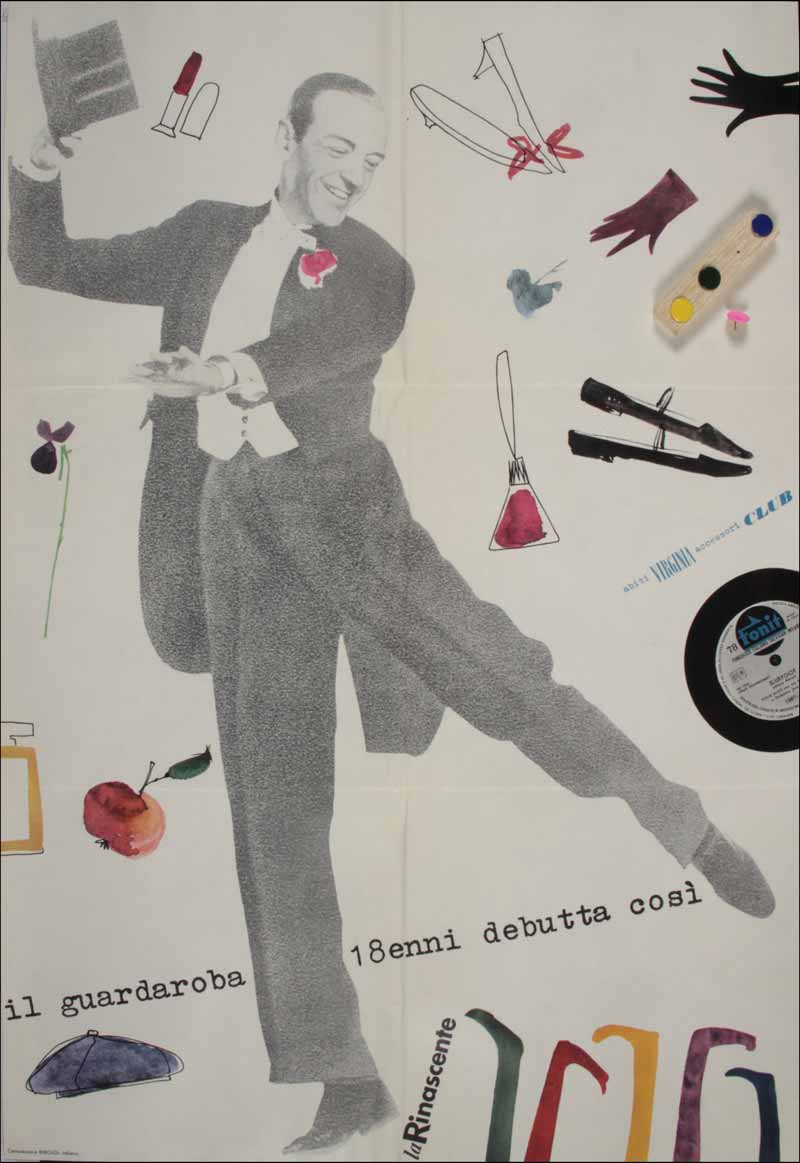
1 — Il guardaroba 18enni debutta così, Lettera di invito alla sfilata di abiti Virginia presso Palazzo Durini, con in allegato il poster dell'evento e puntine colorate per la sua affissione nella propria casa
Archivio Amneris Latis, Milano
2 — Primavera 1953, 1953, Busta con invito alla sfilata di primavera dei modelli Elle Erre, presso il Tea-room de la Rinascente in piazza del Duomo
Progetto grafico Max Huber
Archivio Amneris Latis, Milano
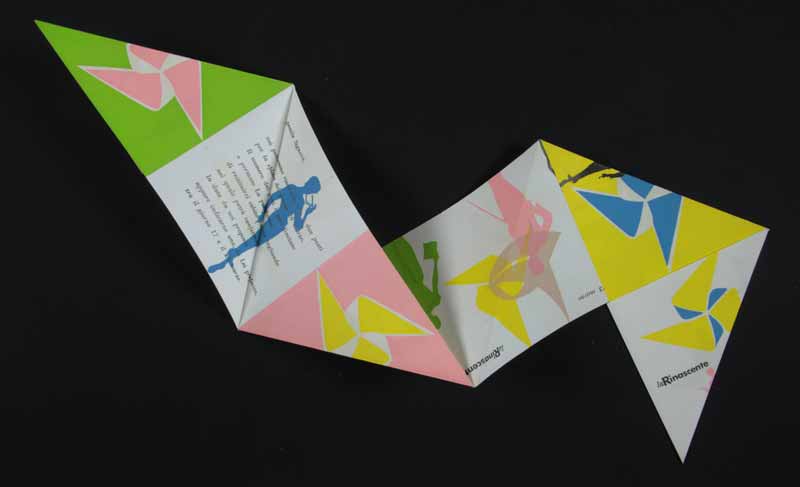
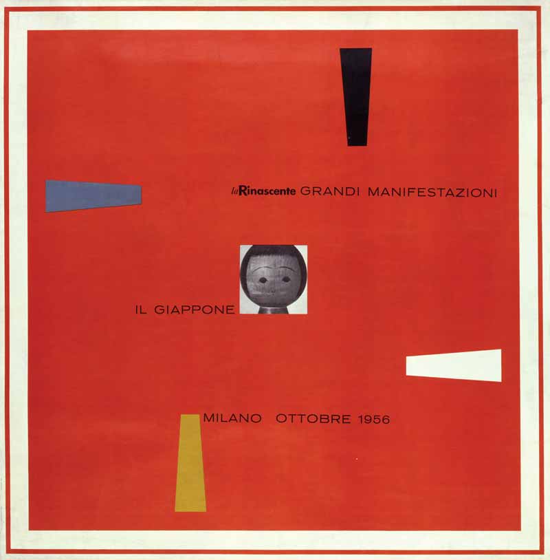
3 — La Rinascente Grandi Manifestazioni. Il Giappone, invito alla mostra
Progetto grafico Lora Lamm
Art director Amneris Latis
Archivio Amneris Latis, Milano
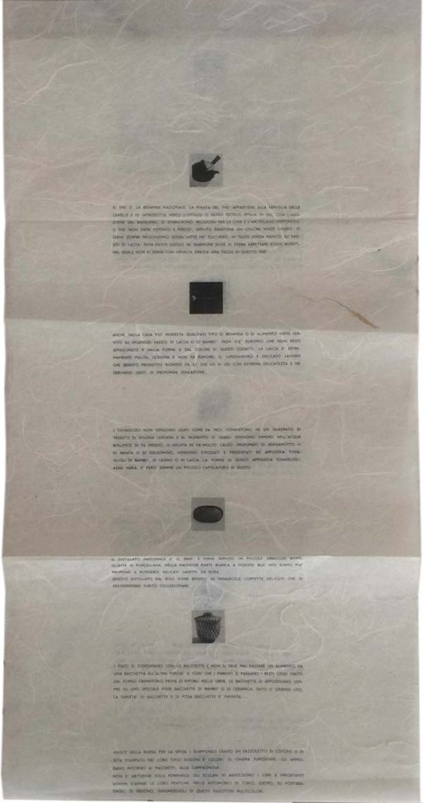
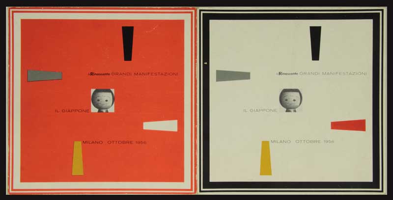
4 — La Rinascente Grandi Manifestazione. Il Giappone, 1956, materiale promozionale in carta di riso
Progetto grafico Lora Lamm
Fotografia Serge Libiszewski
Art director Amneris Latis
Archivio Amneris Latis, Milano
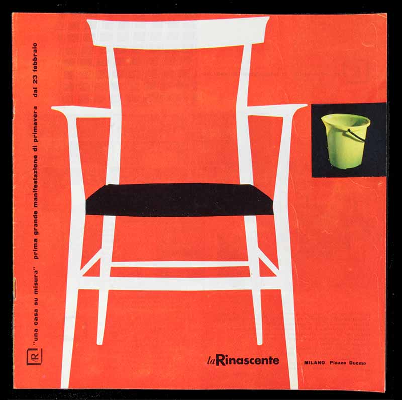
5 — lR, "Una casa su misura”. Prima grande manifestazione di primavera, 1957, Catalogo
Archivio Amneris Latis, Milano
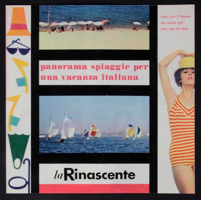
6 — Panorama spiaggie per una vacanza italiana, 1958, Catalogo
Archivio Amneris Latis, Milano
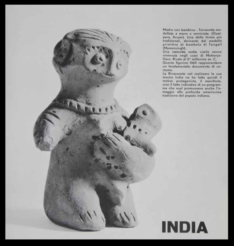
7 — India, La Rinascente Grandi Manifestazione, 1959, catalogo della Mostra
Progetto grafico Roberto Sambonet
Fotografia Serge Libiszewski
Art director Amneris Latis
Archivio Amneris Latis, Milano
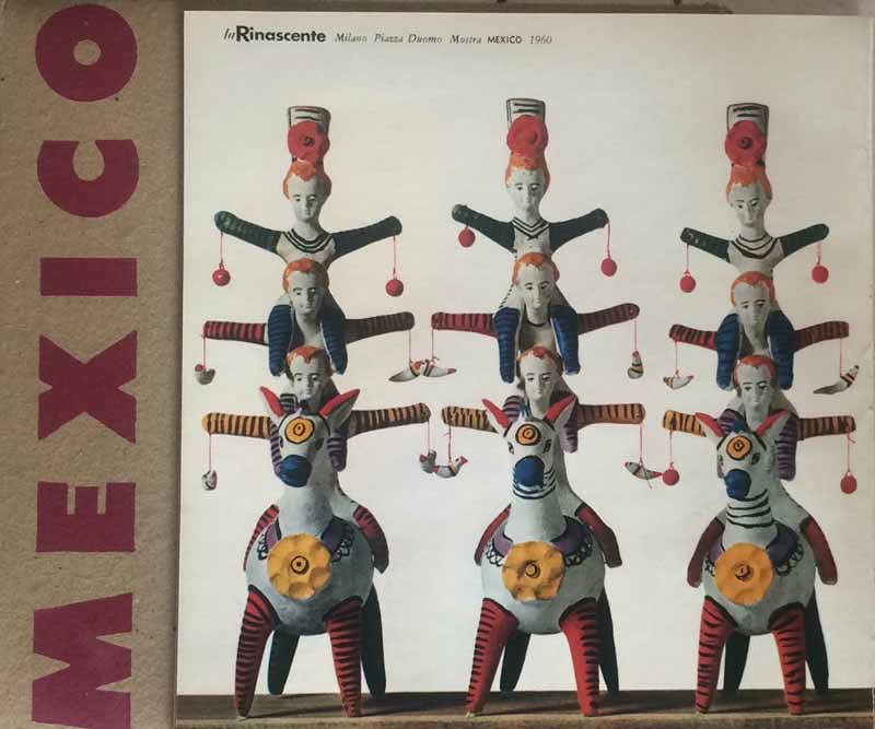
8 — La Rinascente Grandi Manifestazione. Mexico, 1960, catalogo della Mostra
Progetto grafico Lora Lamm
Fotografia Serge Libiszewski
Art director Amneris Latis
Archivio Amneris Latis, Milano
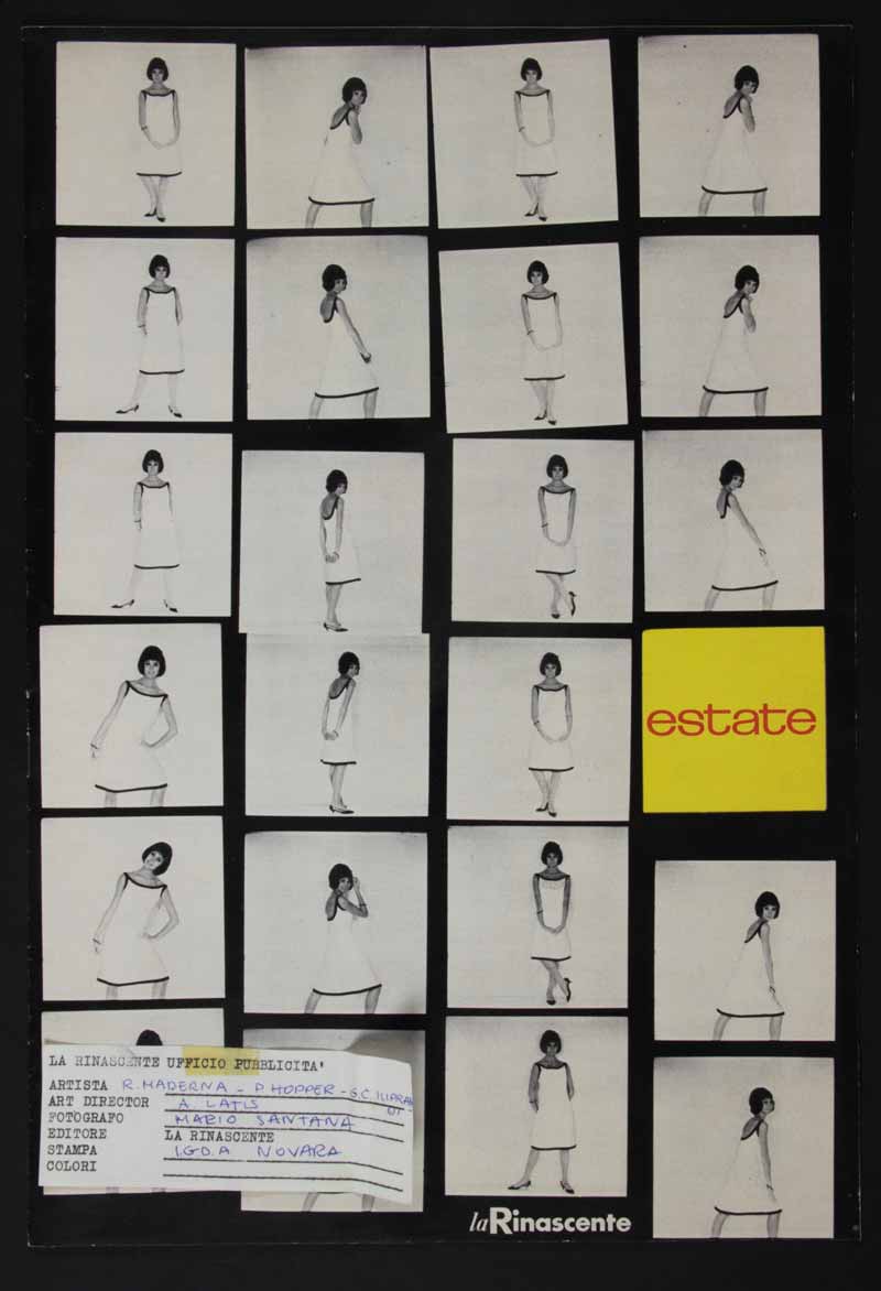
9 — Estate, 1962, Catalogo
Progetto grafico Roberto Maderna, Pegge Hopper, Giancarlo Iliprandi
Fotografia Mario Santana
Art director Amneris Latis
Archivio Amneris Latis, Milano
Max Huber e Aoi Huber Kono
Max Huber is one of the most important graphic designers of the twentieth century.
Born in 1919 in Baar, in the Swiss canton of Zug, his style took on board the teaching of great maestros of the Modern Movement such as Max Bill and László Moholy-Nagy. He combined their principles with numerous cultural stimuli which arrived in Milan, where he first arrived in 1940 to work in the prestigious graphic design studio of Antonio Boggeri, mixing with the likes of Bruno Munari, Luigi Veronesi and Albe Steiner.
Again in Milan at the end of the war, he was one of the first to apply avant-garde aesthetics to commercial communication.
Some of his works remain impressed in the collective mind of generations of Italians, not least the lR logo of Rinascente which will forever conjure up the department store for the general public. In 1954 he won the Golden Compass Award with his circle-adorned printed plastic, commissioned by the Ponte Lambro Plant.
In 1999 the Max Huber Archive was set up in accordance with the wishes of his wife Aoi Huber Kono, in order to organize and catalogue the designer’s papers and work materials.
The archive, housed in Novazzano in the Swiss canton of Ticino, includes sketches, studies and projects related to Max Huber’s work in graphic design, publishing and display sets, along with drawings, paintings and photographs. These include an original test run print in tempera for an lR poster created by Lora Lamm and with a handwritten dedication on the back to Aoi Huber Kono.
1 — lR la Rinascente, 1950, carta da imballo
Progetto grafico Max Huber
Archivio Max e Aoi Huber, Chiasso
2 — Strenne. La Rinascente, 1951, Listino
Progetto grafico Max Huber
Archivio Amneris Latis, Milano
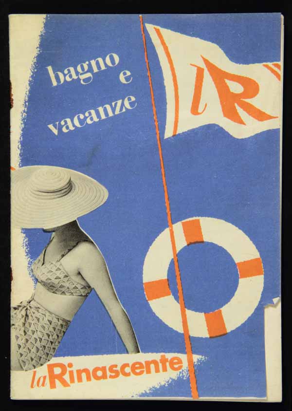
3 — Bagno e vacanze. lR, 1951, Listino
Progetto grafico Max Huber
Illustrazioni Grignani
Collezione Michele Rapisarda, Milano
4 — La Rinascente: Ski, 1951, brochure
Progetto grafico Max Huber
Archivio Amneris Latis, Milano
5 — Prove grafiche per materiale pubblicitario Casalinghi arredamento, [1950-1955], cartoncini a stampa
Progetto grafico Max Huber
Archivio Amneris Latis, Milano
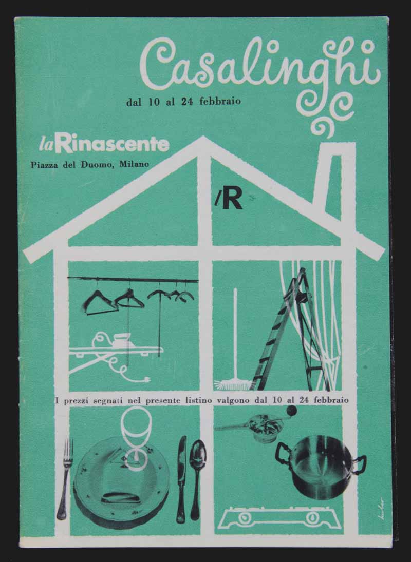
6 — Casalinghi, 1951, listino
Progetto grafico Max Huber
Archivio Amneris Latis, Milano
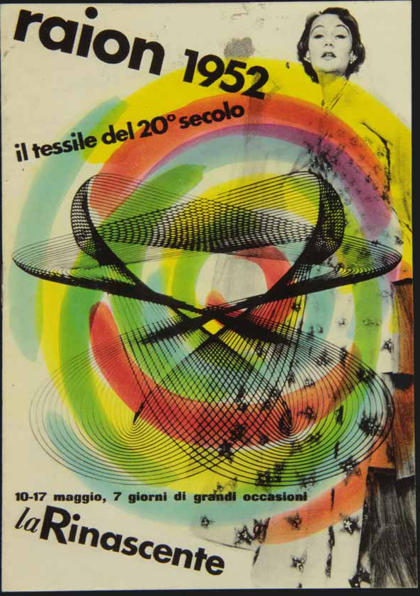
7 — Raion 1952, il tessile del 20° secolo, 1952, brochure
Progetto grafico Max Huber
Collezione Michele Rapisarda, Milano
8 — Prova grafica per materiale pubblicitario Raion, [1951-1952], cartoncino a stampa
Progetto grafico Max Huber
Archivio Amneris Latis, Milano
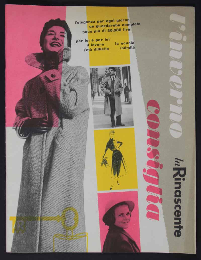
9 — L’inverno consiglia, 1952, catalogo
Progetto grafico Max Huber
Archivio Amneris Latis, Milano
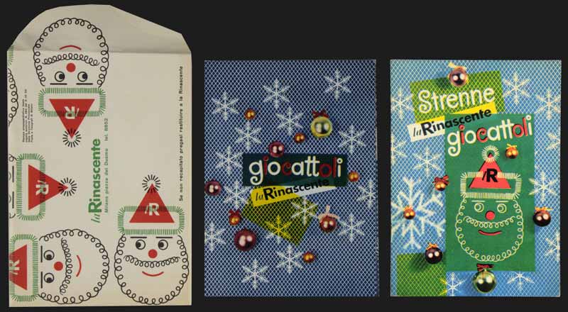
10 — Giocattoli la Rinascente, 1952, busta e cataloghi
Progetto grafico Max Huber
Collezione Michele Rapisarda, Milano
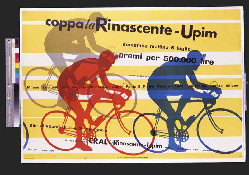
11 — Coppa la Rinascente-Upim, 1952, manifesto
Progetto grafico Max Huber
Archivio Max e Aoi Huber, Chiasso
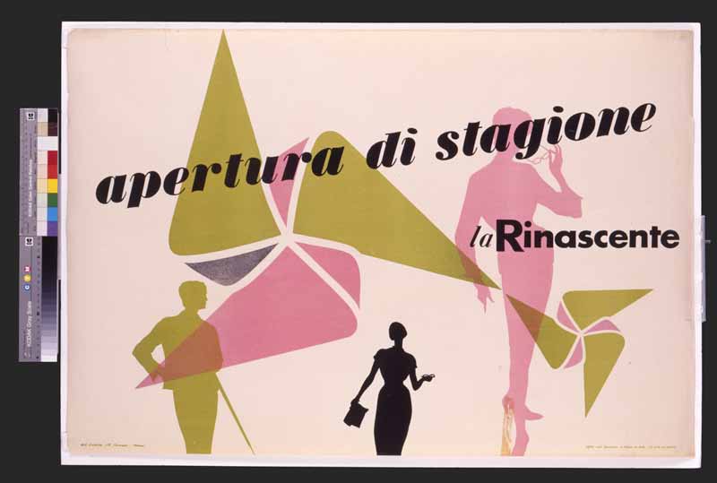
12 — Apertura di stagione. La Rinascente, 1953, manifesto
Progetto grafico Max Huber
Archivio Max e Aoi Huber, Chiasso
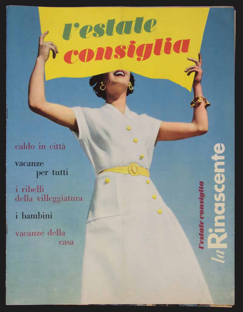
13 — L’estate consiglia, 1953, catalogo
Progetto grafico Max Huber
Archivio Amneris Latis, Milano
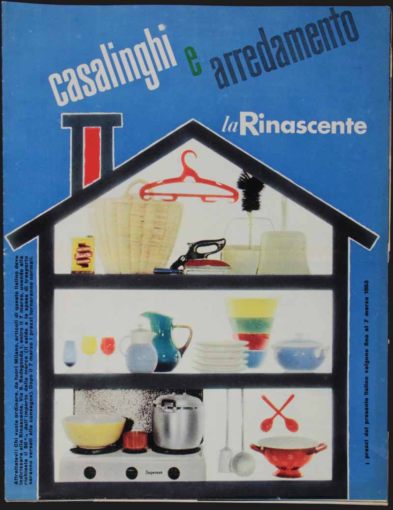
14 — Casalinghi e arredamento la Rinascente, 1953, listino
Progetto grafico Max Huber
Archivio Amneris Latis, Milano
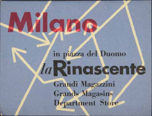
15 — Milano. La Rinascente Grandi Magazzini in piazza del Duomo, 1953, guida pieghevole della città di Milano, realizzata e offerta da la Rinascente
Progetto grafico Max Huber
Archivio Amneris Latis, Milano
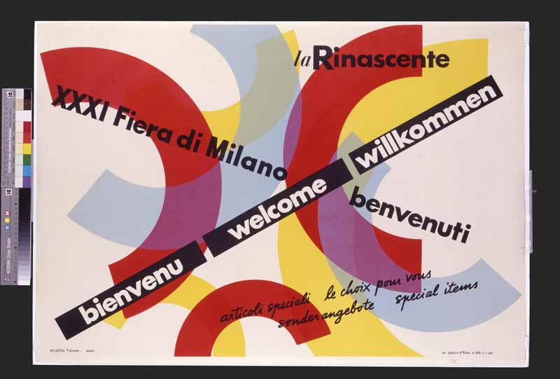
16 — XXXI Fiera di Milano, benvenuti. La Rinascente, 1953, Manifesto
Progetto grafico Max Huber
Archivio Max e Aoi Huber, Chiasso
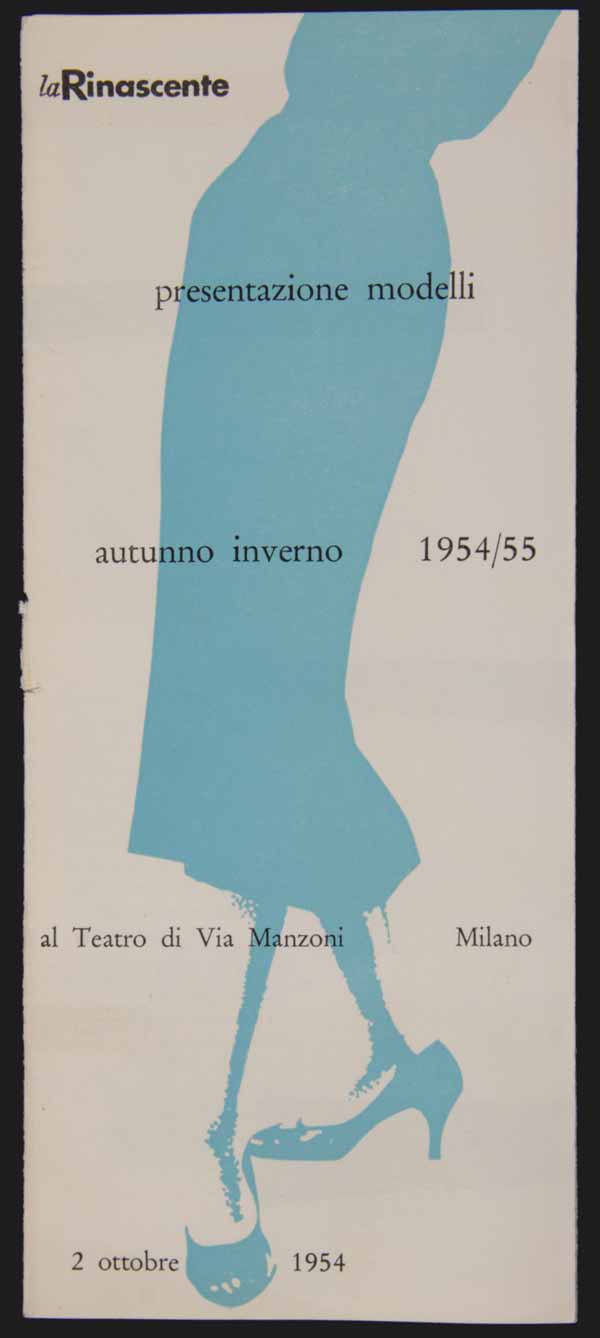
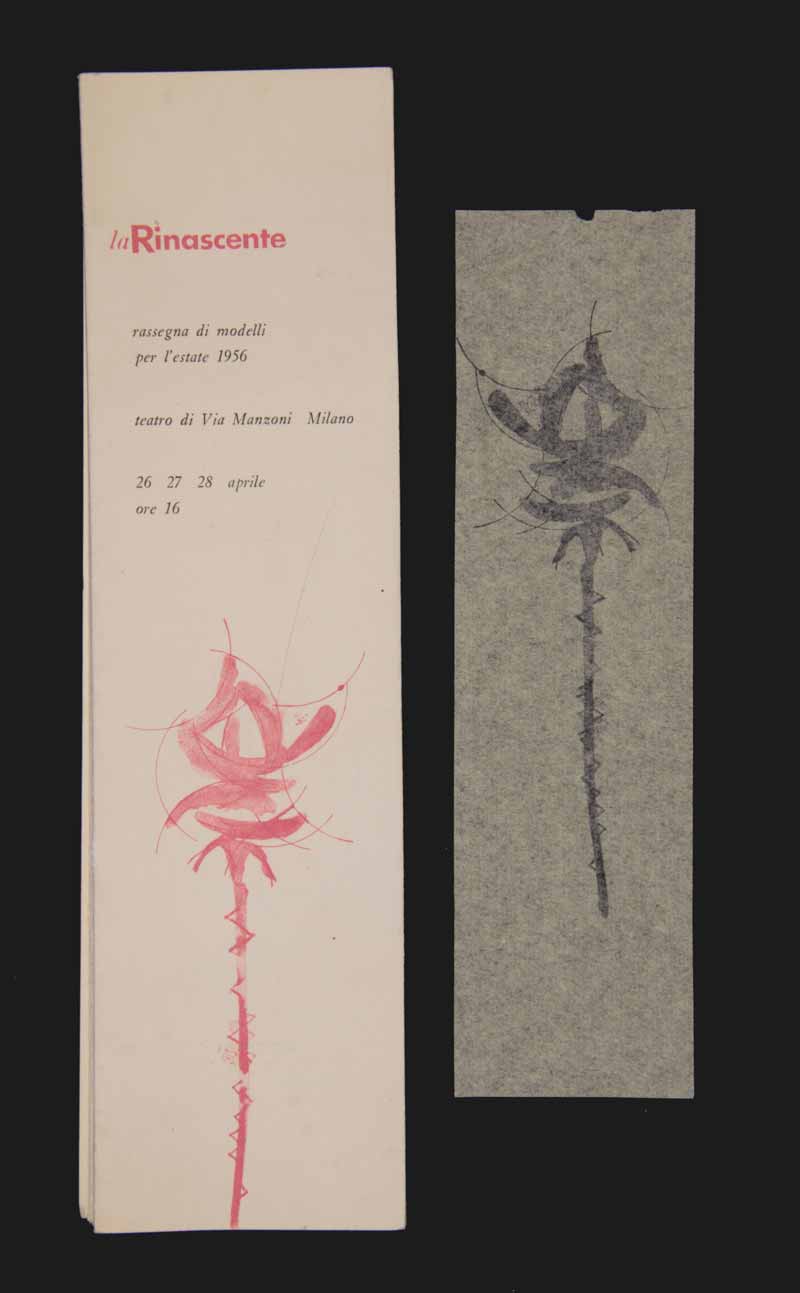
17 — Presentazione dei modelli autunno inverno Elle Erre in sfilata presso il Teatro Manzoni di Milano, 1954, pieghevole
Progetto grafico Max Huber
Archivio Amneris Latis, Milano
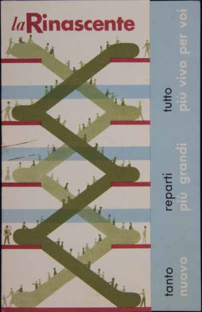
18 — La Rinascente. Tutto nuovo, reparti più grandi, tutto più vivo per voi, 1954. calendario vendite speciali
Progetto grafico Max Huber
Archivio Amneris Latis, Milano
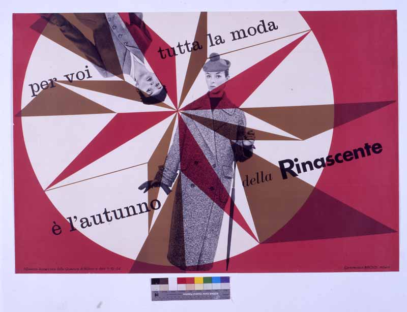
19 — Per voi tutta la moda, è l’autunno della Rinascente, 1954, Manifesto
Progetto grafico Max Huber
Archivio Amneris Latis, Milano
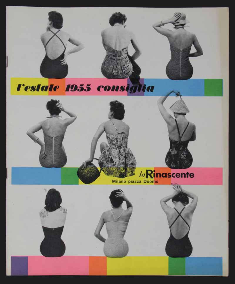
20 — L’estate 1955 consiglia, 1955, catalogo
Progetto grafico Max Huber
Fotografia Gerard Haertter
Art director Amneris Latis
Archivio Amneris Latis, Milano
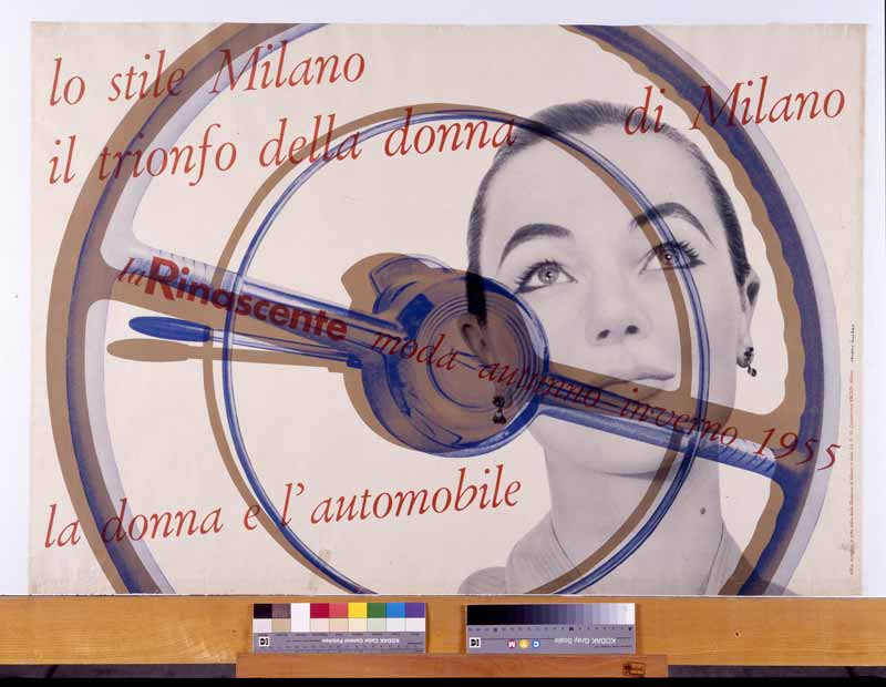
21 — La donna e l’automobile. Lo stile Milano, il trionfo della donna di Milano.La Rinascente moda autunno inverno, 1955, manifesto
Progetto grafico Max Huber
Fotografia Gerard Haertter
Art director Amneris Latis
Archivio Max e Aoi Huber, Chiasso
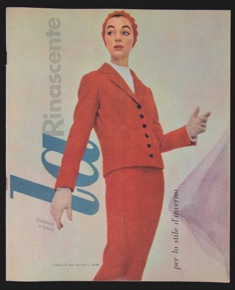
22 — Per lo stile d’inverno, 1955, catalogo
Progetto grafico Max Huber
Fotografia Gerard Haertter
Art director Amneris Latis
Archivio Amneris Latis, Milano
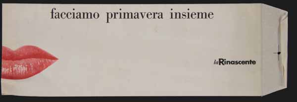
23 — Facciamo primavera insieme, 1955 busta in carta per spedizione catalogo
Progetto grafico Max Huber
Archivio Amneris Latis, Milano
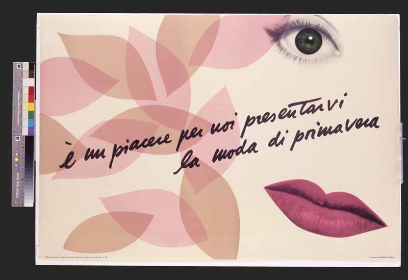
24 — È un piacere per noi presentarvi la moda di primavera, 1955, manifesto
Progetto grafico Max Huber
Archivio Max e Aoi Huber, Chiasso
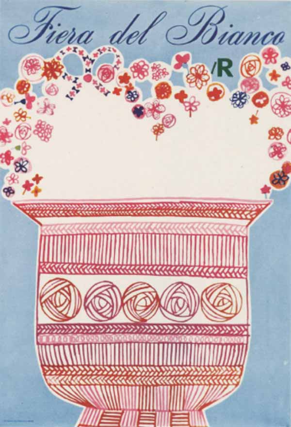
25 — Fiera del Bianco lR, 1964, manifesto
Progetto grafico Aoi e Max Huber
Archivio Max e Aoi Huber, Chiasso
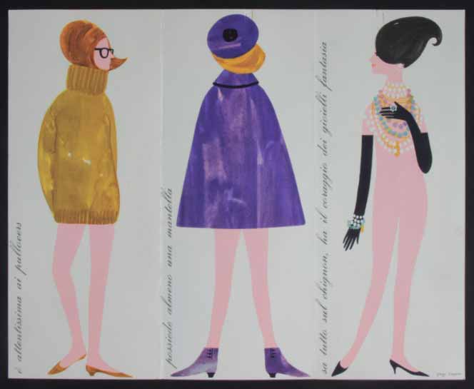
Pegge Hopper
«From 1961 to 1963, I lived in Milan, Italy, and I worked for la Rinascente. Europe was still trying to get back on its feet after the Second World War and the continent was in love with all things American. I had only recently completed art school and I, on the contrary, was in love with all things European.
The posters that I created for la Rinascente were exhibited in the lR shops and offices all over Italy. La Rinascente has a long and important history in the use of posters for its institutional advertising. The concept of promoting a season or holiday instead of simple merchandise was unique. I was incredibly lucky to have the chance and freedom to use my graphic and artistic training to create these images. It was the job of a lifetime».
Pegge Hopper
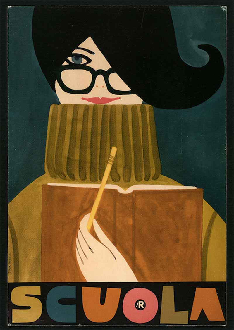
1 — Scuola. lR, [1962-63], poster
Progetto grafico Pegge Hopper
Archivio la Rinascente, Milano
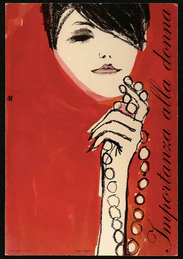
2 — Importanza alla donna. lR, [1962-63], poster,
Progetto grafico Pegge Hopper
Archivio la Rinascente, Milano
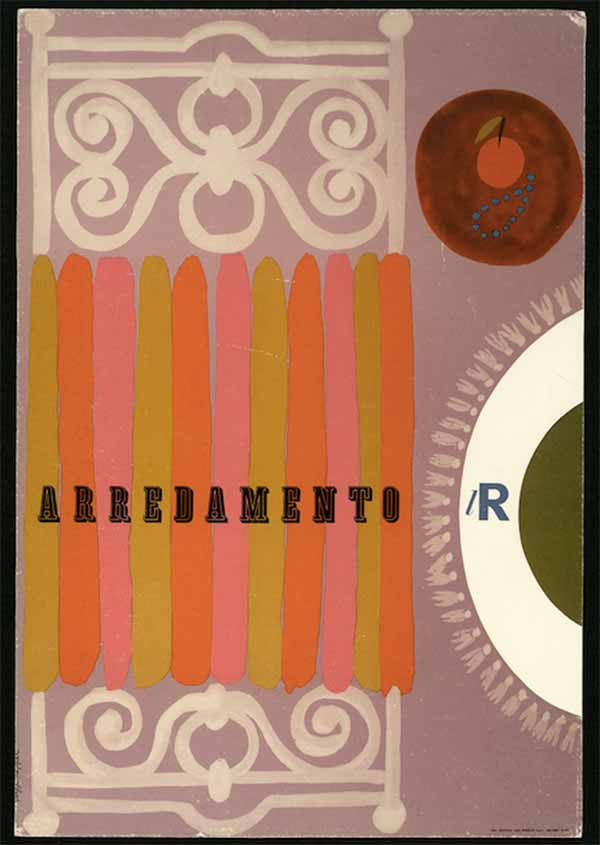
3 — Arredamento. lR, 1962, poster
Progetto grafico Pegge Hopper
Archivio la Rinascente, Milano
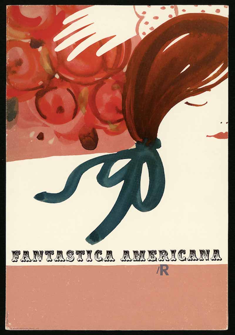
4 — Fantastica americana. lR, 1963, poster
Progetto grafico Pegge Hopper
Archivio la Rinascente, Milano
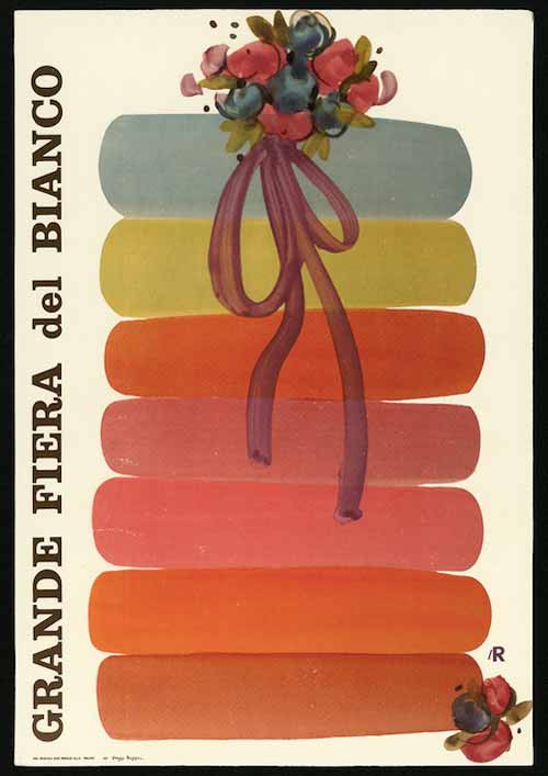
5 — Grande Fiera del Bianco. lR, 1962, poster
Progetto grafico Pegge Hopper
Archivio la Rinascente, Milano
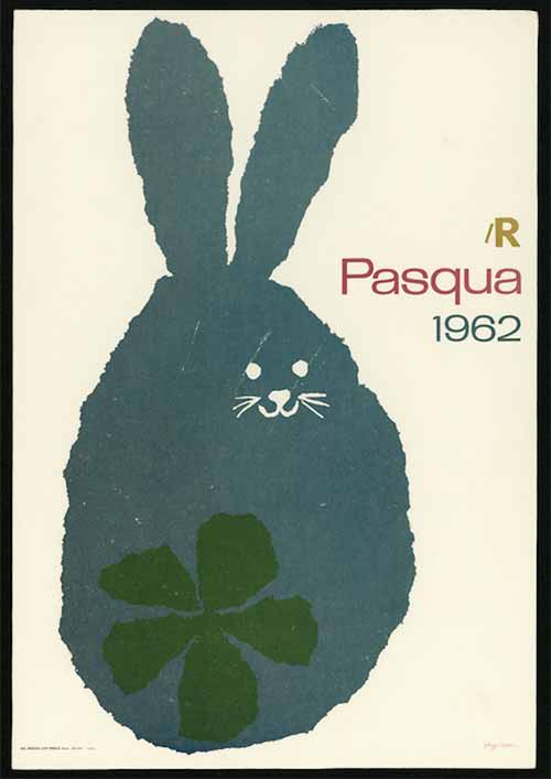
6 — Pasqua 1962. lR, 1962, poster
Progetto grafico Pegge Hopper
Archivio la Rinascente, Milano
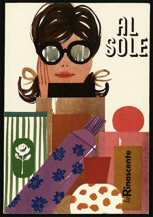
7 — Al sole. La Rinascente, [1962-63], poster
Progetto grafico Pegge Hopper
Archivio la Rinascente, Milano
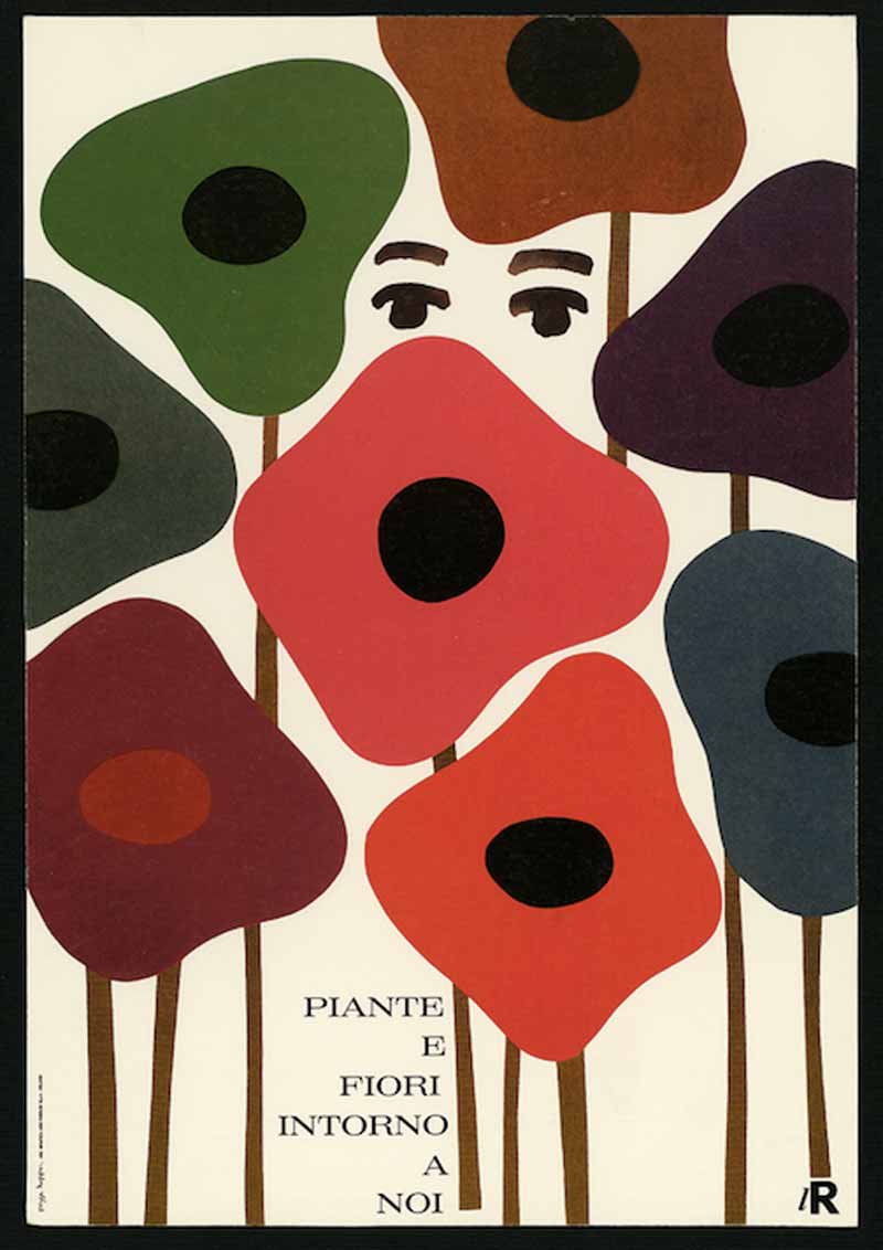
8 — Piante e fiori intorno a noi. lR, [1962-63], poster
Progetto grafico Pegge Hopper
Archivio la Rinascente, Milano
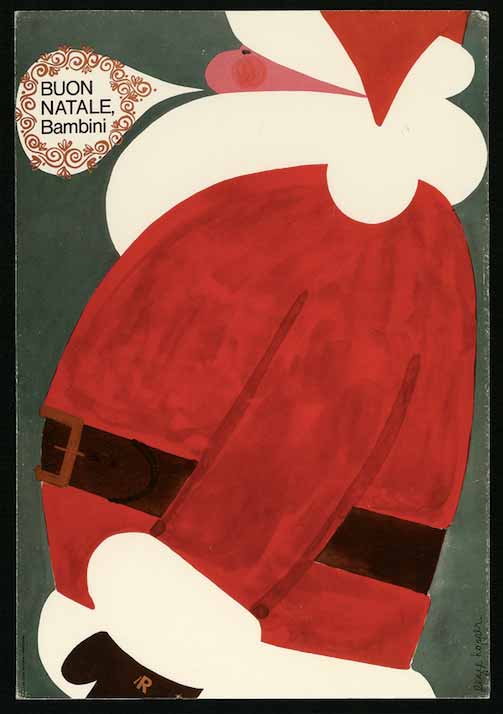
9 — Buon Natale bambini. lR, [1962-63], poster
Progetto grafico Pegge Hopper
Archivio la Rinascente, Milano
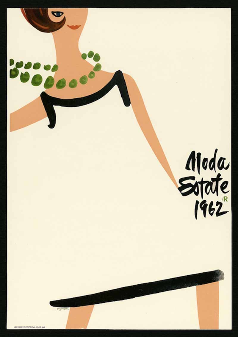
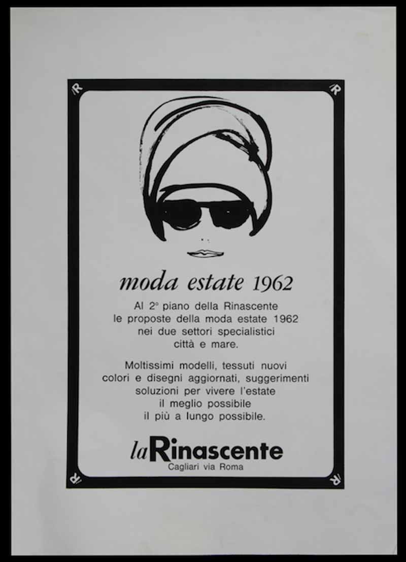
10 — Moda estate 1962. lR, 1962, poster
Progetto grafico Pegge Hopper
Archivio la Rinascente, Milano
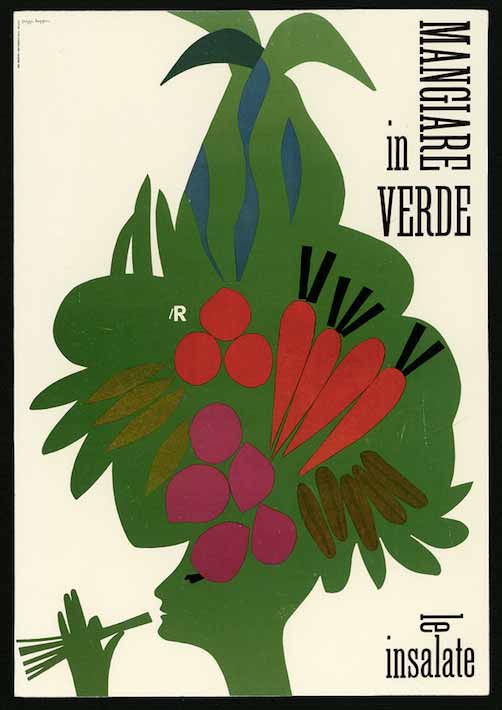
11 — Mangiare in verde, le insalate. lR, 1962, poster
Progetto grafico Pegge Hopper
Archivio la Rinascente, Milano
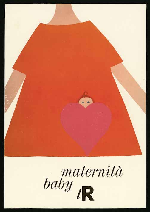
12 — Maternità baby. lR, 1962, poster
Progetto grafico Pegge Hopper
Archivio la Rinascente, Milano
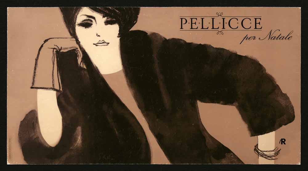
13 — Pellicce per Natale. lR, [1962-63], poster
Progetto grafico Pegge Hopper
Archivio la Rinascente, Milano
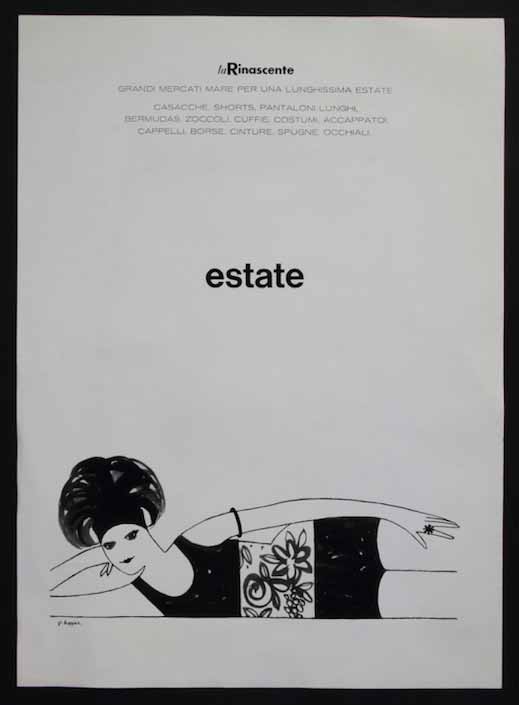
14 — Estate 1962, 1962, poster
Progetto grafico Pegge Hopper
Archivio la Rinascente, Milano
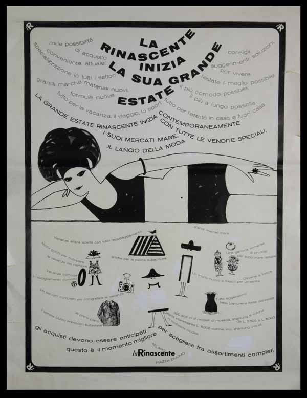
15 — La Rinascente inizia la sua grande estate, 1962ca., Poster
Progetto grafico Pegge e Bruce Hopper
Art director Amneris Latis
Archivio Amneris Latis, Milano
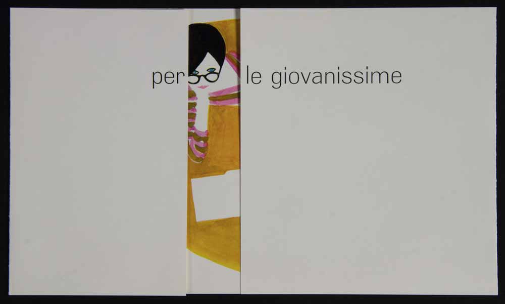
16 — Per le giovanissime, [1962-63], invito alla sfilata spettacolo presso il Teatro Manzoni, Milano
Progetto grafico Pegge Hopper
Archivio Amneris Latis, Milano
17 — Una donna importante ama il rosso, 1962, avviso di apertura di stagione per la moda autunno-inverno
Progetto grafico Pegge Hopper
Archivio Amneris Latis, Milano
18 — Moda estate 1962, poster
Progetto grafico Pegge Hopper
Archivio Amneris Latis, Milano
Ettore Mariani
Ettore Mariani was born in Milan in 1949. After gaining his diploma in advertising graphic design, he started working with the Rinascente-Upim group in 1968, in the field of image development. Here he worked with art director Robert Berrevoets on the creation of graphic work and packaging for Upim. The meeting with Berrevoets proved fundamental in his graphic and technical development.
From 1970 onward, he collaborated with the art director Adriana Botti Monti in Rinascente’s Advertising Department. This environment of high creative professionalism – as Mariani himself asserted - contributed to his fostering of a greater aesthetic and cultural understanding. In 1972 he entered the world of advertising when he worked on behalf of Rinascente in the Intermarco Farner agency, learning about advertising issues and the logistics of communication and marketing. From 1973, he worked in the Display Department of Rinascente, under the leadership of architect Gian Carlo Ortelli, responsible for the graphic design of window displays, sets and interior communication messages within the retail stores.
From 1974 to 1983 he filled the role of art director for the coordination of exhibitions and promotions in the stores, developing his natural talent for graphic design and photographic images, making a solid contribution to the creation of concepts and images linked to market demand – a 360 degree task of coordination involving not only the development of graphic materials but also the planning of creative projects for display fittings and promotional events.
From 1984 to 2006, he was in charge of coordinated images for the Upim retail stores and packaging, with the creation of Upim private trademarks for a number of product lines which were coordinated with the communication and display set-ups.
Ettore Mariani’s work has appeared in various national and international magazines as well as industry annuals. He became an award-winning member of the Inspiration Academy in New York in 1980 for his work for the lR retail stores, and later received the Puntina Aiap Award in 1985, in the exhibition sector.
1 — Moda donna uomo. lR, 1975-1976, Locandina per allestimento interno
Progetto grafico Ettore Mariani
Fotografia Adver photo
Archivio Ettore Mariani, Milano
2 — Moda donna uomo. lR, 1975-1976, Locandina per allestimento interno
Progetto grafico Ettore Mariani
Fotografia Adver photo
Archivio Ettore Mariani, Milano
3 — Moda donna uomo. lR, 1975-1976, Locandina per allestimento interno
Progetto grafico Ettore Mariani
Fotografia Maurizio Vedovello
Archivio Ettore Mariani, Milano
4 — Moda donna uomo. lR, 1975-1976, Locandina per allestimento interno
Progetto grafico Ettore Mariani
Fotografia Maurizio Vedovello
Archivio Ettore Mariani, Milano
5 — Moda uomo. lR, 1975, Locandina per allestimento interno
Progetto grafico Ettore Mariani
Fotografia Adver photo
Archivio Ettore Mariani, Milano
6 — Moda uomo. lR, 1975, Locandina per allestimento interno
Progetto grafico Ettore Mariani
Fotografia Adver photo
Archivio Ettore Mariani, Milano
7 — Moda uomo. lR, 1975, Locandina per allestimento interno
Progetto grafico Ettore Mariani
Fotografia Adver photo
Archivio Ettore Mariani, Milano
8 — Moda uomo. lR, 1975, Locandina per allestimento interno
Progetto grafico Ettore Mariani
Fotografia Adver photo
Archivio Ettore Mariani, Milano
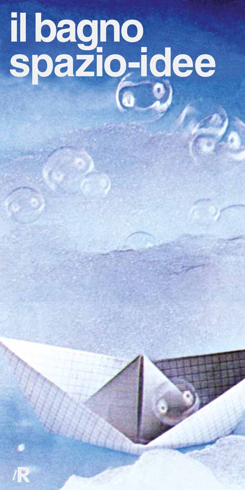
9 — Il bagno spazio-idee. lR, 1979, Locandina
Progetto grafico Ettore Mariani
Fotografia Tino Crippa
Archivio Ettore Mariani, Milano
10 — Reparti vari, 1977-1979, Locandina
Progetto grafico e fotografia Ettore Mariani
Archivio Ettore Mariani, Milano
11 — Reparti vari, 1977-1979, Locandina
Progetto grafico e fotografia Ettore Mariani
Archivio Ettore Mariani, Milano
12 — Reparti vari, 1977-1979, Locandina
Progetto grafico e fotografia Ettore Mariani
Archivio Ettore Mariani, Milano
13 — Reparti vari, 1977-1979, Locandina
Progetto grafico e fotografia Ettore Mariani
Archivio Ettore Mariani, Milano
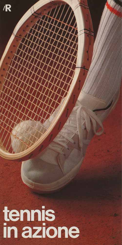
14 — Tennis in azione. lR, 1978, Locandina
Progetto grafico Ettore Mariani
Fotografia Gianni Ghezzi
Archivio Ettore Mariani, Milano
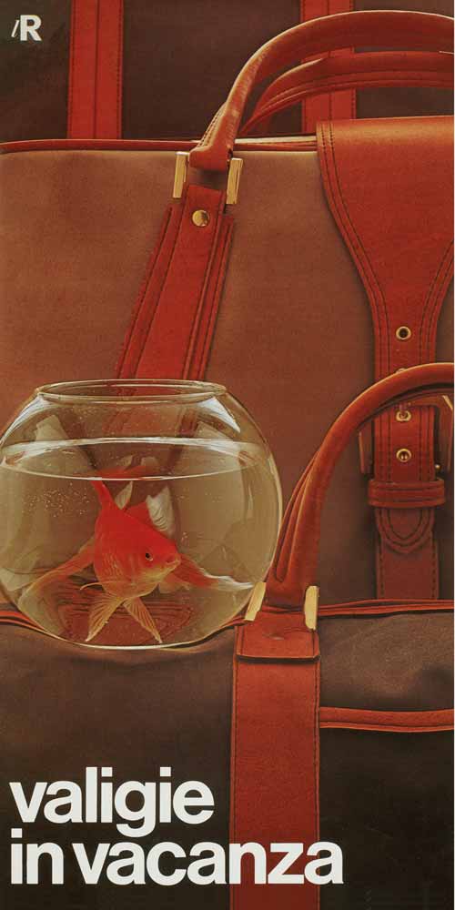
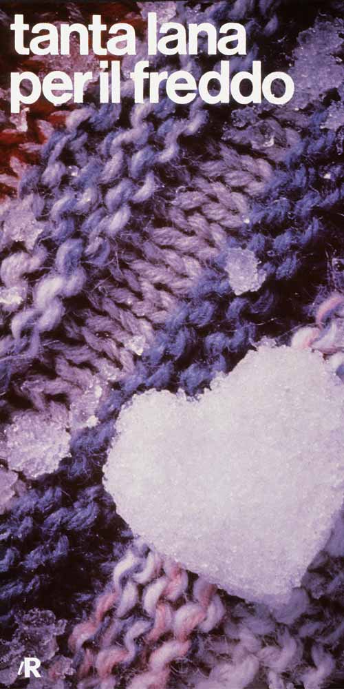
15 — Valigie in vacanza. lR, 1978, Locandina
Progetto grafico Ettore Mariani
Fotografia Adriano Brasaferri
Archivio Ettore Mariani, Milano
16 — Moda bambino lR, 1976, Locandina
Progetto grafico Ettore Mariani
Archivio Ettore Mariani, Milano
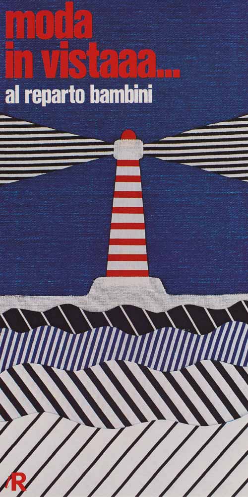
17 — Moda bambino lR, 1976, Locandina
Progetto grafico Ettore Mariani
Archivio Ettore Mariani, Milano
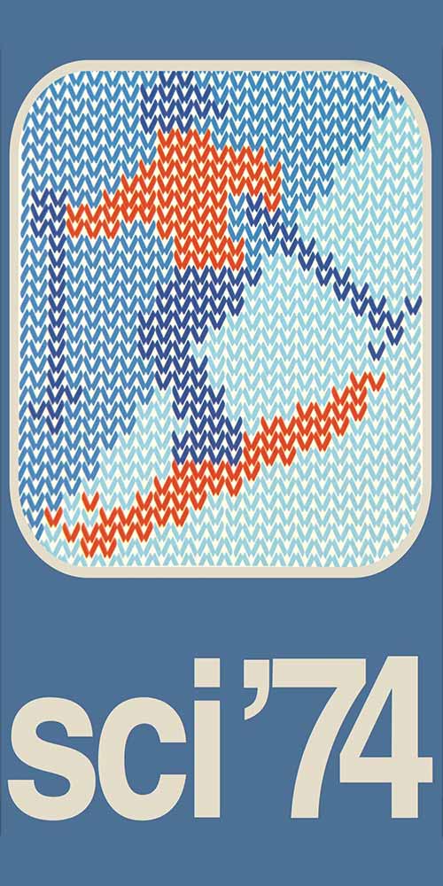
18 — Sci '74, 1974, simbologia per locandina
Progetto grafico Ettore Mariani
Archivio Ettore Mariani, Milano
Salvatore Gregorietti
Salvatore Gregorietti was born in Palermo in 1941, and is considered to be one of the leading lights in Italian graphic design.
In 1959, following his schooling at the Artistic High School of Brera in Milan, he moved to Zurich and attended the Kunstgewerbeschule, a vocational school of arts and crafts. In 1961, he returned to Italy where he began to collaborate with the Milan studio belonging to Massimo Vignelli.
In 1965, he became a partner of Unimark Internazional, a studio of graphic design and communication, alongside Massimo Vignelli, Bob Noorda, Franco Mirenzi and Mario Boeri, dealing mainly with graphic design issues regarding coordination of images, publishing, packaging, institutional and commercial communication.
In 1964 he began consulting work for the Advertising and Communication Department of Rinascente; he worked with Pier Giorgio Brovelli (commercial manager), Adriana Botti Monti (art director) and with the photographers Aldo Ballo, Serge Libis, Ugo Mulas and Oliviero Toscani. Gregorietti and Adriana Botti established a strong working relationship: together they managed to merge the culture of the image with architectural planning, thus arriving at the creation and production of rather special communication tools (posters, catalogues and notices for newspapers), where photography was key while the graphic design of the texts with its precision and proportion tended to blend in.
His work received important accolades, winning the Art Directors Club award for three consecutive years. He collaborated with important businesses and institutions: Pirelli, Agip, Sanpaolo, Confindustria, the Biennale of Venice, Fondazione Feltrinelli, Benetton, Prenatal; in publishing: Sonzogno, Bompiani, Sylvestre Bonnard, Feltrinelli; for periodicals: “Linus”, “Capital”, “Thema”, “Casa Vogue” and “Ottagono”, a magazine of design and architecture which won him the Golden Compass in 1979. He taught at the Academy of Fine Arts in Carrara and, in 1988,co-authored with Emilia Vassale La forma della scrittura (The shape of writing), republished by Sylvestre Bonnard in 2007.
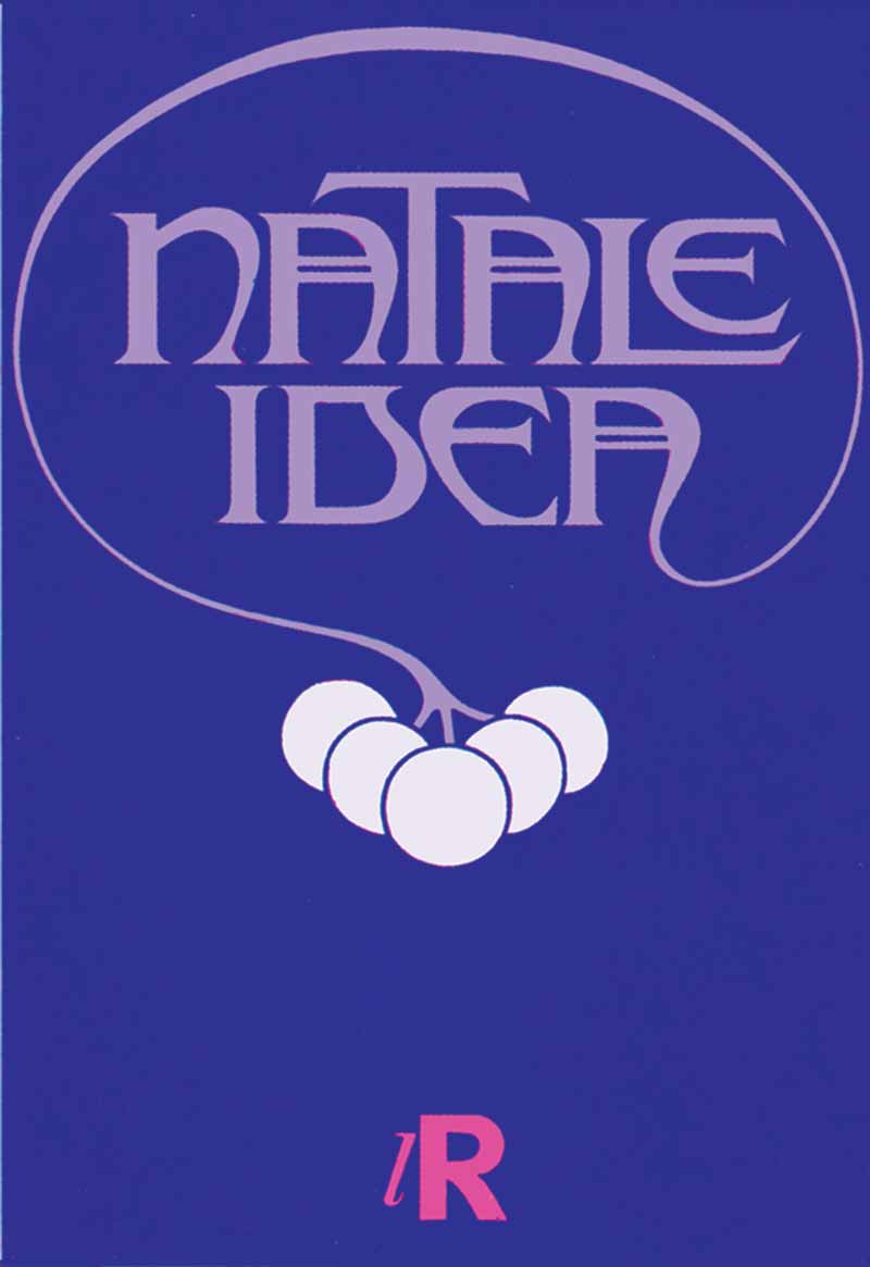
1 — Natale Idea. lR, 1965, manifesto
Progetto grafico Salvatore Gregorietti
Archivio Salvatore Gregorietti, Milano
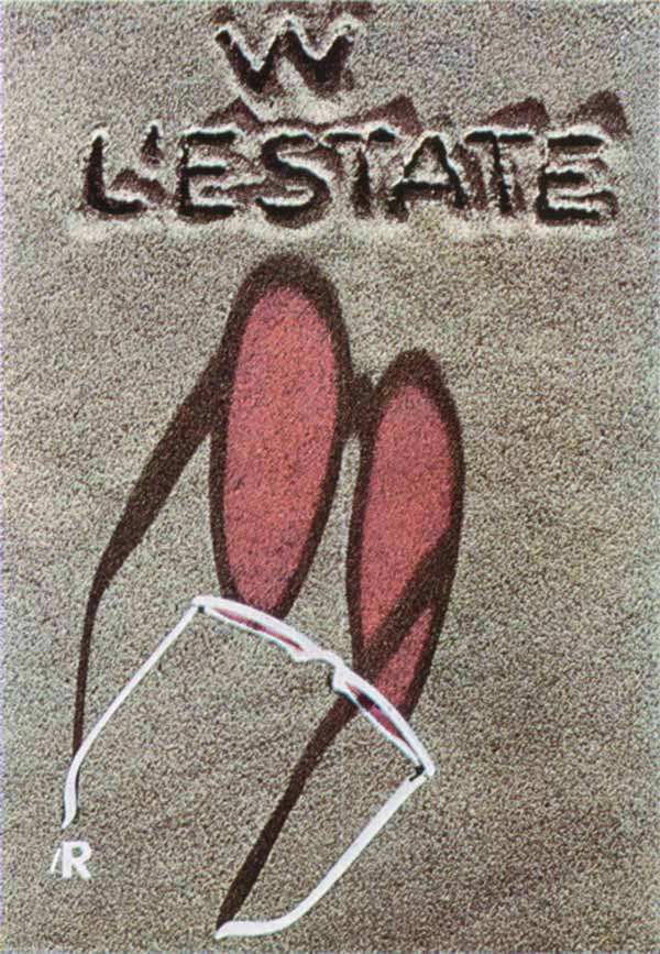
2 — W l’estate. lR, 1965, catalogo
Progetto grafico Salvatore Gregorietti
Fotografia Serge Libiszewski
Archivio Salvatore Gregorietti, Milano
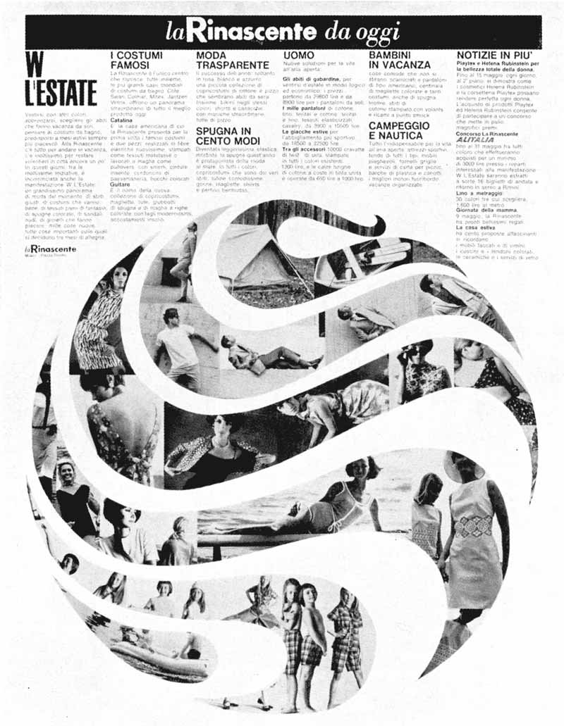
3 — La Rinascente da oggi, 1965 ca., avviso per quotidiani
Progetto grafico Salvatore Gregorietti
Archivio Salvatore Gregorietti, Milano
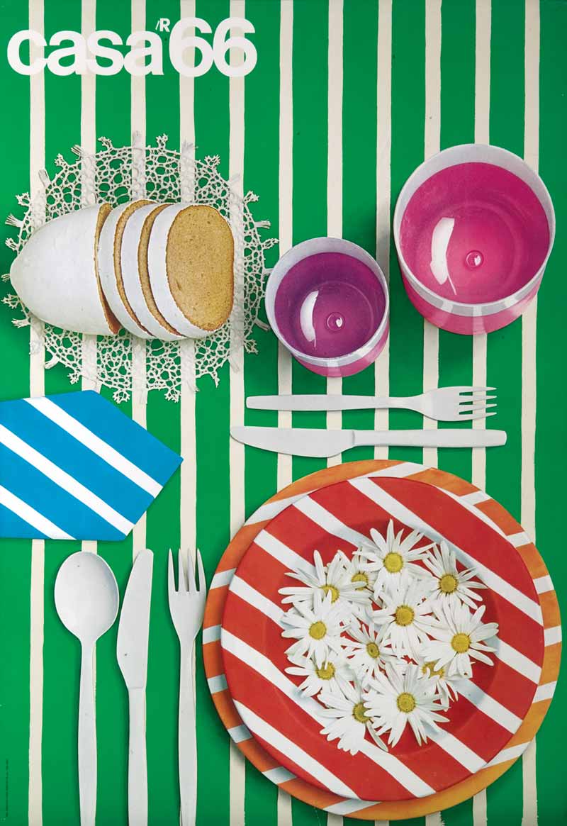
4 — Casa 66. lR, 1966, manifesto
Progetto grafico Salvatore Gregorietti
Fotografia Aldo Ballo
Archivio Salvatore Gregorietti, Milano
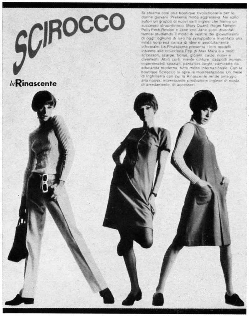
5 — Scirocco, 1966, annuncio per quitidiano
Progetto grafico Salvatore Gregorietti
Archivio Salvatore Gregorietti, Milano
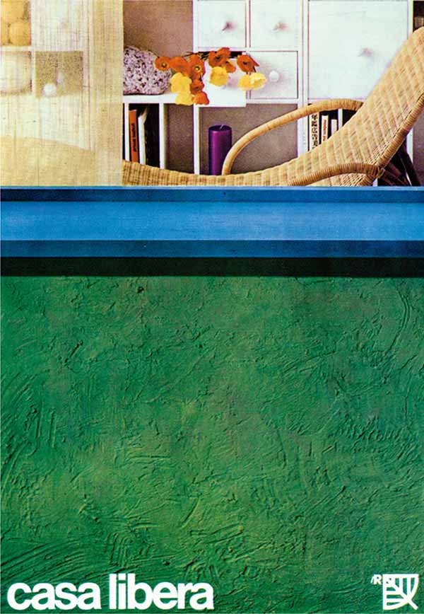
6 — Casa Libera, 1966, manifesto dedicato alla manifestazione ‘Verde’
Progetto grafico Salvatore Gregorietti
Fotografia Aldo Ballo
Art director Adriana Botti Monti
Archivio Salvatore Gregorietti, Milano
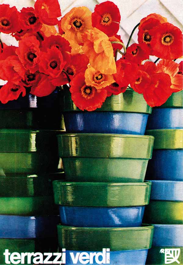
7 — Terrazzi verdi, 1966, manifesto dedicato alla manifestazione ‘Verde’
Progetto grafico Salvatore Gregorietti
Fotografia Aldo Ballo
Art director Adriana Botti Monti
Archivio Salvatore Gregorietti, Milano
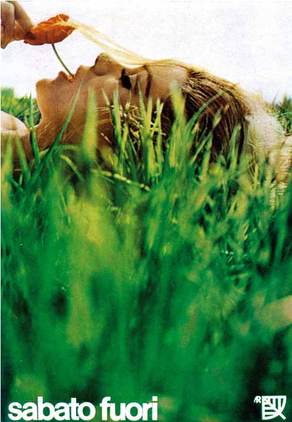
8 — Sabato fuori. lR, 1966, manifesto dedicato alla manifestazione ‘Verde’
Progetto grafico Salvatore Gregorietti
Fotografia Serge Libiszewski
Art director Adriana Botti Monti
Archivio Salvatore Gregorietti, Milano
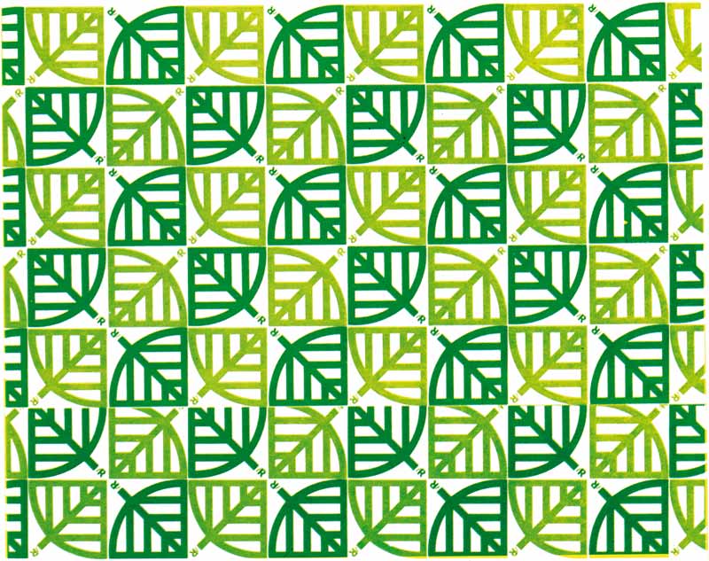
9 — Carta da imballo per la manifestazione “Verde 1966”, 1966
Progetto grafico Salvatore Gregorietti
Archivio Salvatore Gregorietti, Milano
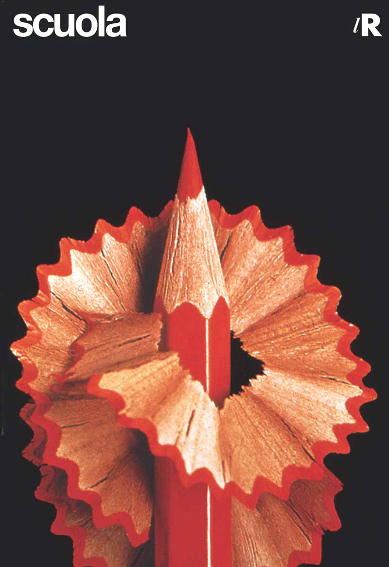
10 — Scuola, 1967 – 1971, manifesto
Progetto grafico Salvatore Gregorietti
Fotografia Aldo Ballo
Art director Adriana Botti Monti
Archivio Salvatore Gregorietti
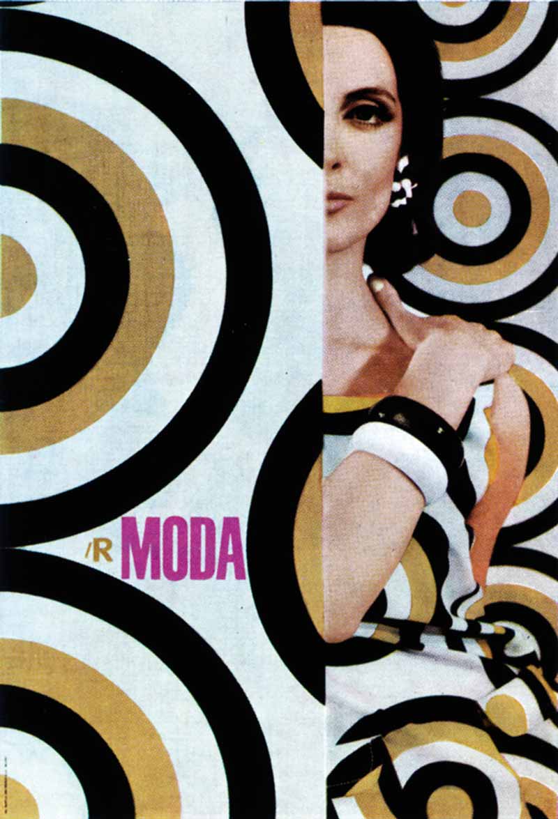
11 — Moda lR, 1964-1974 Manifesto
Progetto grafico Salvatore Gregorietti
Fotografia Oliviero Toscani
Modella Isa Stoppi
Archivio Salvatore Gregorietti, Milano
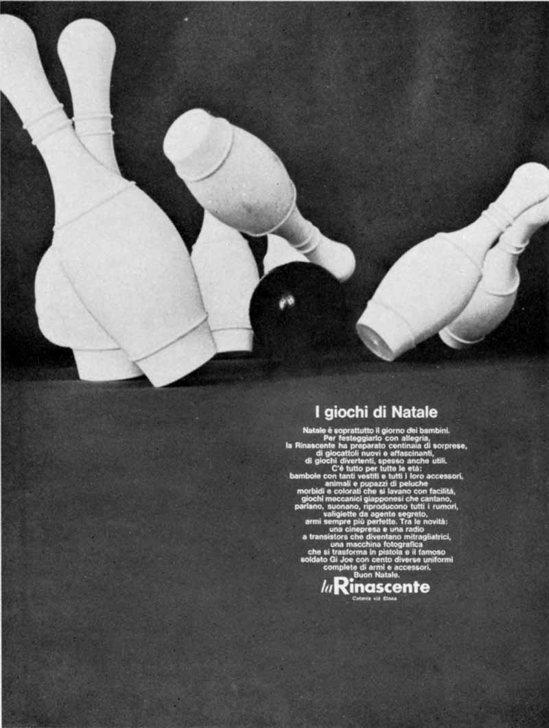
12 — I giochi di Natale, 1965-1974, Annuncio per quotidiani
Progetto grafico Salvatore Gregorietti
Archivio Salvatore Gregorietti, Milano
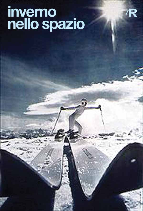
13 — Inverno nello spazio. lR, 1965-1974, Manifesto
Progetto grafico Salvatore Gregorietti
Archivio Salvatore Gregorietti, Milano
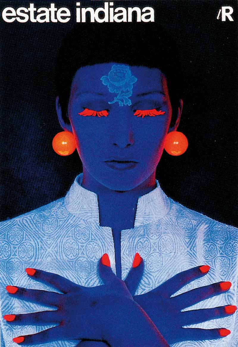
14 — Estate Indiana, 1968, manifesto
Progetto grafico Salvatore Gregorietti
Fotografia Serge Libiszewski
Art director Adriana Botti Monti
Archivio Serge Libiszewski
“The ultraviolet light used in nightclubs had become very fashionable among photographers. I had used it just in that occasion. I had the model’s false eyelashes and nails painted this fluorescent orange, the same colour as the plastic earrings, and I looked for a piece to put on her forehead to act as a third eye. I wanted a painted piece of filigree, but even for a make-up artist that could not be possibly done. I rifled through underwear from a previous shoot. I found a rose, little more than some lacework taken from a slip. I cut it out and placed it on her forehead”.
Salvatore Gregorietti
Giancarlo Iliprandi
Giancarlo Iliprandi was born in 1925 in Milan. After gaining a diploma in painting and set design from the Academy of Fine Arts in Brera, he worked for over sixty years on visual communication design, experimental research and operative methodology, collaborating with the main Italian businesses and organizations (RAI Radio Televisione Italiana, la Rinascente, RB Rossana, Olivetti, Montecatini, Fiat, Eni).
He was a teacher at the Società Umanitaria, the ISIA of Urbino, the European Institute of Design, and the School of Design at the Polytechnic of Milan.
He published twenty didactic texts and over forty travelogues. To mark his ninetieth birthday, he published his illustrated autobiography Note (Hoepli, 2015). During his career, he received countless accolades, including two ADI Golden Compass Awards in 1979 and a third in 2004.
In 2002, he was awarded an honorary degree in industrial design from the Polytechnic of Milan. In 2011, he received an ADI Golden Compass Life Award, for his invaluable contribution to Italian design.
He furthered cultural promotion in his roles as president of the Art Directors Club Milano, of Icograda, Chairman of the BEDA, and president of the ADI.
With reference to his collaboration with the Advertising Department of Rinascente between 1955 and 1968, Iliprandi remembered:
An unforgettable period. Full of days of normal perfection interspersed with high level events. And these gentlemen Borletti and Brustio, who wandered between the shop aisles looking at goods as if they had all come from their own wardrobes. And as if they had to be returned there. Many tried, later, to identify this approach with a certain taste if not style. Today we can safely say that it was a project expressed in its most paradigmatic elements. Shape, function, innovation. This is what la Rinascente was in those years, an example of all-round design. Very complex, like every design system. Absent of any attention-seeking individuals, a real team game. Let’s hope that all this effort be supported by the construction of the archive, unfortunately with only paper evidence surviving to bear witness. Like every type of ‘show’, the store lived on the stage, in front of its audience every day. Round of applause
Giancarlo Iliprandi
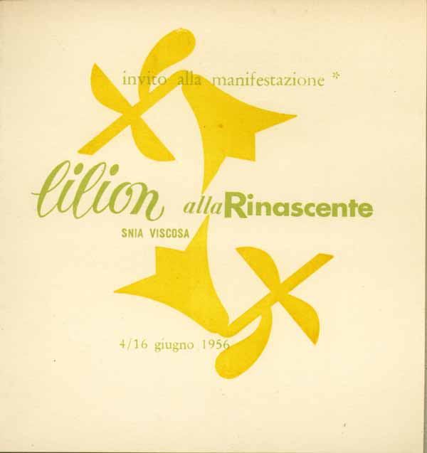
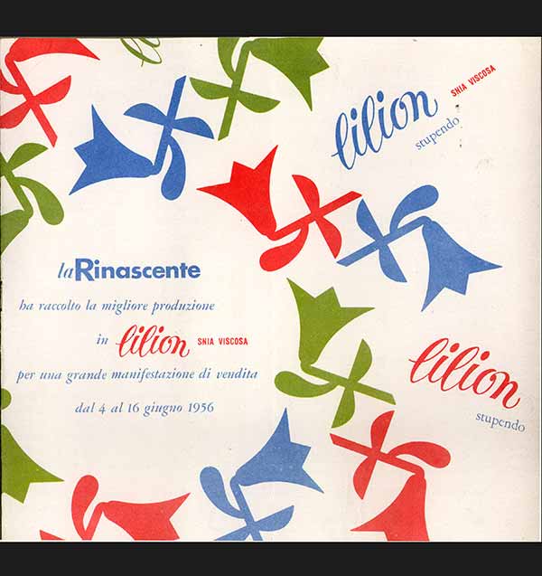
1 — Lilion Snia Viscosa alla Rinascente, 1956, invito alla manifestazione
Progetto grafico Giancarlo Iliprandi
Studio Iliprandi – Fondo Giancarlo Iliprandi, Milano
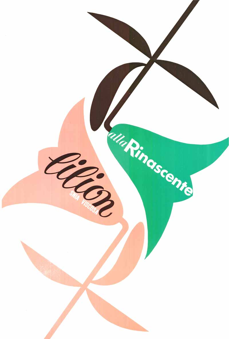
2 — Prova grafica per materiale pubblicitario “Lilion”, 1956 ca.
Progetto grafico Giancarlo Iliprandi
Studio Iliprandi – Fondo Giancarlo Iliprandi, Milano
3 — Lilion Snia Viscosa. La Rinascente, 1956, catalogo della manifestazione di vendita
Progetto grafico Giancarlo Iliprandi
Studio Iliprandi – Fondo Giancarlo Iliprandi, Milano
4 — Lilion Snia Viscosa alla Rinascente, 1956, Materiale grafico per cartellistica interna di reparto
Progetto grafico Giancarlo Iliprandi
Studio Iliprandi - Fondo Giancarlo Iliprandi, Milano
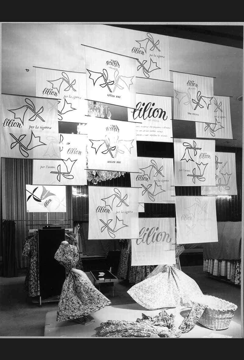
5 — Lilion Snia Viscosa alla Rinascente. Materiali per allestimento di reparto, 1956, stendardi in tessuto
Progetto grafico Giancarlo Iliprandi
Studio Iliprandi - Fondo Giancarlo Iliprandi, Milano
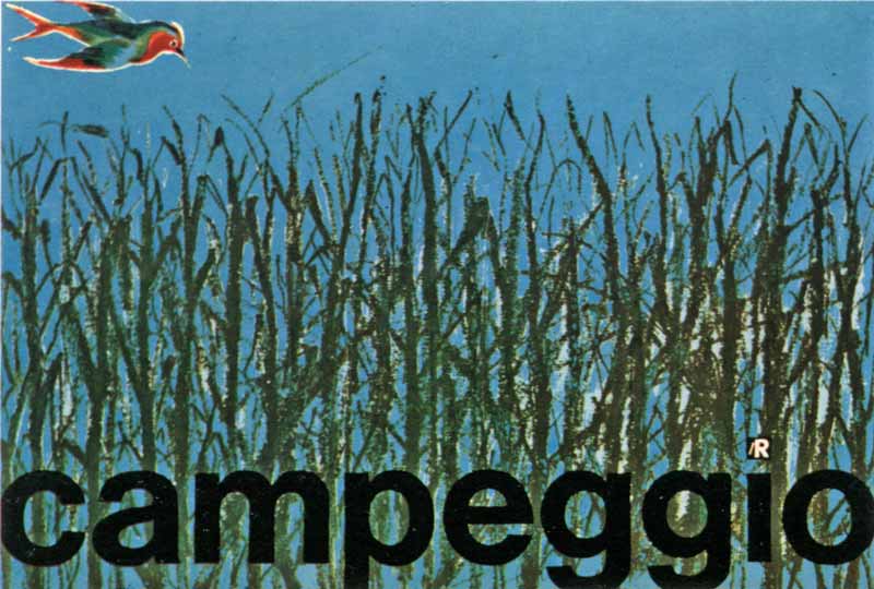
6 — Campeggio. lR, 1958, manifesto
Progetto grafico Giancarlo Iliprandi
Studio Iliprandi - Fondo Giancarlo Iliprandi, Milano
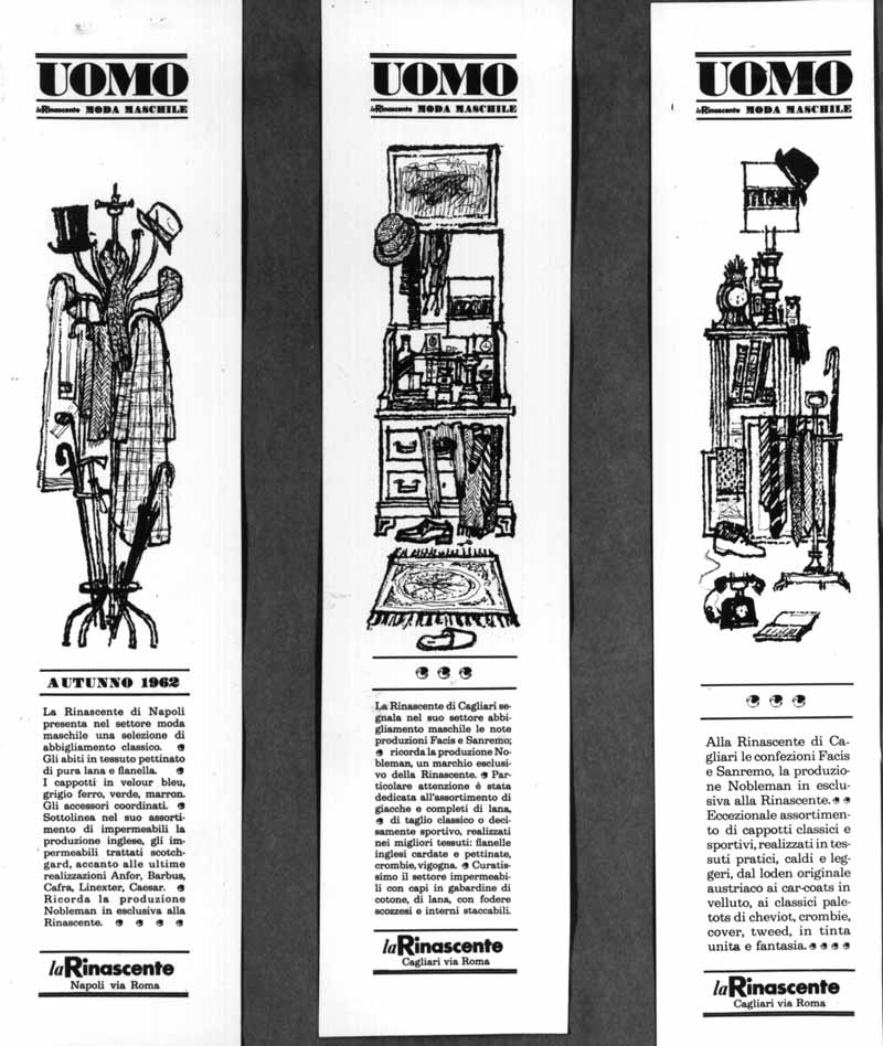
7 — Uomo la Rinascente Moda Maschile, 1961, catalogo
Progetto grafico Giancarlo Iliprandi
Studio Iliprandi - Fondo Giancarlo Iliprandi, Milano
8 — Uomo la Rinascente Moda Maschile, 1961, Catalogo
Progetto grafico Giancarlo Iliprandi
Studio Iliprandi - Fondo Giancarlo Iliprandi, Milano
9 / 10 — Uomo la Rinascente Moda Maschile, 1962, pagine interne del catalogo
Progetto grafico Giancarlo Iliprandi
Fotografia Mario Santana
Art director Adriana Botti
Archivio Amneris Laris, Milano
11 — Uomo la Rinascente Moda Maschile, 1961-1962, avvisi per quotidiani
Progetto grafico Giancarlo Iliprandi
Studio Iliprandi - Fondo Giancarlo Iliprandi, Milano
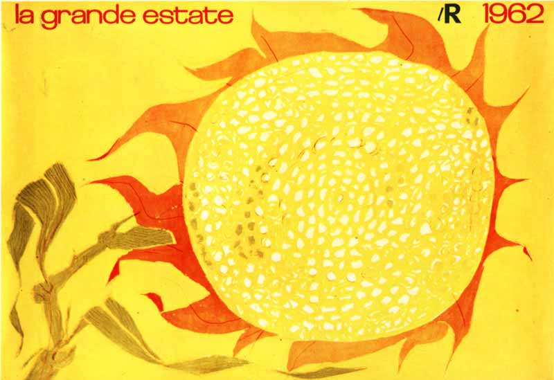
12 — La grande estate lR 1962, 1962, manifesto
Progetto grafico Giancarlo Iliprandi
Studio Iliprandi - Fondo Giancarlo Iliprandi, Milano
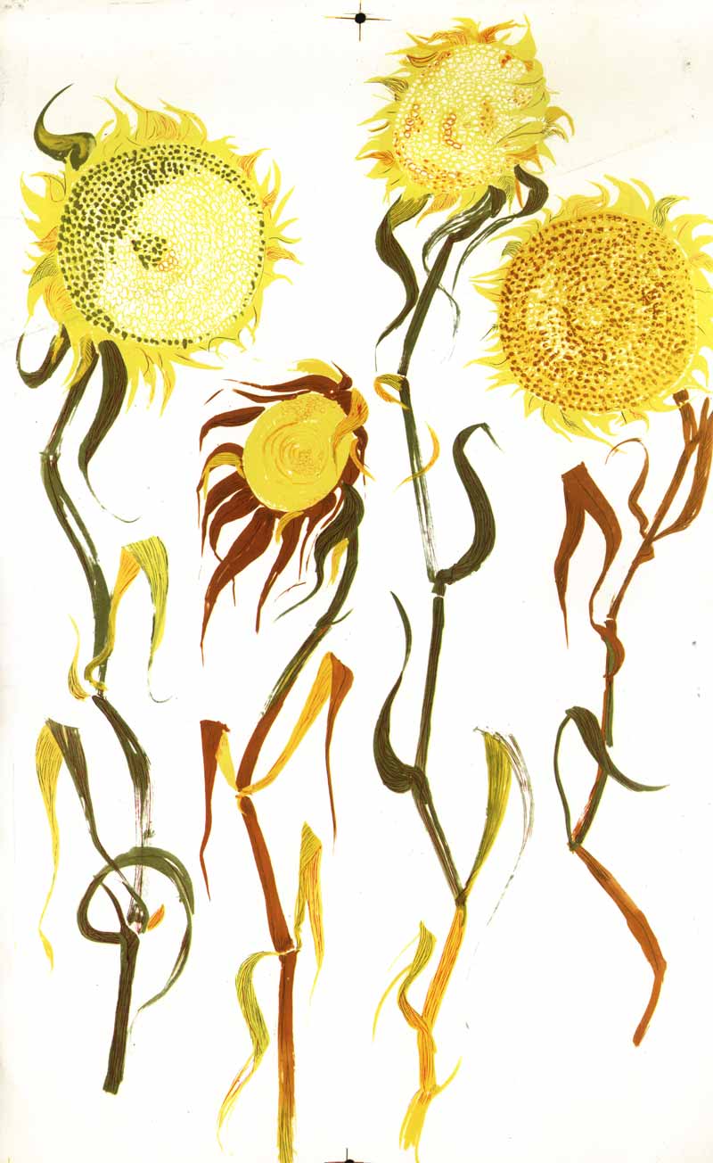
13 — Girasoli, 1962, disegno per la manifestazione “La grande estate lR 1962”
Progetto grafico Giancarlo Iliprandi
Studio Iliprandi - Fondo Giancarlo Iliprandi, Milano
14 — Uomo lR, 1963, catalogo [quarta di copertina e copertina]
Progetto grafico Giancarlo Iliprandi
Fotografia Serge Libiszewski
Studio Iliprandi - Fondo Giancarlo Iliprandi, Milano
15 — Uomo la Rinascente Moda Maschile, 1963, catalogo [quarta di copertina e copertina]
Progetto grafico Giancarlo Iliprandi
Fotografia Serge Libis
Art director Adriana Botti Monti
Archivio Serge Libiszewski, Milano
16 — Uomo Estate lR, 1964, manifesto
Progetto grafico Giancarlo Iliprandi
Fotografia Serge Libiszewski
Studio Iliprandi - Fondo Giancarlo Iliprandi, Milano
17 — Uomo la Rinascente Moda Maschile, 1966, catalogo [quarta di copertina e copertina]
Progetto grafico Giancarlo Iliprandi
Fotografia Oliviero Toscani
Art director Adriana Botti Monti
Studio Iliprandi - Fondo Giancarlo Iliprandi, Milano
18 — Uomo la Rinascente Moda Maschile, 1966, catalogo [quarta di copertina e copertina]
Progetto grafico Giancarlo Iliprandi
Fotografia Carlo Orsi
Art director Adriana Botti Monti
Studio Iliprandi - Fondo Giancarlo Iliprandi, Milano
19 — Ski. la Rinascente, [1960-1965], Catalogo
Progetto grafico Giancarlo Iliprandi
Fotografia Oliviero Toscani
Art director Adriana Botti Monti
Studio Iliprandi - Fondo Giancarlo Iliprandi, Milano
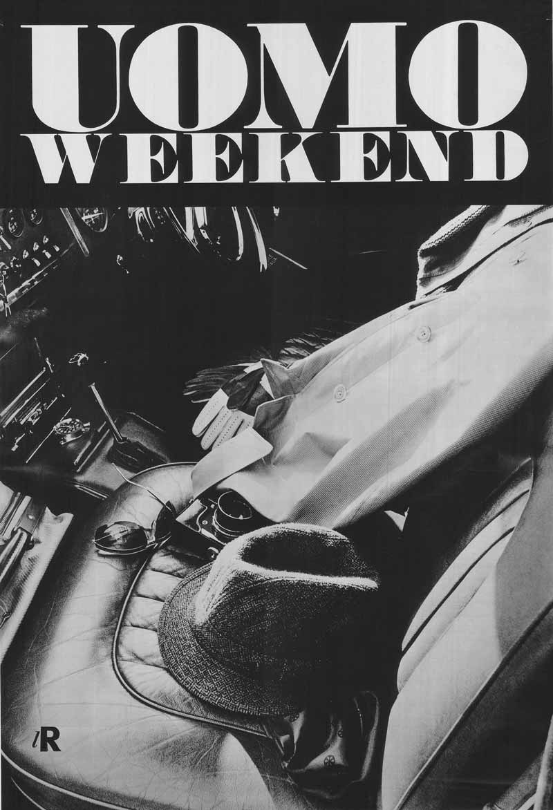
20 — Uomo Weekend, [1964-1967], manifesto
Progetto grafico Giancarlo Iliprandi
Fotografia Serge Libiszewski
Studio Iliprandi - Fondo Giancarlo Iliprandi, Milano
21 — Avvisi pubblicitari per quotidiani
Progetto grafico Giancarlo Iliprandi
Studio Iliprandi - Fondo Giancarlo Iliprandi, Milano
22 — Avvisi pubblicitari per quotidiani
Progetto grafico Giancarlo Iliprandi
Studio Iliprandi - Fondo Giancarlo Iliprandi, Milano
Serge Libiszewski
Serge Libiszewski, better known as Sergio Libis, was born in San Gallo (Switzerland) on 3rd March 1930. Born into a family of photographers, he attended the three-year course of photography at Kunstgewerbeschule, the vocational school of arts and crafts in Zurich. In 1951, he gained his diploma with the maximum marks. He then began his working life at the graphic design studio of Heiniger-Muller.
His career was greatly influenced by a meeting with Max Huber, who encouraged him to move to Milan. Following his friend’s invitation, in 1956 Libis transferred to the Lombardy capital where he was taken on as a photographer in la Rinascente Advertising Department. He collaborated with the art directors Amneris Latis and Adriana Botti Monti, and graphic designers Max Huber, Lora Lamm, Giancarlo Iliprandi and Roberto Maderna. While working for la Rinascente he was able to meet and interact with Richard Sapper, Gian Carlo Ortelli, Bruno Munari, Roberto Sambonet, Marco Zanuso and George Coslin.
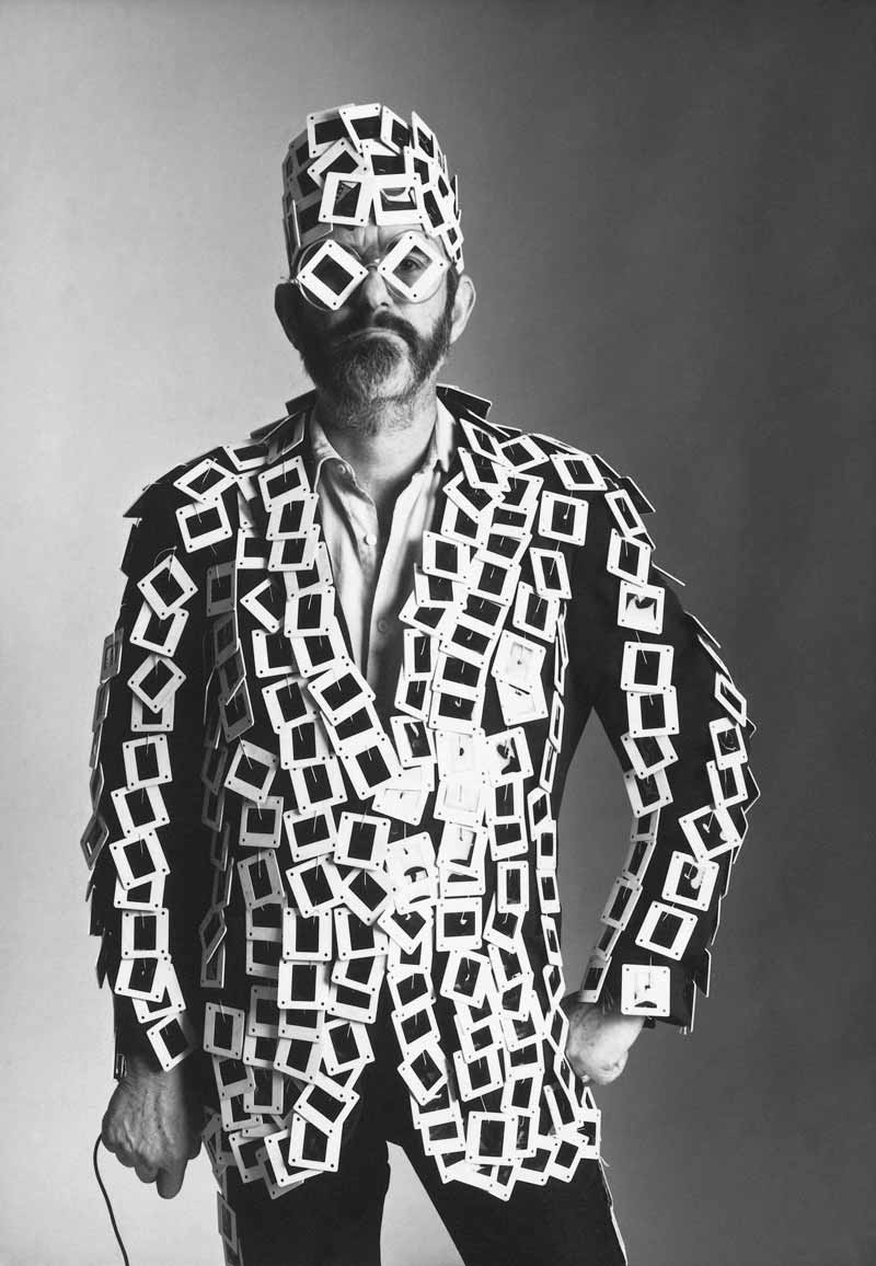
In 1961, he opened his own professional studio dedicated to still life photography, fashion and advertising images. In the following years, Libis continued to collaborate with la Rinascente, gaining a reputation for his innovative and revolutionary creativity. Libis created photo campaigns for the department store, destined to catalogues and advertising posters, proposing a new type of fashion shoot poised midway between a happening and reportage (as in Inverno passione mia and Vacanze di moda). Libis changed the paradigm of fashion photography: he captured moments of life and opted for spontaneous shots, abandoning the insides of the photography studio to take to the streets outside.
In the 70s and 80s, he created photo campaigns for Olivetti, Pirelli, Alfa Romeo, Giorgio Armani and Prenatal, where he became practically a film director on set. He worked increasingly with fashion magazines – his front covers for the “Annabella” magazine in that period entered the public’s collective memory along with his posters.
1 — Uomo lR, 1968, servizio fotografico moda uomo per la Rinascente
Progetto grafico Georg Erhardt
Fotografia Serge Libiszewski
Art director Adriana Botti Monti
Archivio Serge Libiszewski, Milano

2 — Uomo lR. La Rinascente Moda Maschile, 1963, servizio fotografico per il catalogo pubblicitario
Fotografia Serge Libiszewski
Progetto grafico Giancarlo Iliprandi
Art director Adriana Botti
Archivio Serge Libiszewski, Milano
La Rinascente’s Advertising Department was rather independent, and was managed by Gianni Bordoli. He oversaw everything, whether it be the objects chosen or the work done, and if a good job wasn’t done, he just said to redo it. [...] However, we trusted in him and him in us, and his influence was crucial. He observed and oversaw everything, particularly anything to do with communications. [...] It must also be said that the owners, the Brustios and Borlettis, were highly cultured people with an excellent taste. You could talk to them about a book you read, or a film or play you saw. […] Amneris Latis was the art director, followed by Adriana Botti. Together we designed many Men’s catalogues, the kind of large-circulation catalogue that was sent to all the houses in areas where la Rinascente was present. [...] At the time fashion was designed with mannequins, or models who resembled them, dressed up and shot by cameras. In contrast we tried to create an atmosphere, such as with the series of photographs taken in Il Cantinone, a long-established restaurant in Milan, for one of the first ever men’s catalogues. The result is rather interesting: men’s fashion isn’t featured at all, but rather it is the two men’s contrasting attitudes that has more to do with “men” than the clothing
Giancarlo Iliprandi
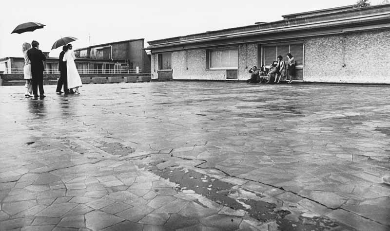
3 — Servizio fotografico per la Rinascente sul tetto del grande magazzino in Piazza del Duomo, 1966-1967
Fotografia Serge Libiszewski
Archivio Serge Libiszewski, Milano
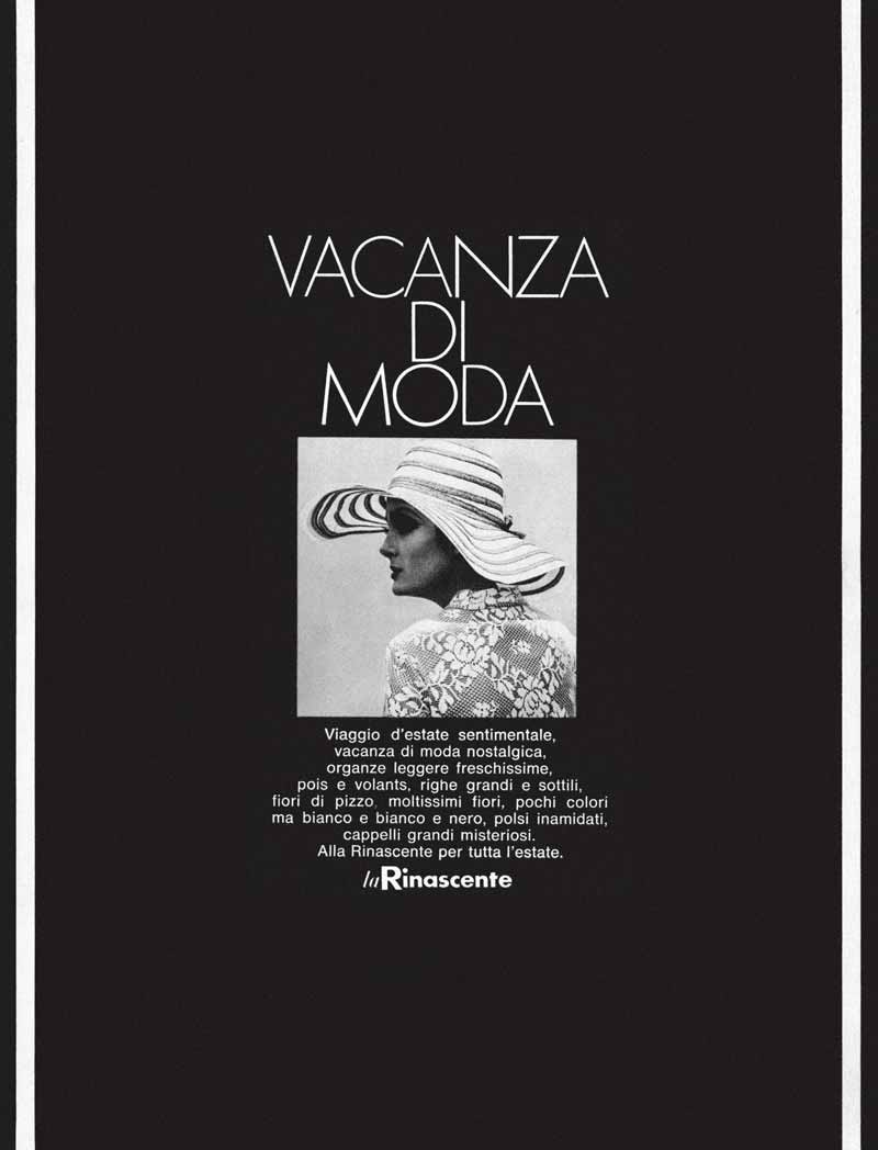
4 — Vacanza di moda, 1968, catalogo pubblicitario per la Rinascente
Fotografia Serge Libiszewski
Progetto grafico Salvatore Gregorietti
Art director Adriana Botti
Archivio Serge Libiszewski, Milano
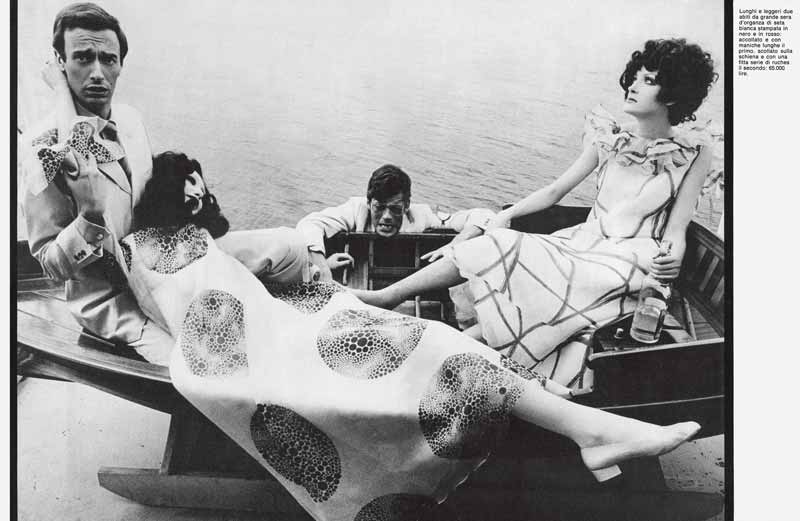
The idea was originally Nanette’s. She noticed the beauty and spontaneity of the wedding photos I took for friends who were getting married. With this in mind, I rented a boat and invited friends to spend a day out on the lake with a big lunch. I asked each of the guests to bring an object dear to them. Alfonso Mazza, an accountant, brought an easel and canvasses, painting being his hobby, as well as his collection of broken musical instruments, and Oliviero Toscani had an old family gramophone. The art director Spitali took his violin with him and Cacho Perez, a brilliant art director from Argentina, loved to impersonate a maharajah, and so with this the shoot was underway. The waiter serving the bored model beside him was part of the catering team: I couldn’t have found a more perfect person even if I had organised a casting session!
Serge Libiszewski
5 — Fotografia per i sacchetti Upim, [1965 - 1975]
Fotografia Serge Libiszewski
Archivio Serge Libiszewski, Milano
Italo Lupi
Halfway through the Seventies, three neo-graduates [...] applied to the Research and Development Department of Rinascente. We had just discovered that they were looking for an art director and so we brazenly offered ourselves as three young and creative talents able to cover the single role together as a trio. The intellectual Augusto Morello was head of department at that time, one of the first serious scholars in the field of industrial design who quickly made the decision to take on three inexpert youngsters. The three of us were friends: Roberto Orefice was extremely well read, complicated, experimental and constantly searching for something new; Mario Bellini, right behind him, was at the outset of his unstoppable career; and myself. They were different times – the salary, even divided between the three of us, was enough for us to start our families and buy homes. It all started there and then, including my special friendship with Mario Bellini, a prelude to the future and crucial partnerships for me
Italo Lupi
Italo Lupi, born in Cagliari in 1934, graduated in architecture from the Polytechnic of Milan and began his career in la Rinascente Department of Research and Development between 1960 and 1962 as a graphic design consultant after a work experience with an exceptional maestro: Pier Giacomo Castiglioni.
He immediately focused his efforts on display fittings, on coordinated projects of graphic design and publishing, becoming one of the most important Italian designers with a worldwide reputation. He received many international awards over the years, including two Golden Compass awards. Together with Mario Bellini, he was to design the set for the VI edition of the Golden Compass Award ceremony in the Hall of Caryatids in Milan’s Royal Palace in 1960.
After the important experience with la Rinascente, he became an image consultant for IBM Italy and the Triennale of Milan, art director of “Domus” and from 1992 to 2007 was editor-in-chief and art director of the magazine “Abitare”. He collaborated with some of the heavyweights in the sectors of publishing, design, architecture and fashion, designing logos for the likes of Miu Miu and Fiorucci.
He was responsible for the graphic design of important exhibitions and museums, working closely with the architectural designs of Mario Bellini (Palazzo Grassi, Stupinigi, Triennale of Milan, Museum of History of Bologna), Achille Castiglioni (pavilions RAI and BTicino, Pitti Immagine, XVII Triennale, Museo Correr in Venice), Guido Canali (exhibition on the eighteenth century at Palazzo della Pilotta in Parma). With Migliore and Servetto, he planned the Look of the City of Turin for the 2006 Winter Olympic Games and the 150th anniversary celebration event of Italian Unity, encapsulated in the large light installation on the Mole Antonelliana.
1 — Prova grafica per progetto di packaging, 1960-1962
Progetto grafico Italo Lupi
Archivio Italo Lupi, Milano
2 — Progetto di packaging per calze femminili, 1960-1962
Progetto grafico Italo Lupi
Fotografia Cesare Colombo
Archivio Italo Lupi, Milano
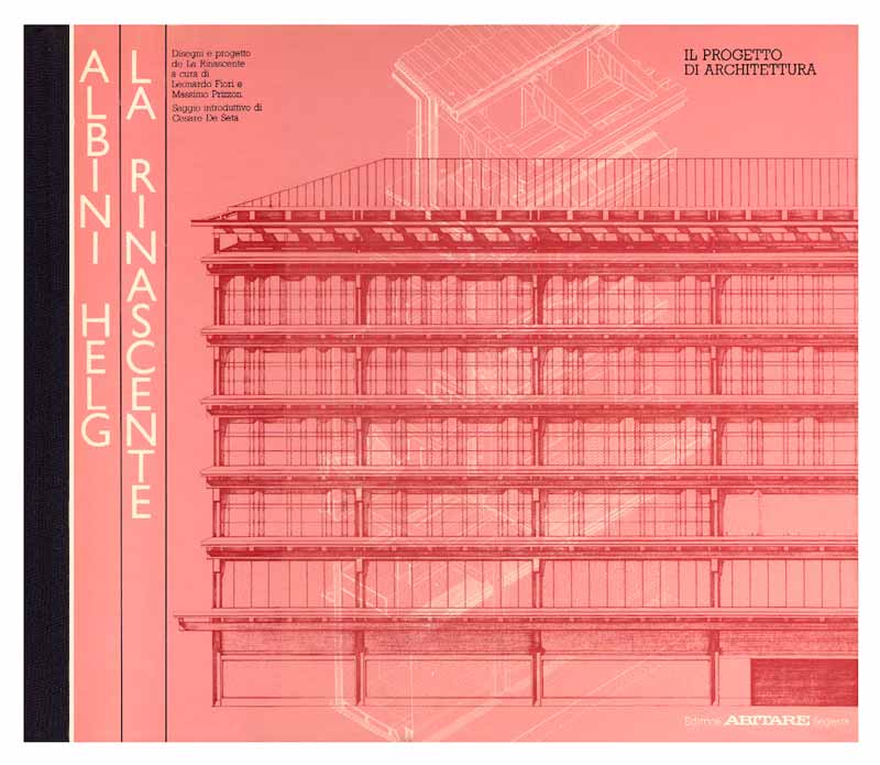
3 — Albini-Helg. La Rinascente. Il Progetto di architettura. Disegni e progetto de la Rinascente di Roma, 1982, Volume a cura di Leonardo Fiori, Massimo Prizzon
Progetto grafico Italo Lupi
Archivio Italo Lupi, Milano
Lora Lamm
Born in Arosa in 1928, Lora Lamm is a Swiss illustrator and graphic designer. She worked for Pirelli and la Rinascente during the Seventies, becoming (along with Anita Klinz) one of the few successful female graphic designers in Italy.
few successful female graphic designers in Italy. After training at the Kunstgewerbeschule in Zurich, Lamm started her professional career working for different agencies. In 1953, she settled in Milan. In that period of economic boom, many Swiss designers decided to transfer to Italy, tempted by the lively intellectual and cultural context as well as the progressive attitudes that were taking hold. These included Xanti Schawinsky, Max Huber, Carlo Vivarelli, Walter Ballmer, Aldo Calabresi and Bruno Monguzzi. Many of them worked for the Boggeri Studio founded by Antonio Boggeri in 1933; it was here that Lora started with small commissions, before being assigned the packaging for Motta products.
In that historic era, some large companies and Italian businesses (including Olivetti) encouraged the development of the advertising industry in Italy, offering opportunities to the best graphic designers and illustrators to create images and iconic campaigns. Like Olivetti, Pirelli and la Rinascente also set up their own departments for advertising and internal communication. It was a schoolmate and colleague, Max Huber, who presented Lora Lamm to la Rinascente in 1954. Huber was already an established designer, who had created the department store’s logo and also oversaw the coordinated branding. Lora became chief of advertising graphics, creating over time (up to the early Sixties) a sizeable series of high-impact catalogues, posters and leaflets. Her fresh new style, direct and iconic, raised her immediately among the elite in Milan designers of the 50’s and 60’s. In 1956, she designed the advertising material for the sales fair “La Rinascente, Grand events: Japan”. Lamm then revived part of the exhibition’s visual material and reinterpreted it in a geometric pattern, with the traditional colours of Japan. This playful and experimental approach became her trademark style.
Starting from 1958, she also worked for Pirelli, Elizabeth Arden, Olivetti and other companies. In 1963, the designer returned to Zurich as a partner at Frank C. Thiessing where she focused on packaging and design for exhibitions.
Lamm established a precise style through her colourful illustrations, her stylized and unexpected creations which induce a sense of wonder and engagement from the audience, communicating enthusiasm and carelessness. With time, Lamm would experiment also with interesting overlaps of designs, her trademark technique, and photography. But her style, personal and easily recognizable, which put illustration first and foremost, produced results that still appear fresh and effective today.
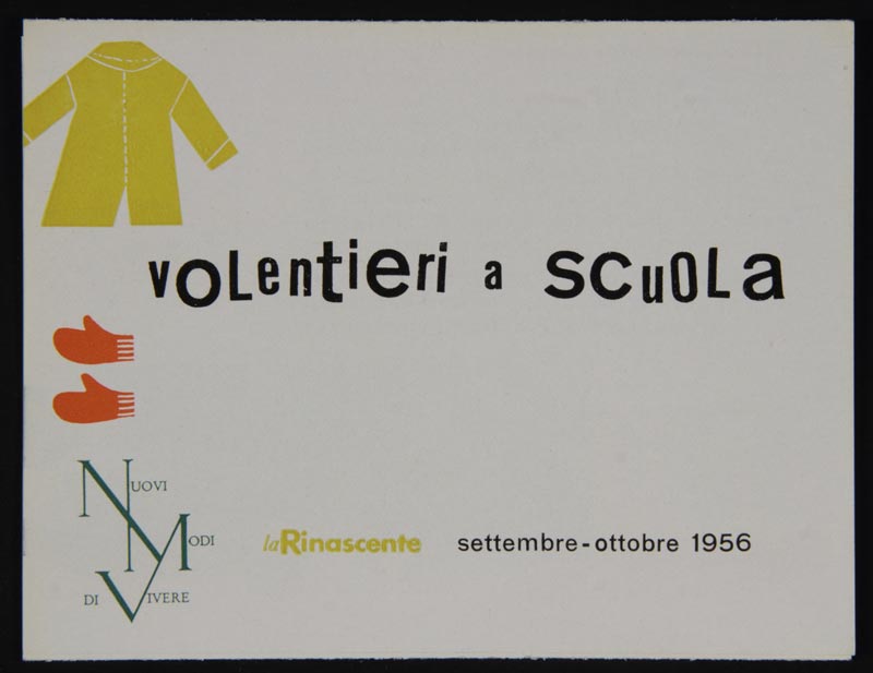
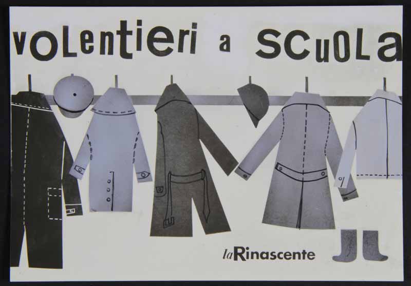
1 — Volentieri a scuola, 1956, pieghevole promozionale della serie ‘Nuovi Modi di Vivere’
Progetto grafico Lora Lamm
Archivio Amneris Latis, Milano
2 — La Rinascente Grandi Manifestazioni. Il Giappone, 1956, manifesto
Progetto grafico Lora Lamm
Art director Amneris Latis
Archivio Amneris Latis, Milano
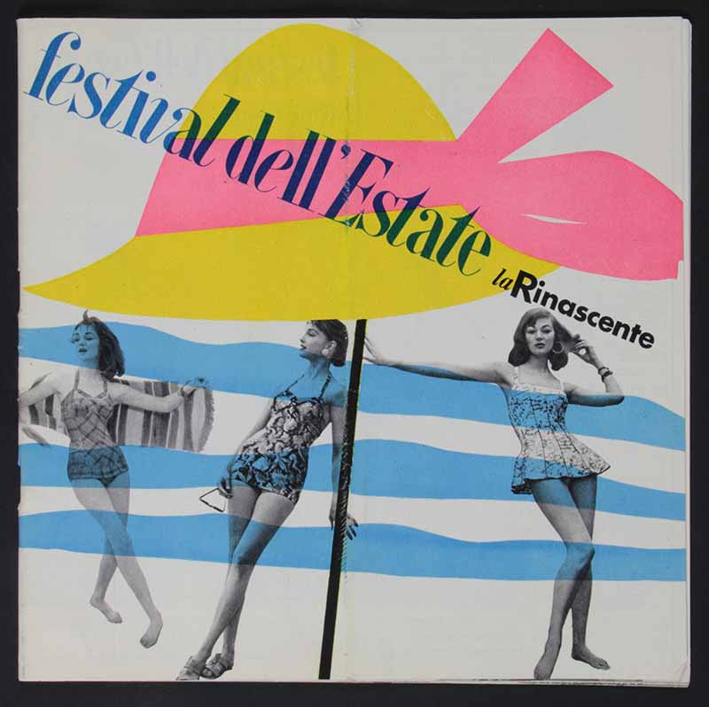
3 — Festival dell’estate, 1956, copertina del catalogo
Progetto grafico Lora Lamm
Archivio Amneris Latis, Milano
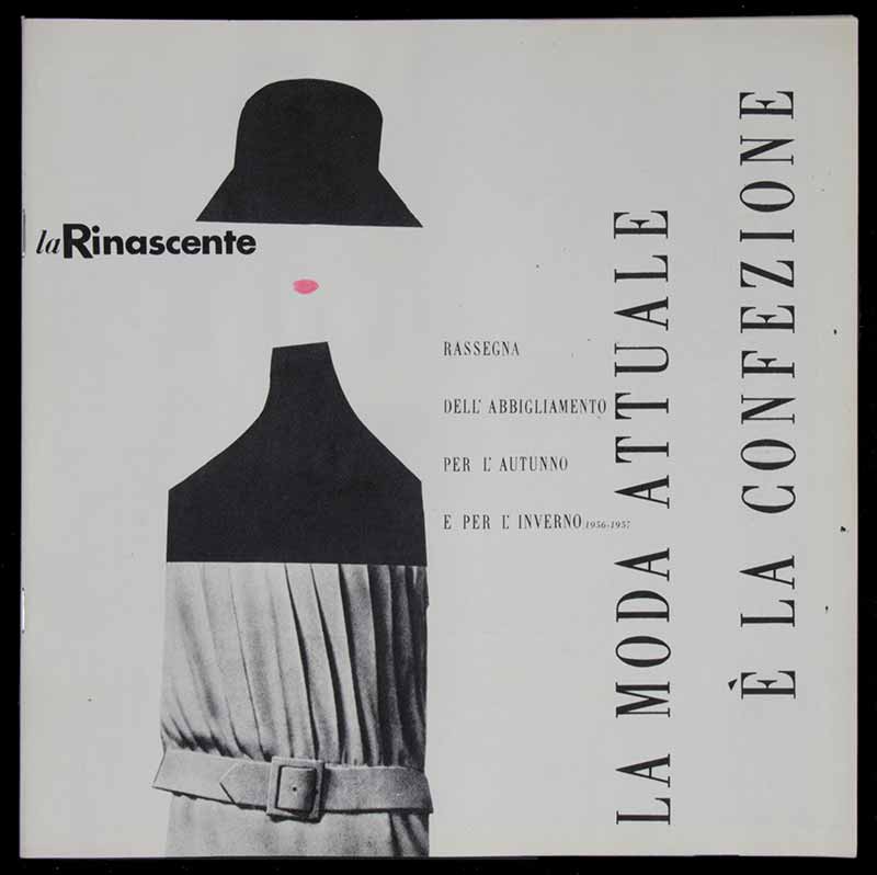
4 — La moda attuale è la confezione, 1956, catalogo
Fotografia Gerard Haertter
Archivio Amneris Latis, Milano
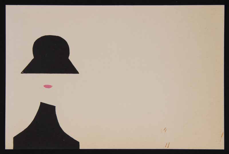
5 — La moda attuale è la confezione, 1956 ca., prova grafica per materiale pubblicitario
Progetto grafico Lora Lamm
Archivio Amneris Latis, Milano
6 — Volentieri a scuola, 1956, cartolina
Progetto grafico Lora Lamm
Archivio Amneris Latis, Milano
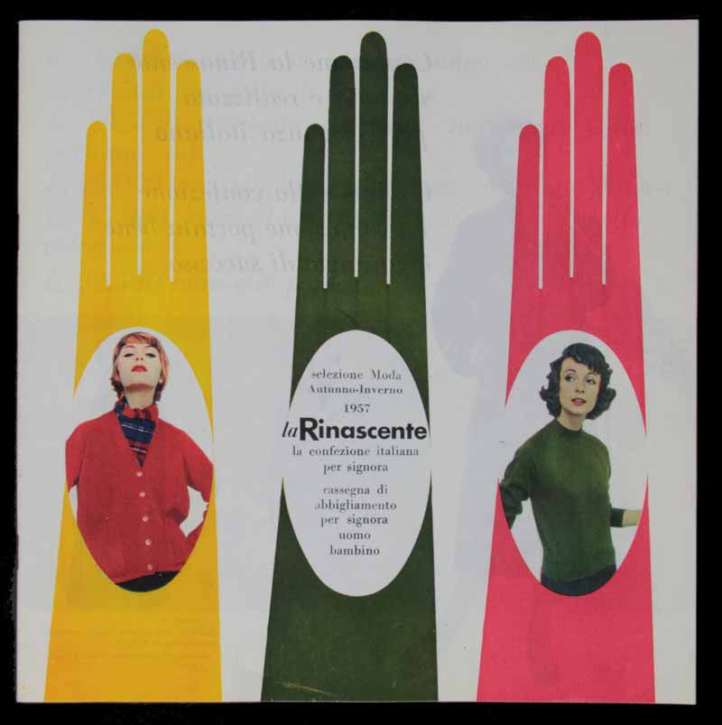
7 — Selezione Moda Autunno-Inverno 1957. La Rinascente, la confezione italiana per signora, 1957, copertina del catalogo
Progetto grafico Lora Lamm
Archivio Amneris Latis, Milano
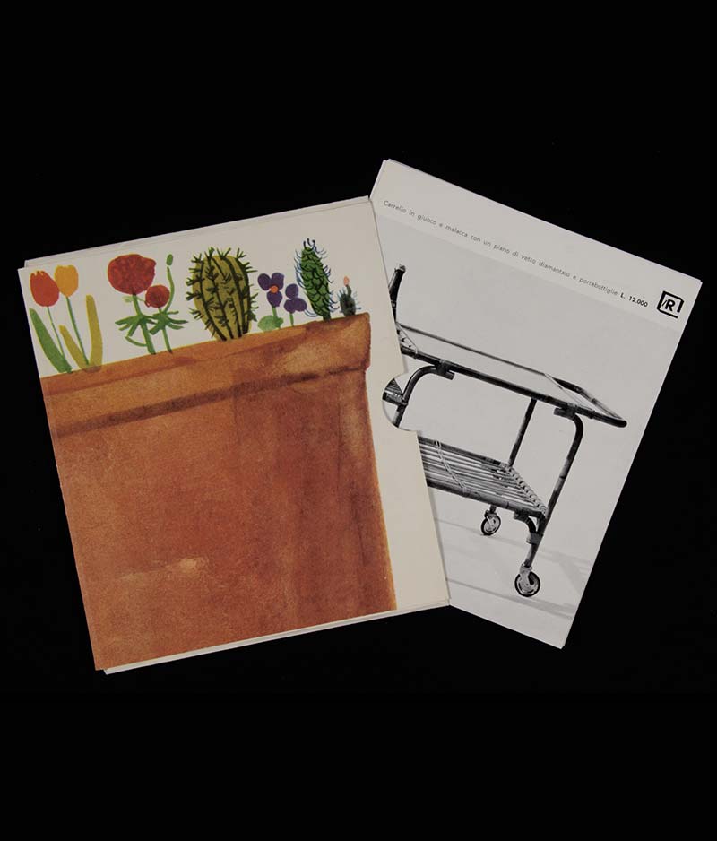
8 — Il giardino, la casa di campagna, il terrazzo di città. Una nuova iniziativa la Rinascente, 1957, folder con cartoline sciolte per arredamento lR
Progetto grafico Lora Lamm
Archivio Amneris Latis, Milano
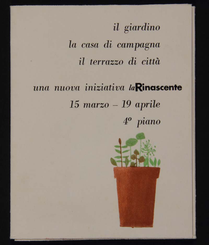
9 — Il giardino, la casa di campagna, il terrazzo di città. Una nuova iniziativa la Rinascente, 1958, invito alla rassegna di mobili e attrezzi da giardino
Progetto grafico Lora Lamm
Archivio Amneris Latis, Milano
10 — La Rinascente. Mobili per comporre, 1958, folder con catalogo e listino per arredamento casa
Fotografia Serge Libiszewski
Progetto grafico Lora Lamm
Archivio Amneris Latis, Milano
11 — I fiori nella casa lR, 1958, prova di stampa per manifesto
Progetto grafico Lora Lamm;
sul verso dedica ad Aoi Huber Kono
Archivio Max e Aoi Huber, Chiasso
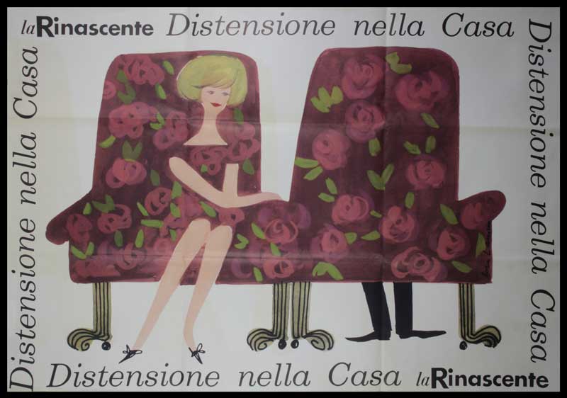
12 — Distensione nella Casa, la Rinascente, 1959, manifesto
Progetto grafico Lora Lamm
Archivio Amneris Latis, Milano
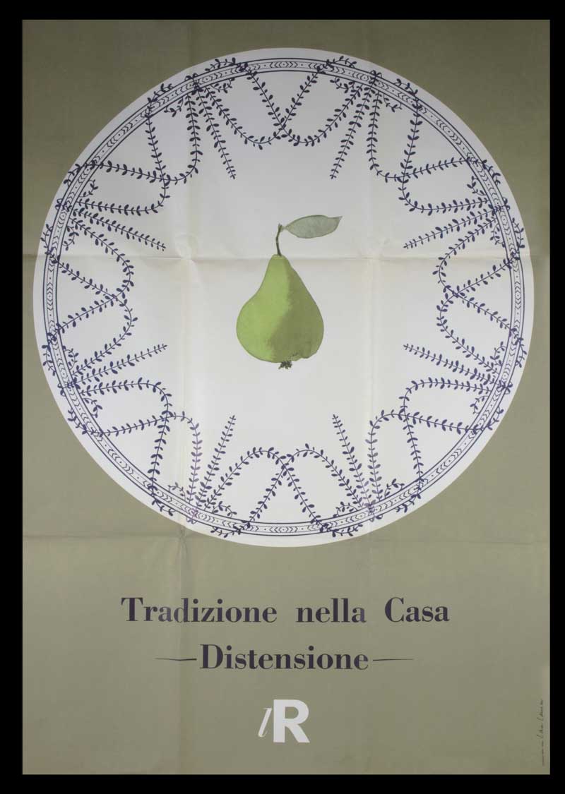
13 — Tradizione nella Casa. Distensione lR, 1959, manifesto
Progetto grafico Lora Lamm
Archivio Amneris Latis, Milano
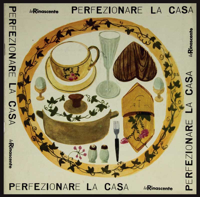
14 / 15 — Perfezionare la casa. La Rinascente, [1960], copertina e pagina del catalogo
Fotografia Serge Libiszewski
Archivio Italo Lupi, Milano
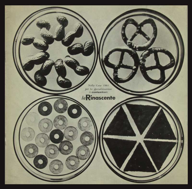
16 — Nella Casa 1961 per la specializzazione: i contenitori, 1961, catalogo
Progetto grafico Lora Lamm
Fotografia Serge Libiszewski
Archivio Italo Lupi, Milano
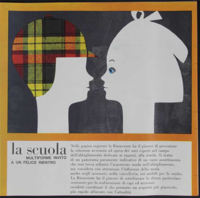
18 — La scuola, 1961, pagine interne del catalogo La nuova modernissima Rinascente piazza Fiume
Progetto grafico Lora Lamm
Archivio Amneris Latis, Milano
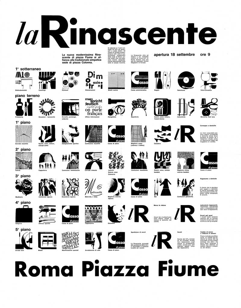
19 — La Rinascente. Apertura Roma Piazza Fiume, 1961, manifesto
Progetto grafico Lora Lamm
Archivio Gian Carlo Ortelli, Milano
20 — La nuova modernissima Rinascente piazza Fiume si affianca alla tradizionale simpatica Rinascente piazza Colonna, 1961, catalogo
Progetto grafico Lora Lamm
Archivio Amneris Latis, Milano
Roberto Sambonet
Roberto Sambonet has a worldwide reputation as a painter, draughtsman and designer.
In 1930 he moved with his family to Milan. After attending a classical high school, he enrolled at the Faculty of Architecture in the Polytechnic of Milan, but soon left to dedicate himself to painting. He began attending evening classes at the Academy of Brera and enjoyed the Milan art environment, taking part in various exhibitions. His strong training in painting was to influence every part of his work as a graphic artist and designer.
In 1948, he moved to Brazil where he remained until 1953, deeply immersing himself in the lively local culture and artistic life, which was particularly strong at that time. In particular he began working with the MASP (Museum of Art of Sao Paolo) and with the director/founder Pietro Maria Bardi. Here he not only took part in a series of exhibitions and initiatives organized by the museum but was also responsible for the set-up of shows and events, creating the invitations and posters, and thus launching into the field of graphics and design.
He enjoyed a highly important trip to Stockholm in 1953 where he discovered Swedish design and moved closer to a more industrial production form of design. Thanks to his intellectual friend and historian Göran Schildt, he met Alvar Aalto who became both a close friend and an influential teacher. With Schildt, he went on long trips in the Mediterranean on board his boat, trips which continued for over thirty years and proved to be a source of inspiration in all his work.
After a series of trips around Europe, in 1953 he returned to Milan where he found an international and cosmopolitan artistic environment. He opened his own studio for graphics and design, and began working for the family business, Sambonet S.p.A. as art director, designer and graphic artist, later overhauling the entire company image.
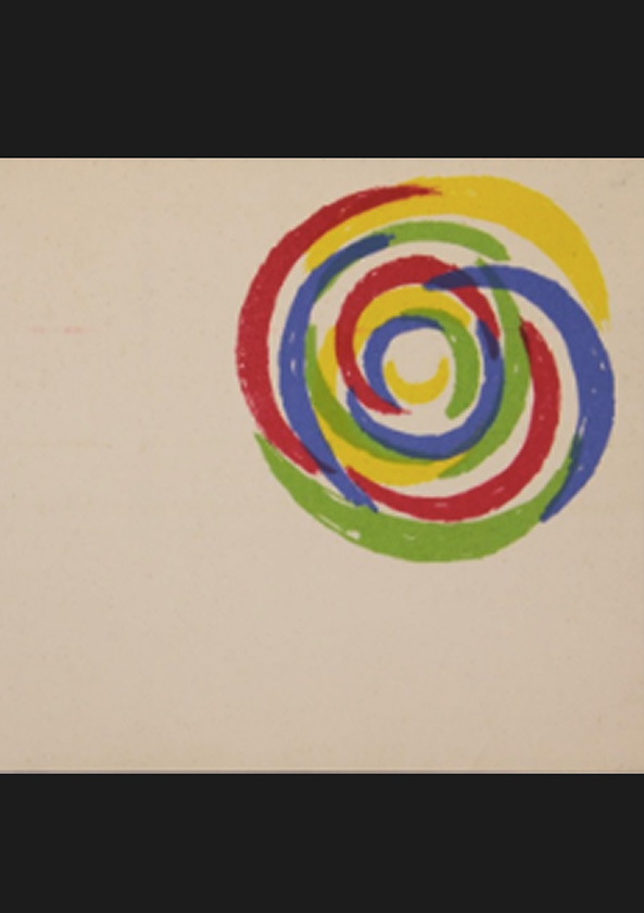
In 1954, thanks to Max Huber, he began a 15-year long and stimulating working relationship with la Rinascente, becoming responsible for the design of window displays and fashion shows, advertising campaigns (including those for magazines and newspapers), the organization and set-up of various product exhibitions and posters, such as “Natale-idea” (Christmas ideas) and “Casa” (House), for which latter he created the concentric spiral logo. Together with the architect Gian Carlo Ortelli and Gianni Bordoli (head of the Advertising Department) he was responsible for the lR Grand Exhibitions dedicated to India (1959) and the Indios (1964) not only dealing with the staging and graphic art for catalogues but also searching for characteristic items to exhibit, visiting different countries around the world.
In 1956, he received the Golden Compass Award for his work on “Round-oval Plate” which was produced by the Sambonet company, the first in a long series of official accolades.
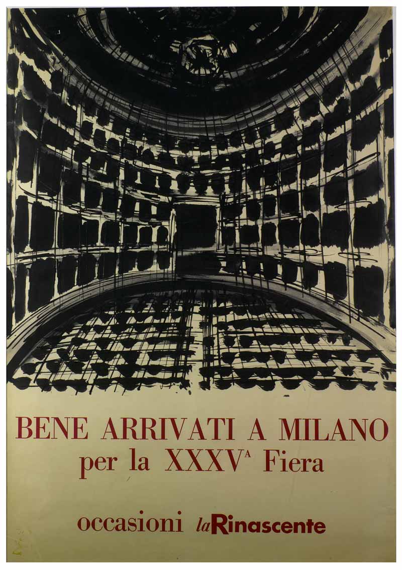
1 — Ben arrivati a Milano per la XXXV Fiera, 1956, manifesto
Progetto grafico Roberto Sambonet
Archivio pittorico Roberto Sambonet, Milano
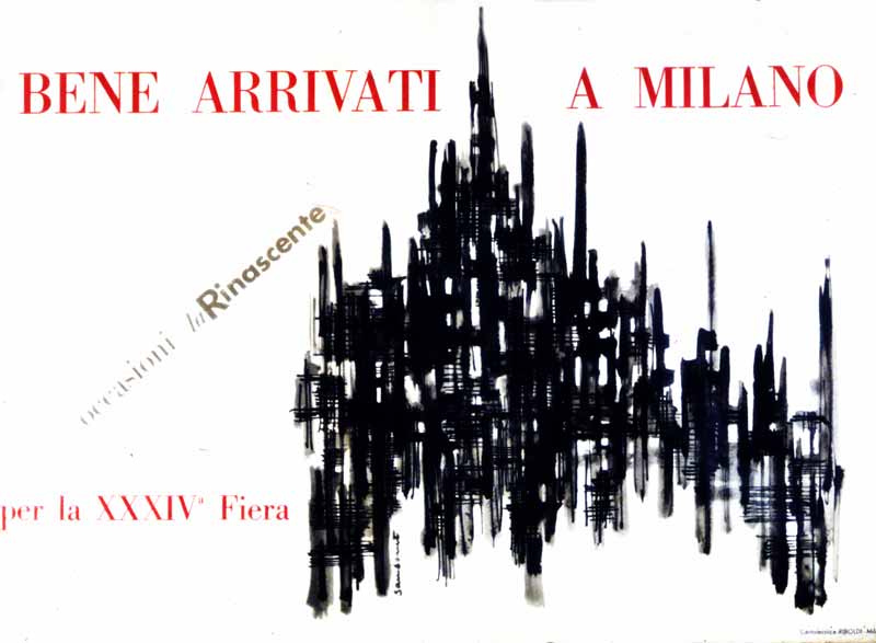
2 — Bene arrivati a Milano per la XXXIV Fiera, 1956, Manifesto
Progetto grafico Roberto Sambonet
CASVA Centro di Alti Studi sulle Arti Visive, Milano
3 — La Rinascente, 1956, poster
Progetto grafico Roberto Sambonet
Archivio Amneris Latis, Milano
4 — La Rinascente: rassegna di modelli per l’estate 1956, presentazione e listino degli abiti ElleErre in sfilata presso il Teatro Manzoni, Milano
Progetto grafico Roberto Sambonet
Archivio Amneris Latis, Milano
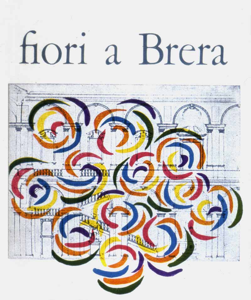
5 — Fiori a Brera, 1956, manifesto
Progetto grafico Roberto Sambonet
CASVA Centro di Alti Studi sulle Arti Visive, Milano
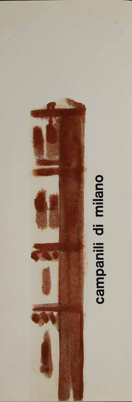
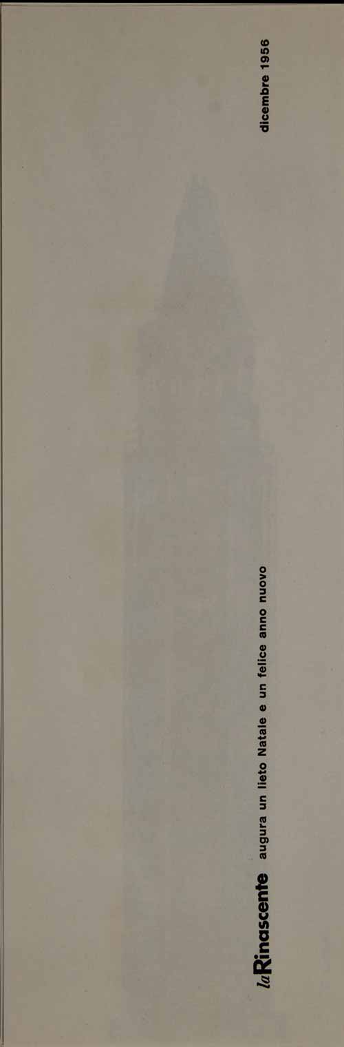
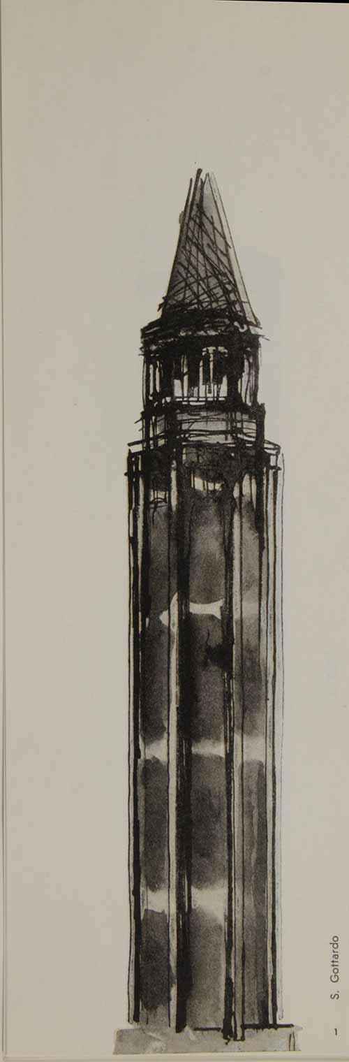
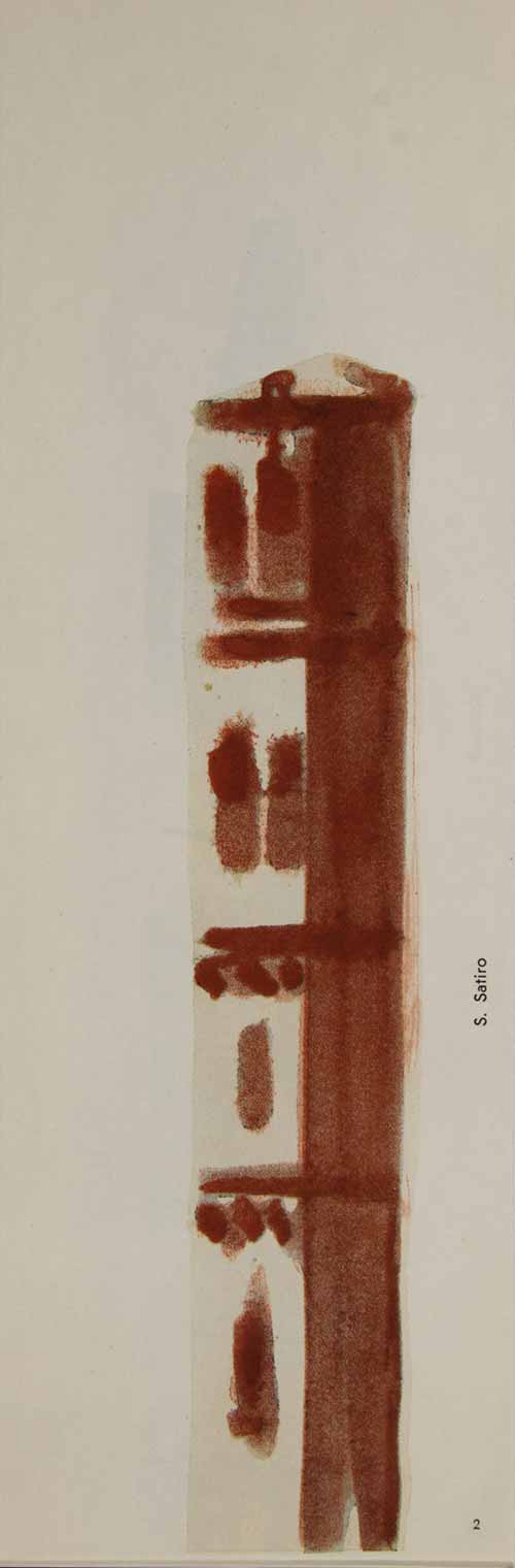
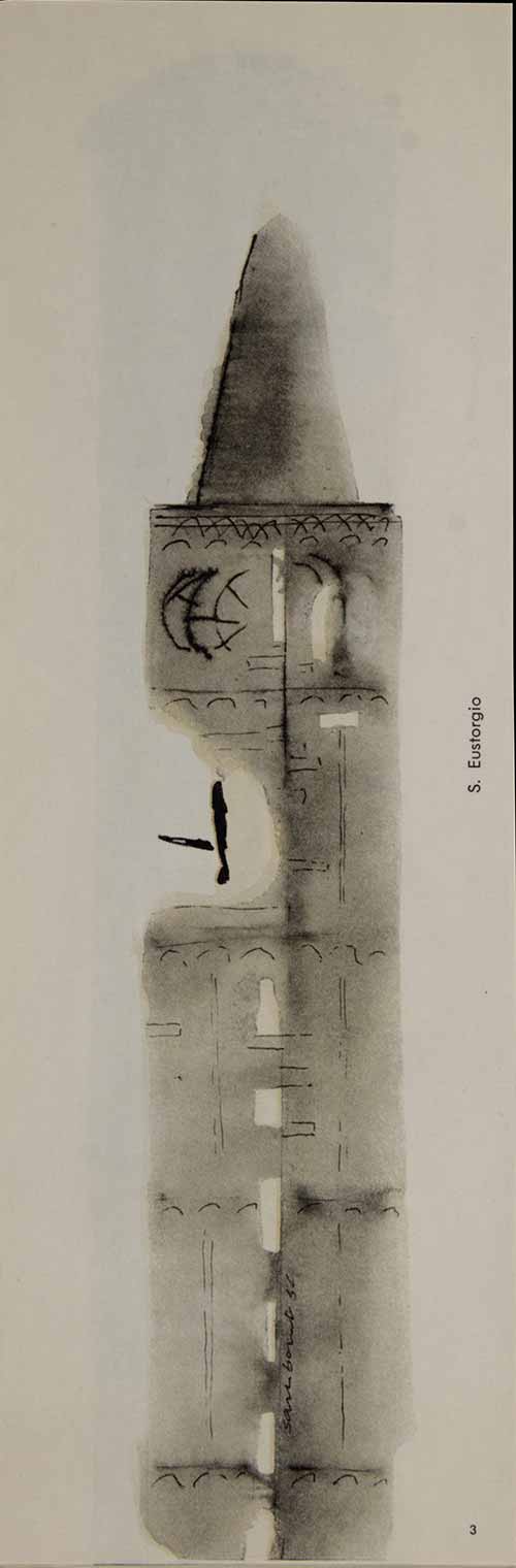
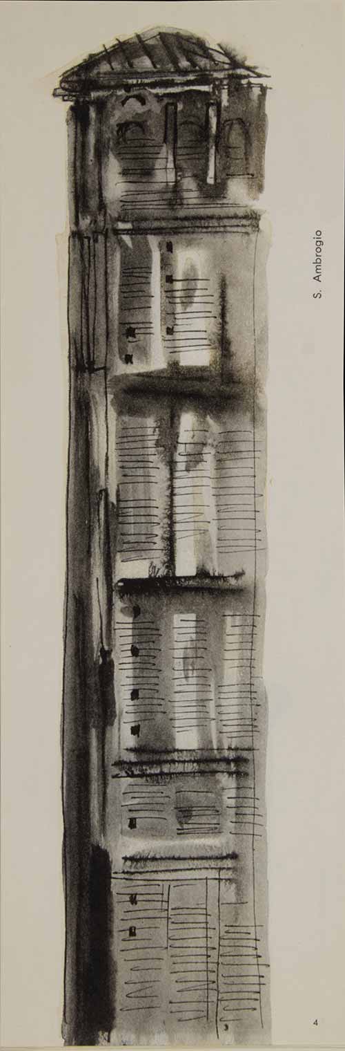
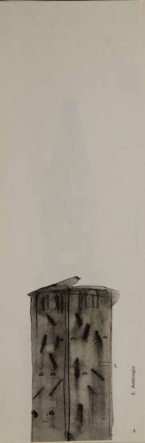
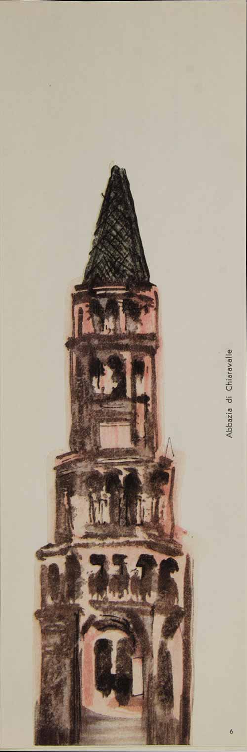
6 / 7 / 8 / 9 / 10 / 11 / 12 / 13 — Campanili di Milano, 1956, folder con litografie, omaggio de la Rinascente
Progetto grafico Lora Lamm
Archivio Gian Carlo Ortelli, Milano
14 — Buone Vacanze, 1958, manifesto
Progetto grafico Roberto Sambonet
Archivio pittorico Roberto Sambonet, Milano
15 — Simbolo per la manifestazione ‘Casa della Rinascente’, 1959
Progetto grafico Roberto Sambonet
CASVA Centro di Alti Studi sulle Arti Visive, Milano
Ornella Noorda
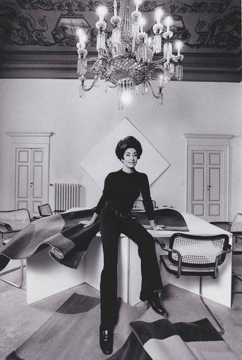
Ornella Noorda graduated in Sculpture from the Brera Academy of Fine Arts with artist and sculptor Marino Marini and Alik Cavaliere. Her works include the sculptures created for the exhibition held at Villa Olmo in Como, and for the “Il Milione” gallery in Milan: it was thanks to these pieces that she was honoured with an award at Quirinale Palace by the President of the Italian Republic Antonio Segni.
In 1959, she began to collaborate with la Rinascente as external consultant of the design office, working closely with Augusto Morello and Amneris Latis. She designed exclusive items for a number of events including ‘Natale Idea’, ‘Casa Idea’, ‘l’Ufficio’ and ‘La Caccia’.
With her expertise in textiles, she created table sets, such as tablecloths, as well as bedroom sets: cushions, bed sheets, covers, quilts, rugs and upholstery fabrics.
“In 1960, I was pregnant with my first child, and so I drew a lot of inspiration from the motif of children. I particularly remember a window display, the first one on the left, under the portico of the Rinascente store in Piazza Duomo: bed sheets, tablecloths and bibs were displayed, hanging from taut threads almost as if in reference to washing lines, that I had exclusively made for Rinascente. Their common theme was cut and whole apples, a peculiar motif that I had used a lot”.
The creations that are most remembered by Ornella Noorda are: Autunno Le Mele (a series of bed sheets for children, tablecloths and placemat sets sold in gift packaging), Numeri (a collection of cushions, decorative fabric panels and tapestries, as well as foulards and tablecloths in a variety of colours) and Amori (gift ideas, merchandising items, foulards and textile items, all linked to one of Noorda’s key graphic designs, based on the theme of love and related to a specific object: a heart).
In 1966, the first edition of the book Amori was published, a collection of graphic works revolving around the theme of the heart, with captions in three languages. The original designs were on display at the MoMA in New York. Still in the field of textiles, Noorda designed a collection of square rugs (2x2m in size) with geometric patterns exclusively for la Rinascente, drawing inspiration from tile mosaics. The rugs, which were produced by a Viennese company, could be used alone or combined with others to create remarkable designs. “Vogue” dedicated a reportage to this project, which was carried out in the Unimark studio, with shots taken by photographer Ugo Mulas.
Noorda not only created design objects and textile items, but also furniture, such as a Plexiglas table designed for ‘Natale Idea’ event that was remarkably successful thanks to its modern, clean-cut lines.
“I had designed a coordinated collection for ‘Natale Idea’ that comprised a large table, formed of a series of closely positioned individual tables, laid with a transparent set of placemats, dinner and soup plates, a series of plexiglass glasses and a centre piece candle holder. A few days before Christmas, I headed to the floor where the installation had been created, but the space was empty because everything had been taken away to decorate the Christmas evenings at Casa Borletti”
Ornella Noorda studied various types of materials, specialising in the by-products of plastic materials that were introduced in the 1960s. She created simple, charming , fun items for everyday use with a strong design, experimenting and creating coloured plastic materials. For ‘l’Ufficio’ event, she designed a line of coordinated items: pen holders, rulers, document holders, paperweights and a special notepad formed of a base and a support made of Plexiglas where a paper roll for issuing receipts is attached.
She continued her close collaboration with Guzzini, leader in the manufacturing of plastic materials, creating design items for the home, table and kitchen. Notably, she designed a collection of trays and stacking containers, and in 1968 she won first prize in Macef.
Fancy, imagination and technique are the defining traits of the character, passion and love that Ornella Noorda feels for her work.
Her collaboration with la Rinascente ended in 1970.
1 — Ornella Noorda, Papavero, 1959-1969, Progetto grafico per oggetti tessili e accessori per la casa, realizzati per la Rinascente
Archivio Ornella Noorda, Milano
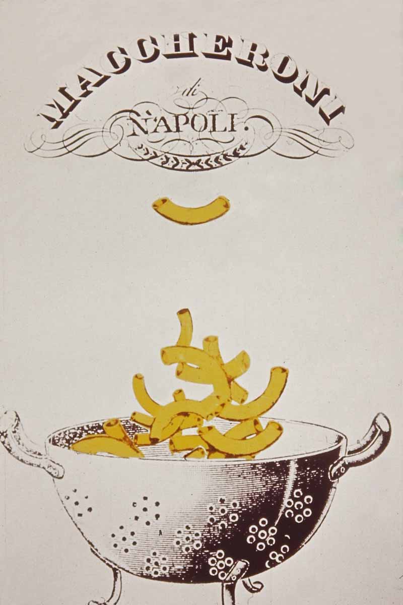
2 — Ornella Noorda, Maccheroni di Napoli, 1959-1969, Progetto grafico per oggetti tessili e accessori per la casa, realizzati per la Rinascente
Archivio Ornella Noorda, Milano
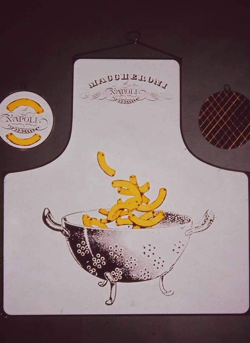
3 — Ornella Noorda, Maccheroni di Napoli, 1959-1969, Oggetti tessili e accessori per la casa, realizzati per la Rinascente
Archivio Ornella Noorda, Milano
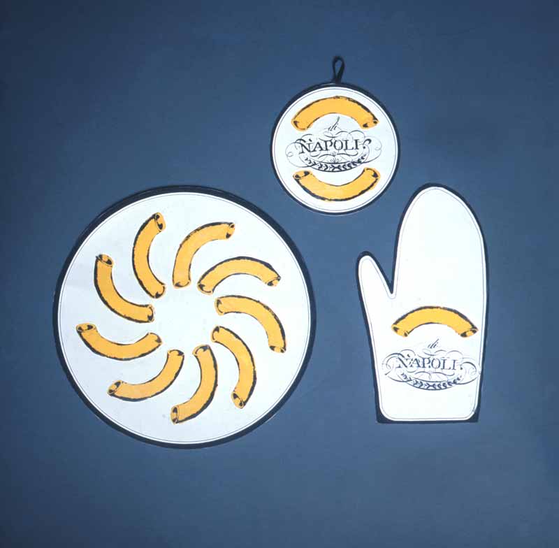
4 — Ornella Noorda, Maccheroni di Napoli, 1959-1969, Oggetti tessili e accessori per la casa, realizzati per la Rinascente
Archivio Ornella Noorda, Milano
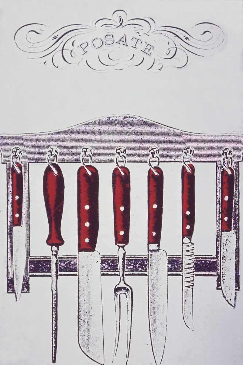
5 — Ornella Noorda, Posate, 1959-1969, Progetto grafico per oggetti tessili e accessori per la casa, realizzati per la Rinascente
Archivio Ornella Noorda, Milano
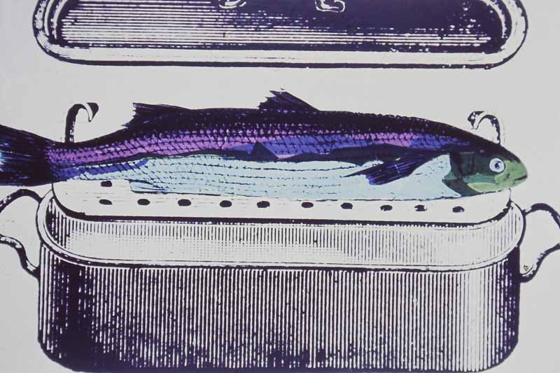
6 — Ornella Noorda, [Pesce], 1959-1969, Progetto grafico per oggetti tessili e accessori per la casa, realizzati per la Rinascente
Archivio Ornella Noorda, Milano
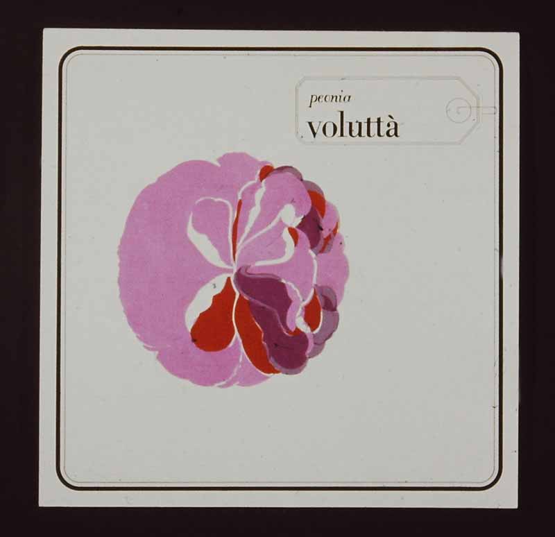
7 — Ornella Noorda, Peonia. Voluttà, 1959-1969, Progetto grafico per oggetti tessili e accessori per la casa, realizzati per la Rinascente
Archivio Ornella Noorda, Milano
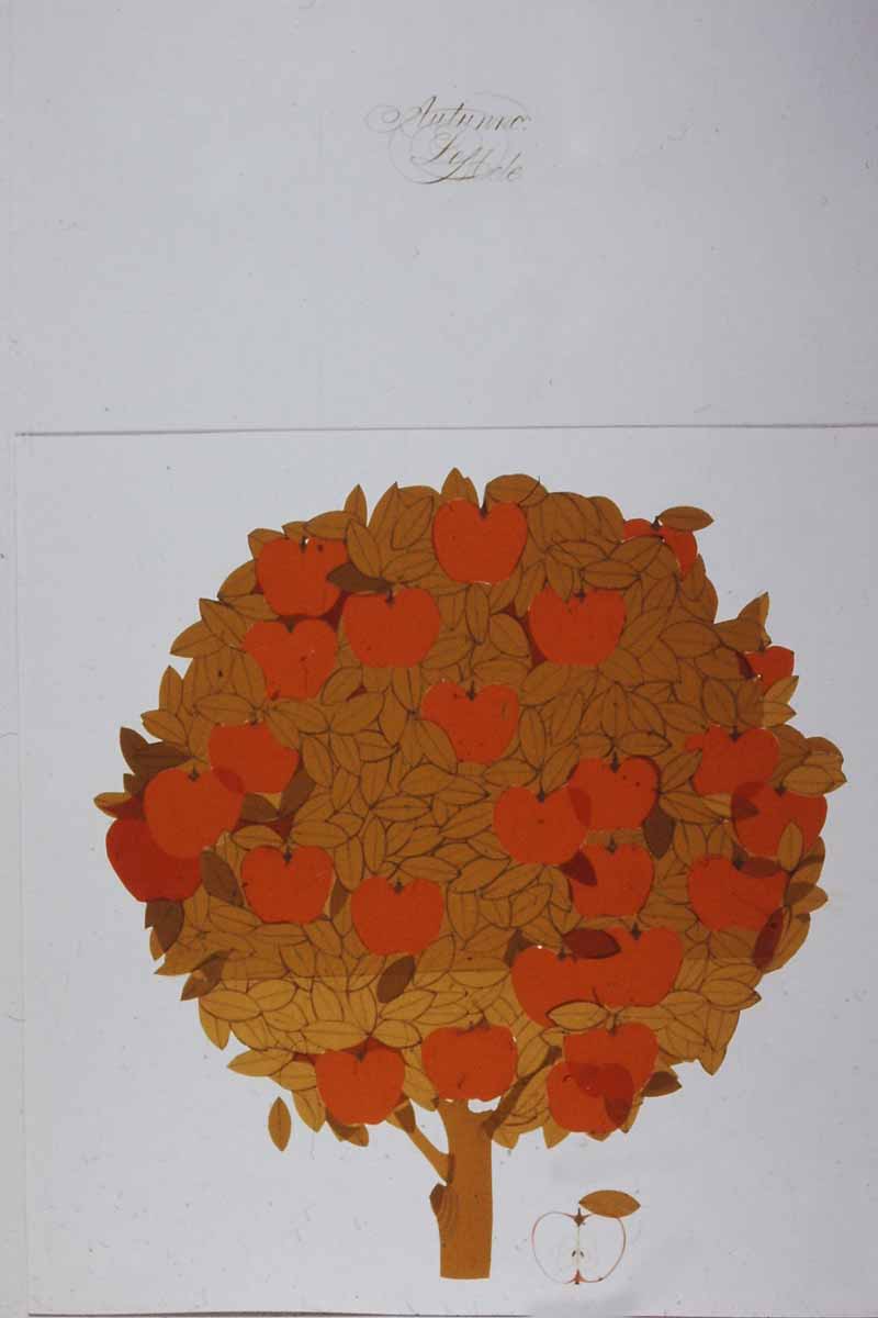
8 — Ornella Noorda, Autunno Le Mele, 1959-1969, Progetto grafico per oggetti tessili per la casa, realizzati per la Rinascente
Archivio Ornella Noorda, Milano
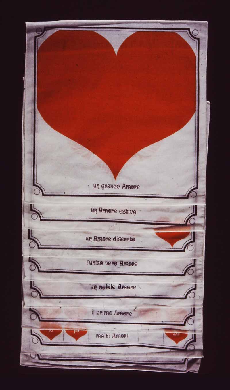
9 — Ornella Noorda, Amori, 1959-1969, Tessili per la casa, realizzati per la Rinascente
Archivio Ornella Noorda, Milano
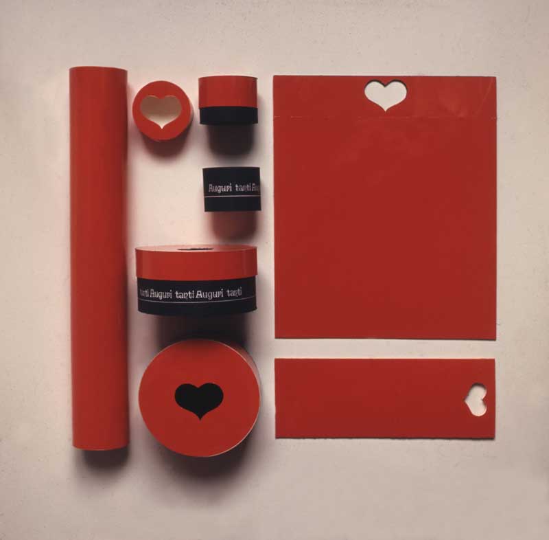
10 — Ornella Noorda, Auguri, 1959-1969, Progetto di packaging della serie “Amori”, realizzato per la Rinascente
Archivio Ornella Noorda, Milano
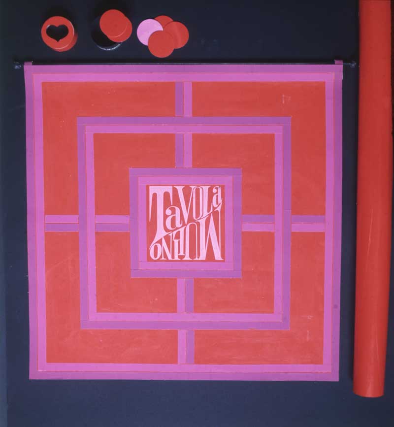
11 — Ornella Noorda, Tavola Mulino, 1959-1969, Pannello decorativo in tessuto, realizzato per la Rinascente
Archivio Ornella Noorda, Milano
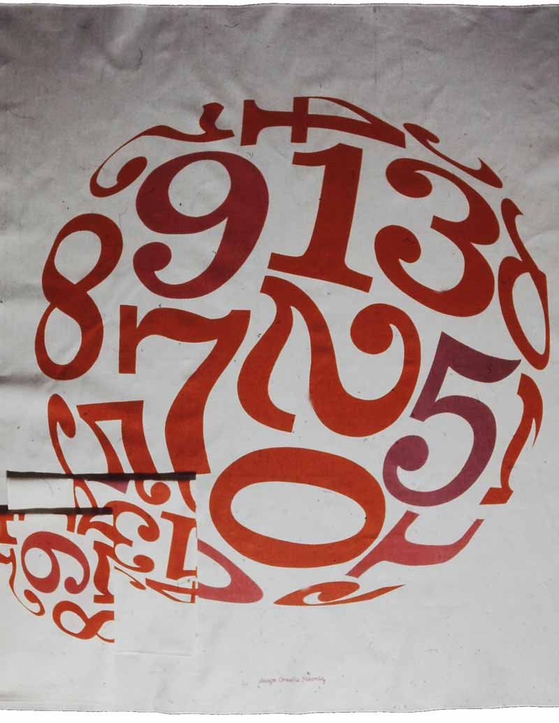
12 — Ornella Noorda, Numeri, 1959-1969, Tessili per la casa, realizzati per la Rinascente
Archivio Ornella Noorda, Milano
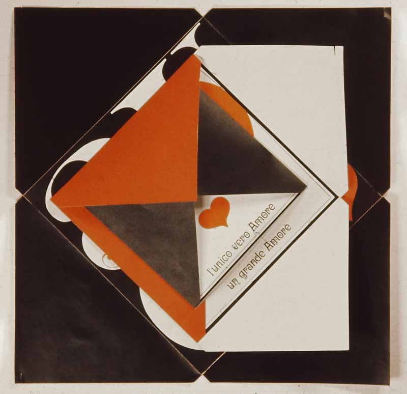
13 — Ornella Noorda, Auguri, 1967ca., Biglietti in cartoncino della serie “Amori”, realizzati per la Rinascente
Archivio Ornella Noorda, Milano
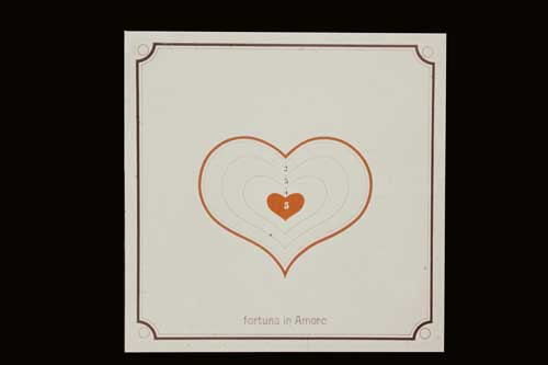
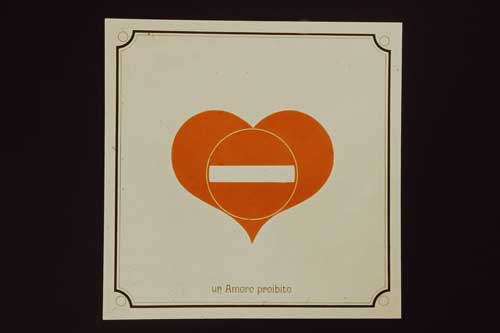
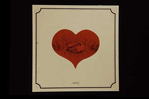
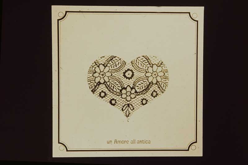
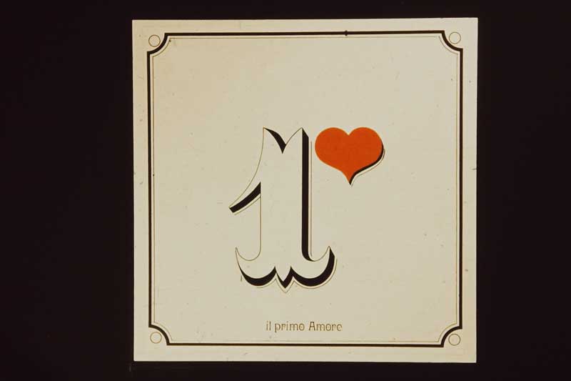
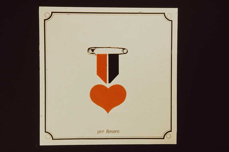
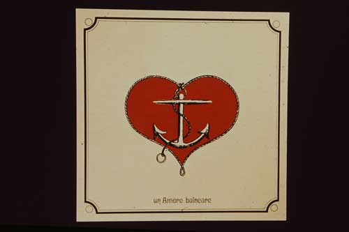
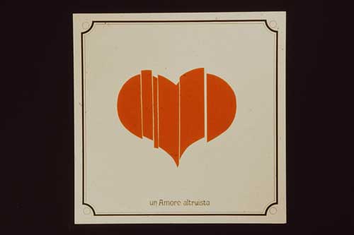
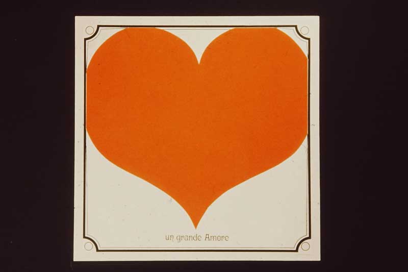
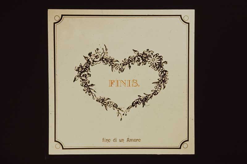
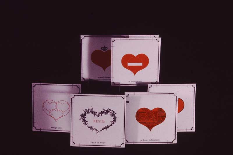
14 — Ornella Noorda, Castello dei sogni, 1967ca., Carte per gioco a incastro della serie “Amori”, realizzati per la Rinascente
Archivio Ornella Noorda, Milano
Helmut Newton
Oliviero Toscani

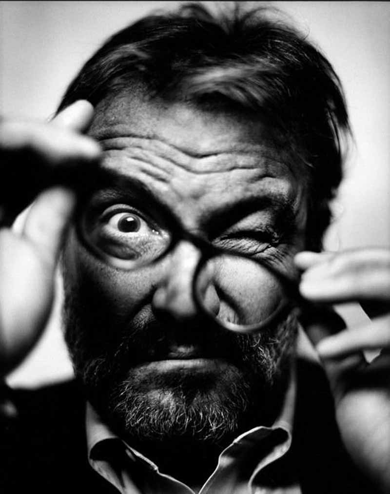
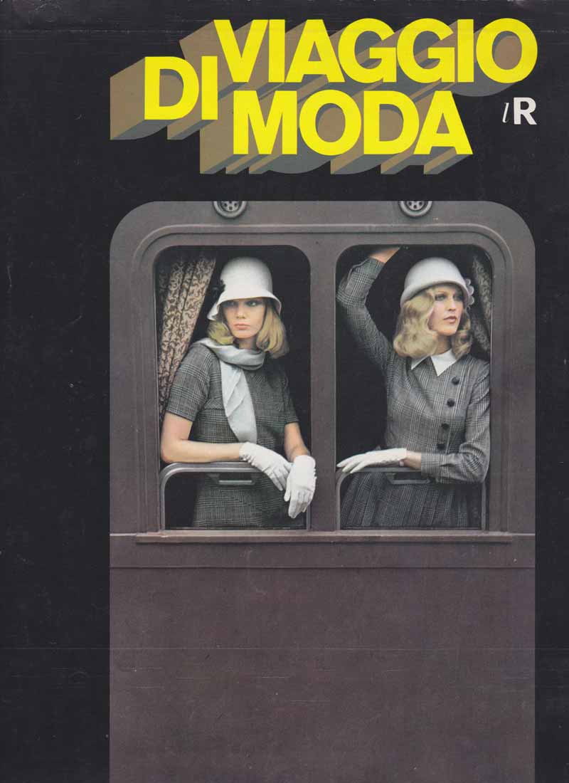
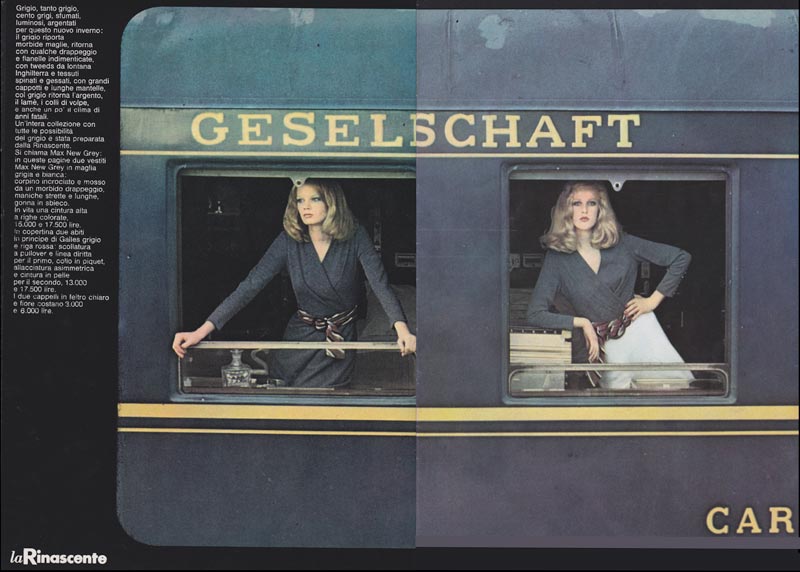
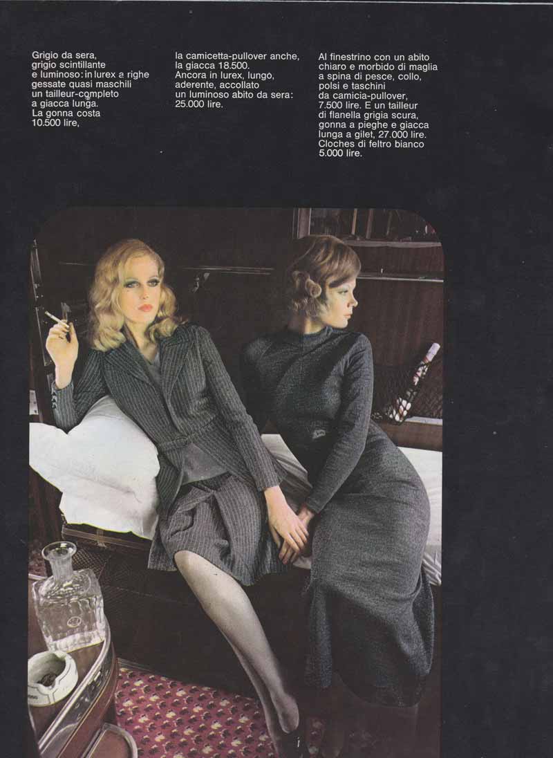
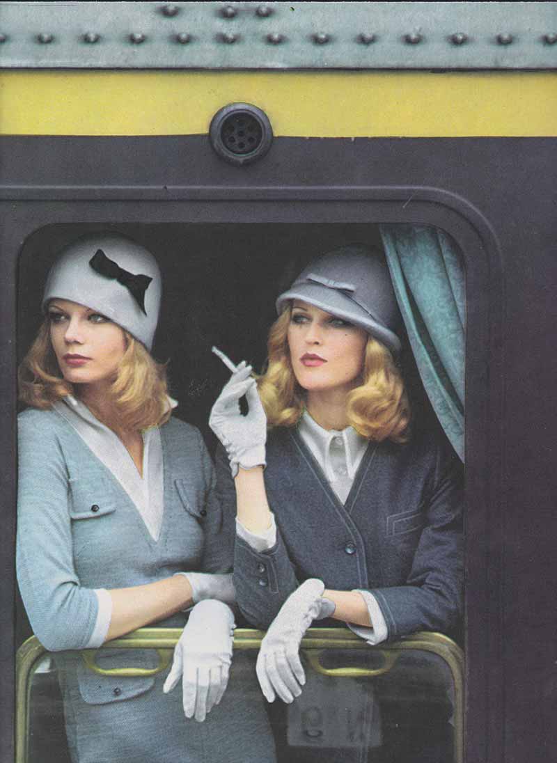
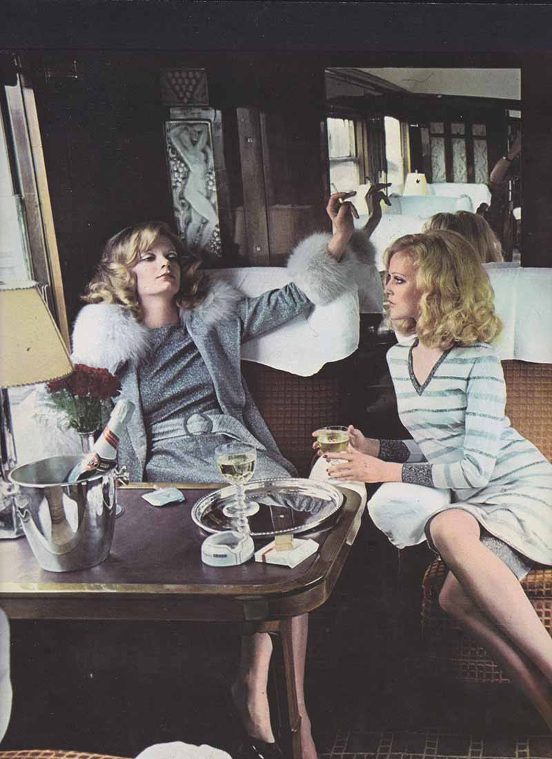
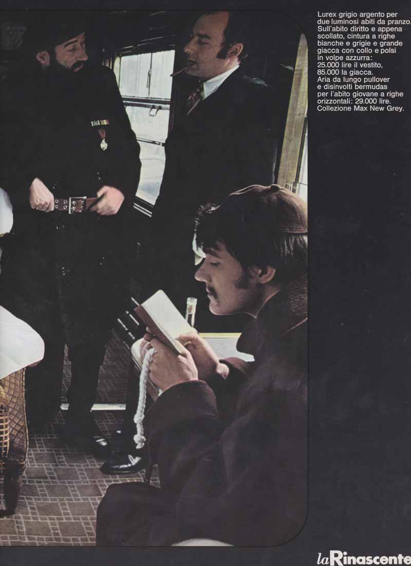
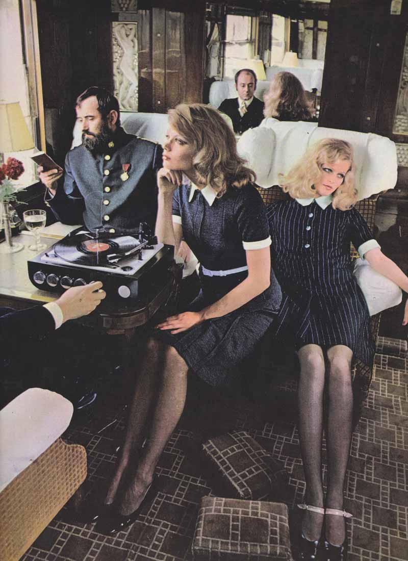
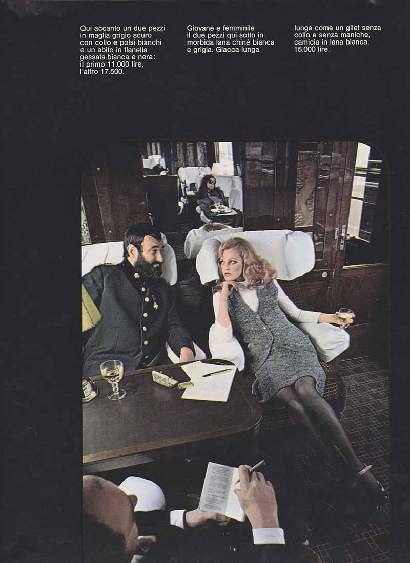
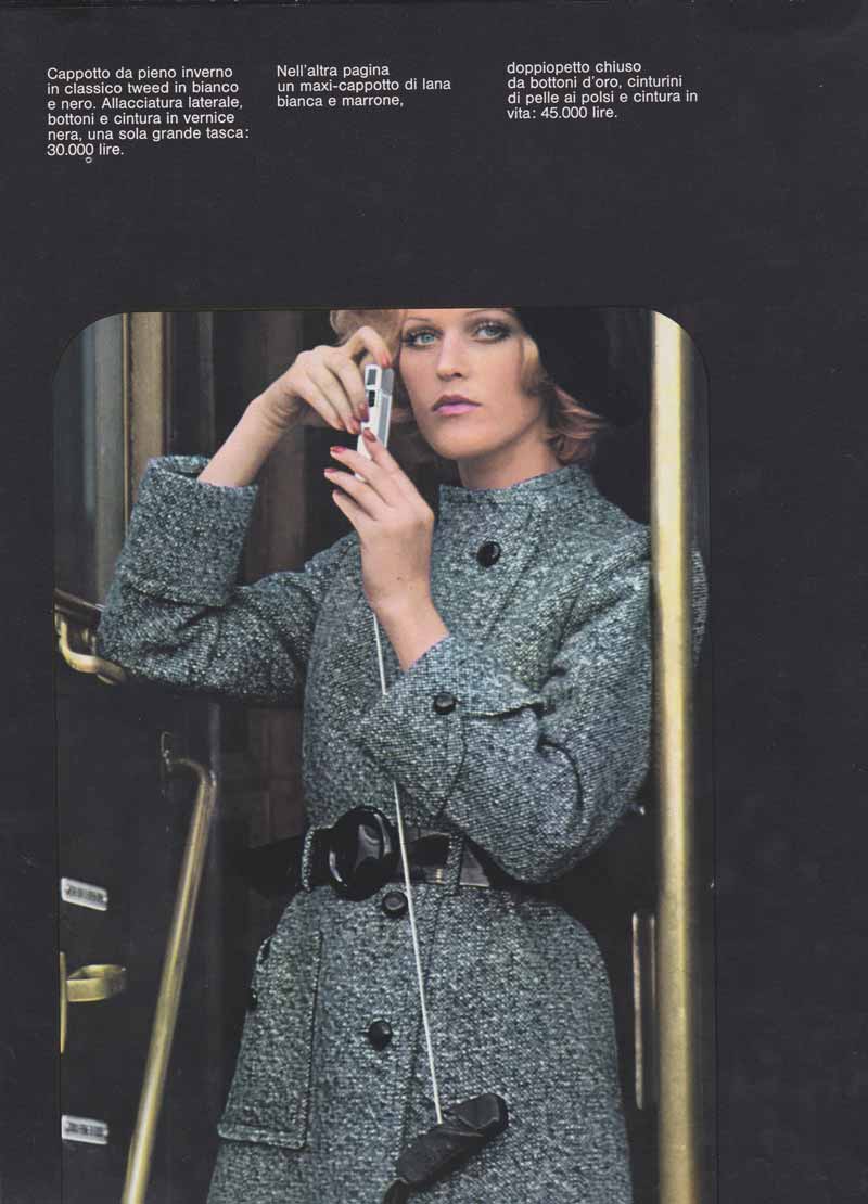
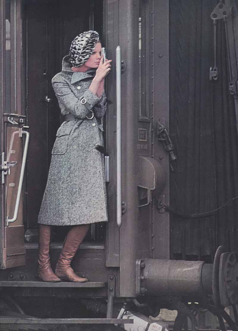
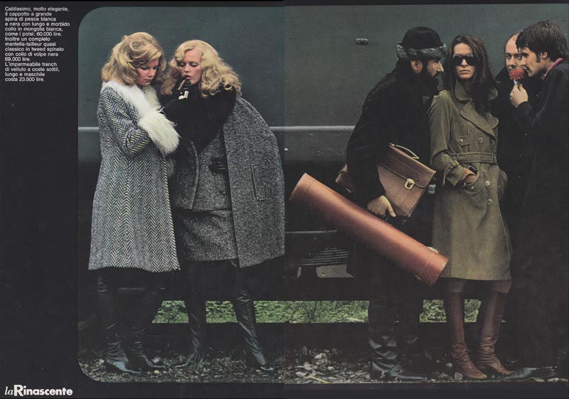
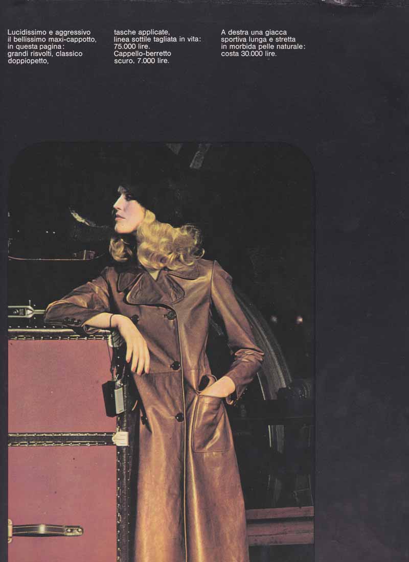
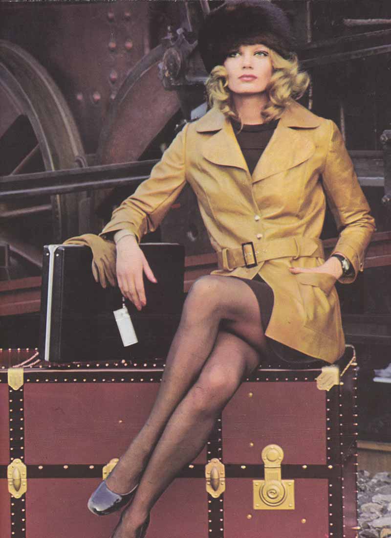
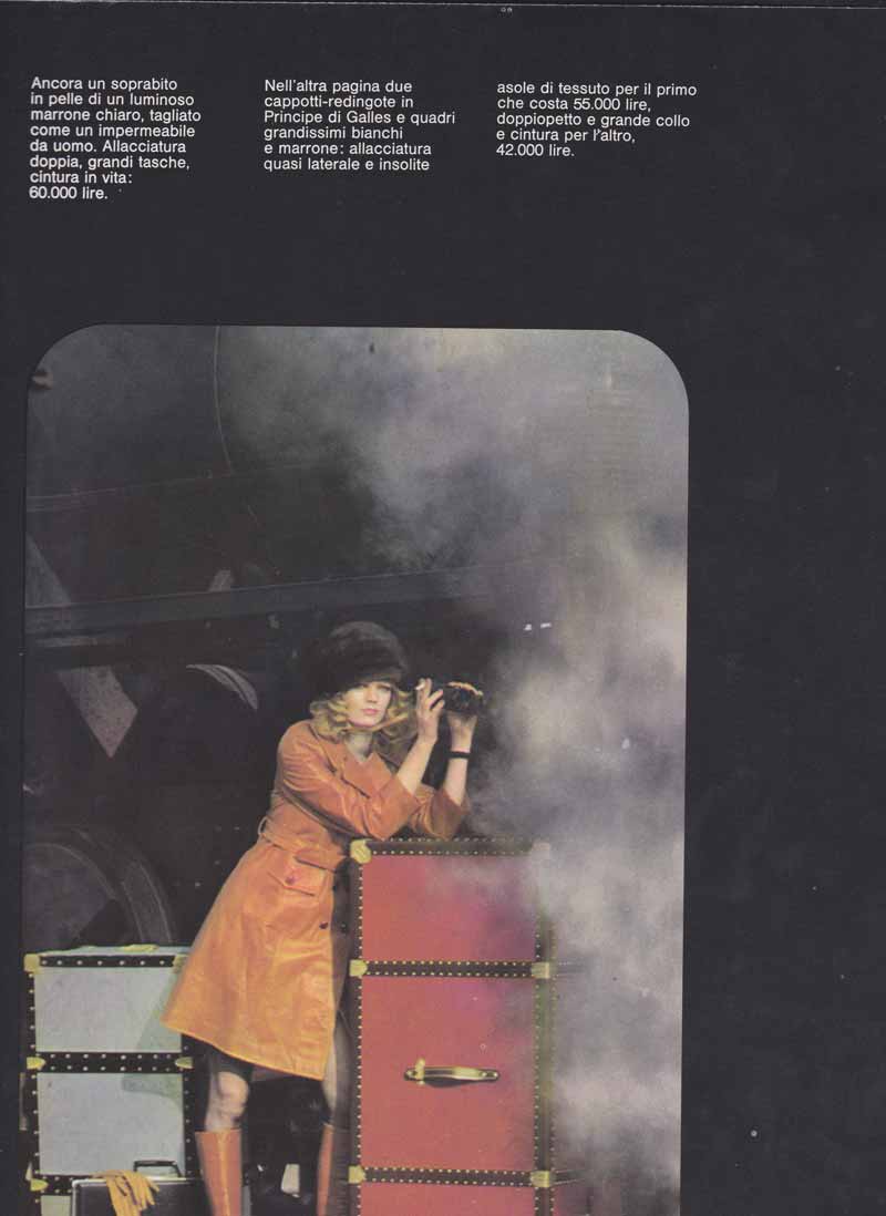
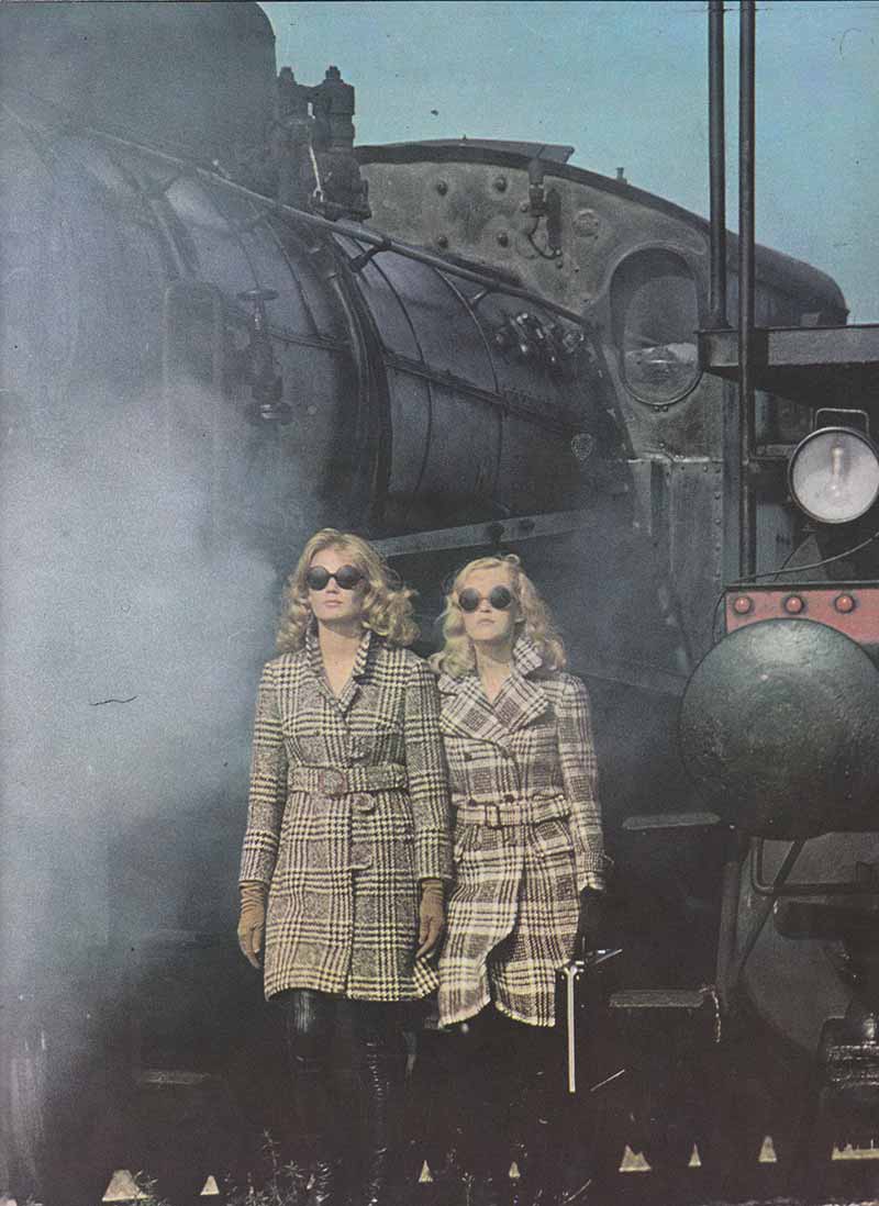
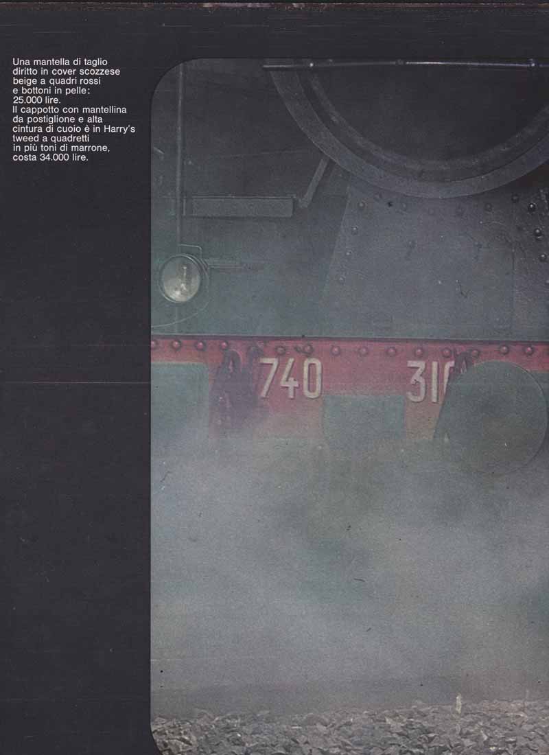
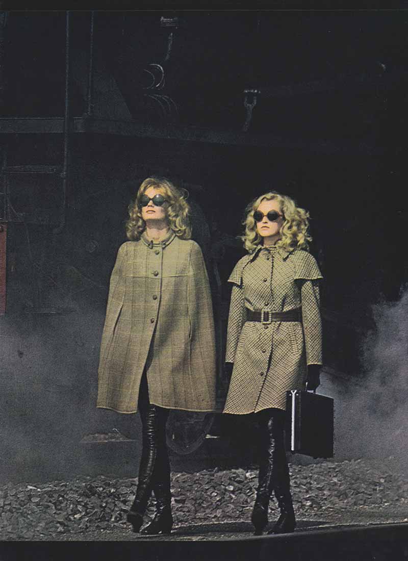
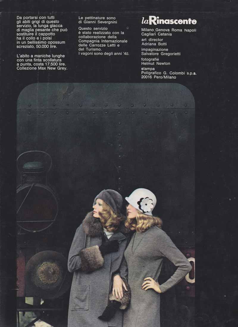
1 — Viaggio di moda, 1968, catalogo pubblicitario
Fotografia Helmut Newton
Progetto grafico Salvatore Gregorietti
Art director Adriana Botti Monti
Archivio Serge Libiszewski, Milano
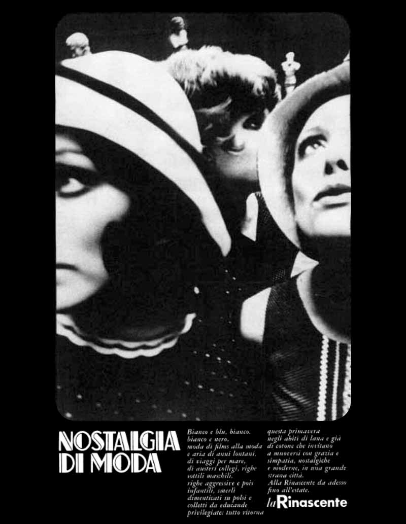
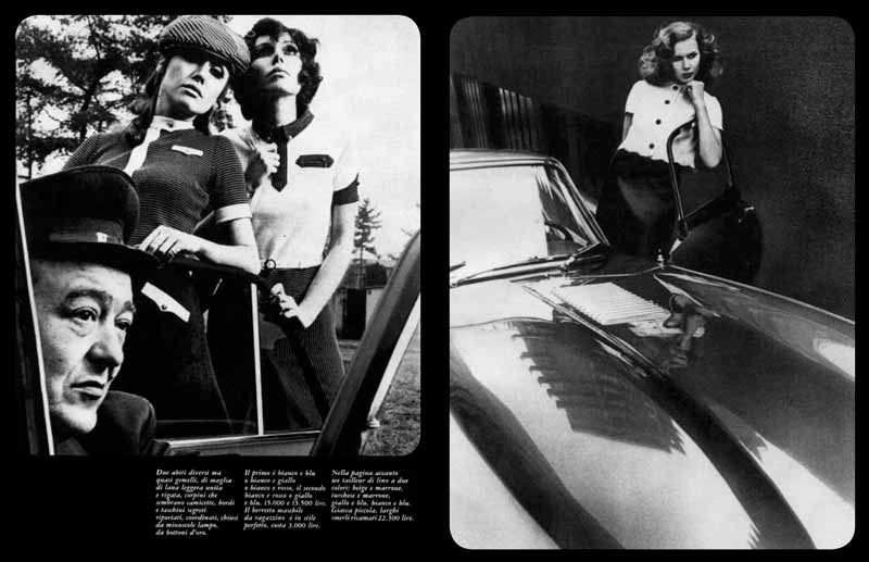
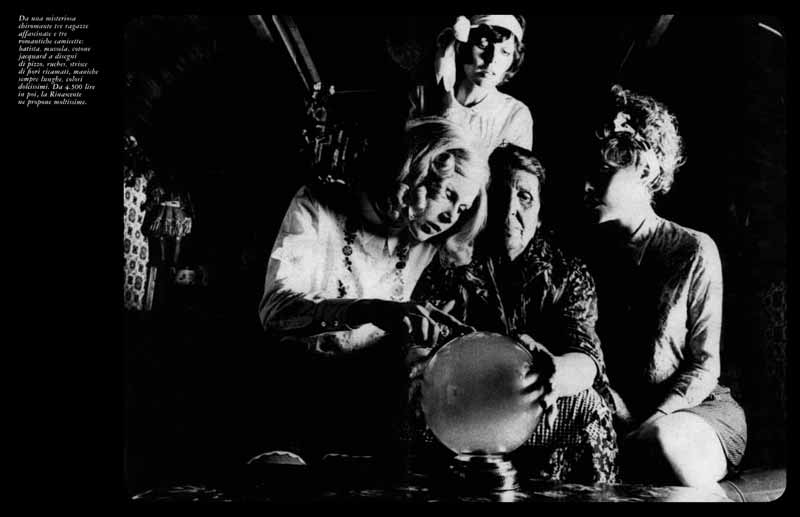
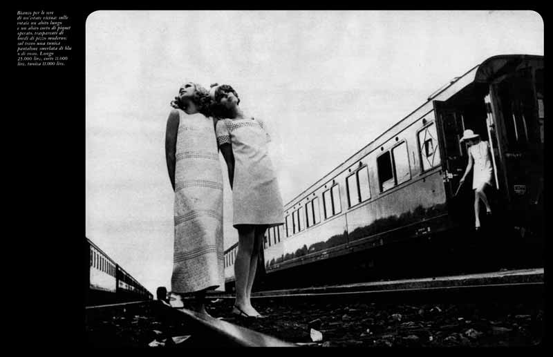

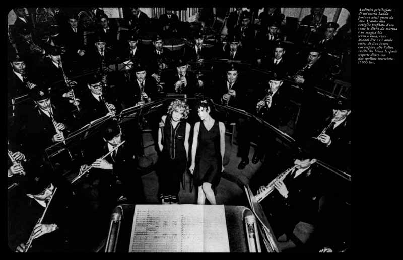
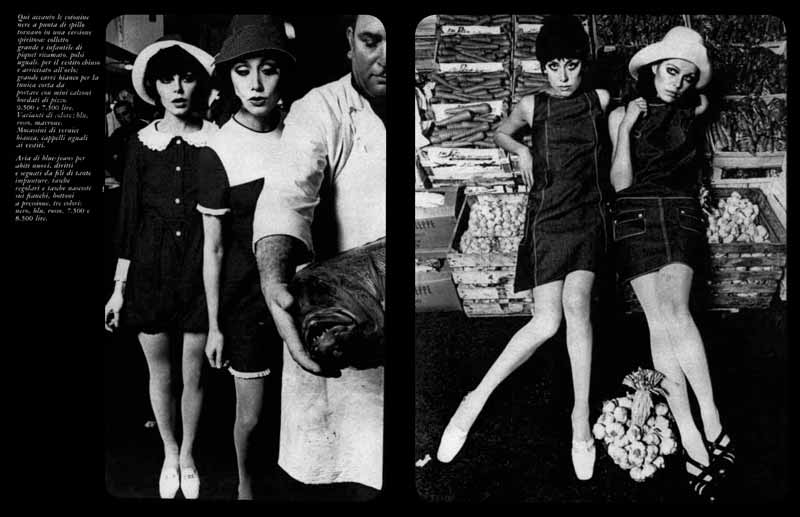
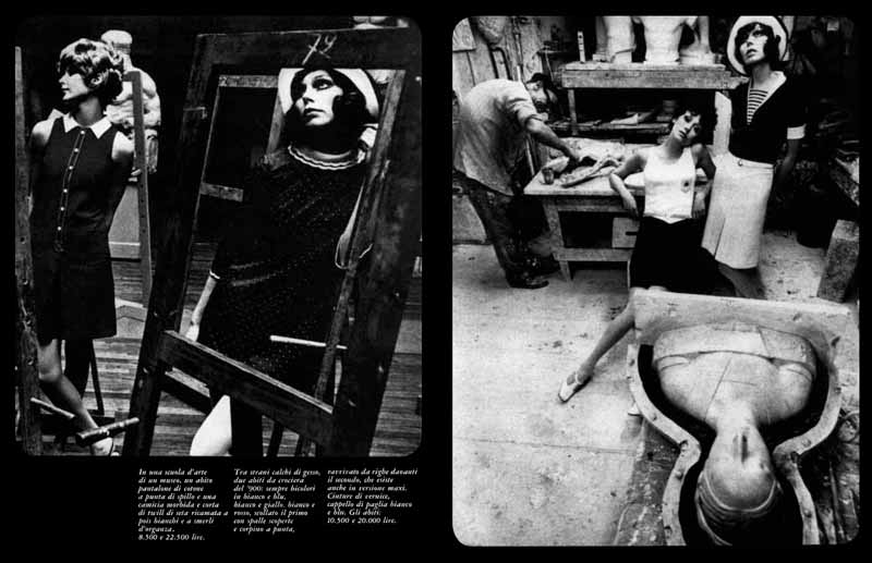
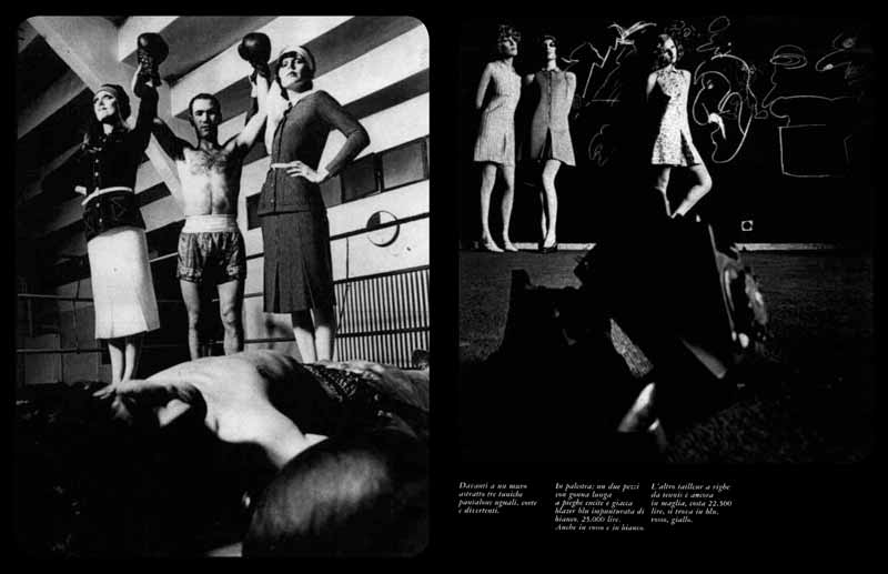
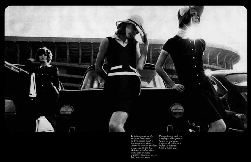
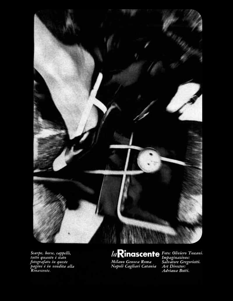
2 — Nostalgia di moda, catalogo moda
Fotografia Oliviero Toscani
Progetto grafico Salvatore Gregorietti
Art director Adriana Botti Monti
Archivio Salvatore Gregorietti, Milano